Prolog: Von der Genliste zum biologischen Verständnis
Eine Differenzielle Expressionsanalyse liefert Hunderte signifikanter Gene. Aber was bedeuten sie? Eine Liste von 500 Gennamen ist biologisch wertlos, solange man nicht versteht, welche Prozesse, Pathways und Funktionen diese Gene repräsentieren. Die Enrichment-Analyse löst dieses Problem: Sie fragt, ob bestimmte biologische Begriffe in der Genliste überrepräsentiert sind — häufiger als man es durch Zufall erwarten würde.
In dieser Geschichte analysieren wir die validierten Zielgene von miR-21 — einem Master-Regulator in der Brustkrebsbiologie. Welche Pathways kontrolliert diese eine miRNA? Welche biologischen Programme überlappen? Die Enrichment-Visualisierung wird die Antworten enthüllen.
Kapitel 1: Der Klassiker — GO Dot Plot
Der Dot Plot ist die Standarddarstellung der Enrichment-Analyse. Jeder Punkt repräsentiert einen angereicherten GO-Term (Gene Ontology). Drei Dimensionen werden gleichzeitig kodiert: Die x-Position zeigt das Gene Ratio (Anteil der Target-Gene im Term), die Farbe zeigt die statistische Signifikanz (-log₁₀ p-Wert), und die Größe zeigt die Anzahl der betroffenen Gene.
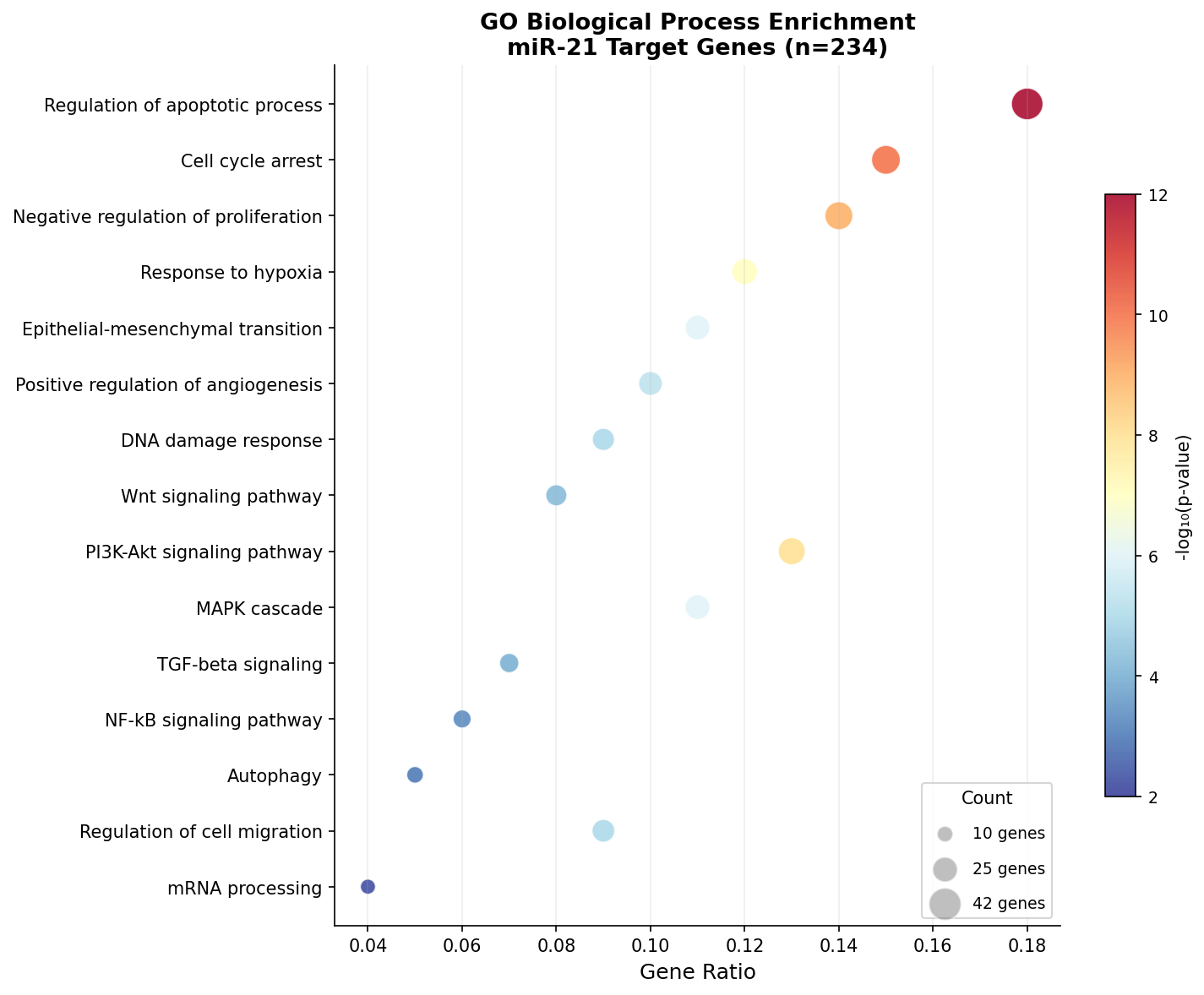
Das Bild ist unmissverständlich: miR-21 reguliert in erster Linie Apoptose und Zellzyklus — die beiden Grundpfeiler der Tumorsuppression. Der p53-Signalweg (p < 10⁻¹⁴) ist der stärkste Treffer, was zu miR-21s bekannter Rolle als Onkomir passt: Es unterdrückt Tumorsuppressoren wie PTEN, PDCD4 und TPM1 und ermöglicht so unkontrolliertes Tumorwachstum.
Kapitel 2: Blasen des Wissens — KEGG Bubble Chart
Der Bubble Chart geht einen Schritt weiter als der Dot Plot: Er zeigt die Fold Enrichment auf der x-Achse — wie stark ein Pathway im Vergleich zum Hintergrund angereichert ist. Auf der y-Achse steht die Signifikanz. Zusammen ergibt sich ein zweidimensionales Landschaftsbild: Oben rechts sind die wichtigsten und überzeugendsten Terme.
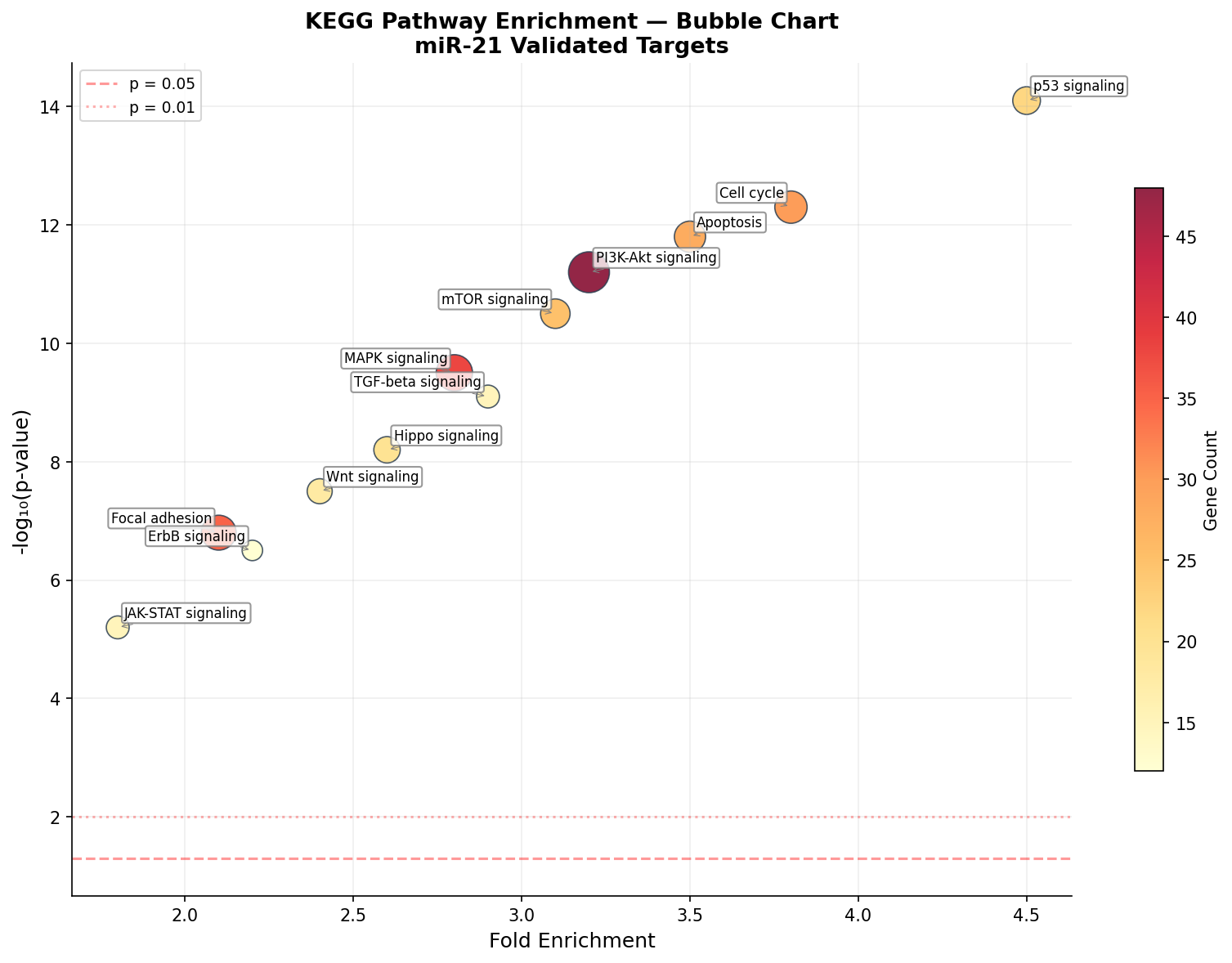
Der Bubble Chart enthüllt eine wichtige Nuance: Statistisch signifikant ≠ biologisch bedeutsam. PI3K-Akt hat viele Gene (große Blase), weil es ein großer Pathway ist — die Fold Enrichment ist aber moderat. Der p53-Pathway hingegen ist klein, aber extrem stark angereichert. Für die Interpretation gilt: Fold Enrichment > 3 bei p < 10⁻⁶ sind die zuverlässigsten Treffer.
Kapitel 3: Spiegel-Spiegel — miR-21 vs. miR-155
Verschiedene miRNAs können die gleichen Pathways regulieren — aber mit unterschiedlicher Stärke. Der Vergleichs-Barplot stellt die Enrichment-Ergebnisse von miR-21 und miR-155 Seite an Seite. Wo sind sie ähnlich? Wo divergieren sie?
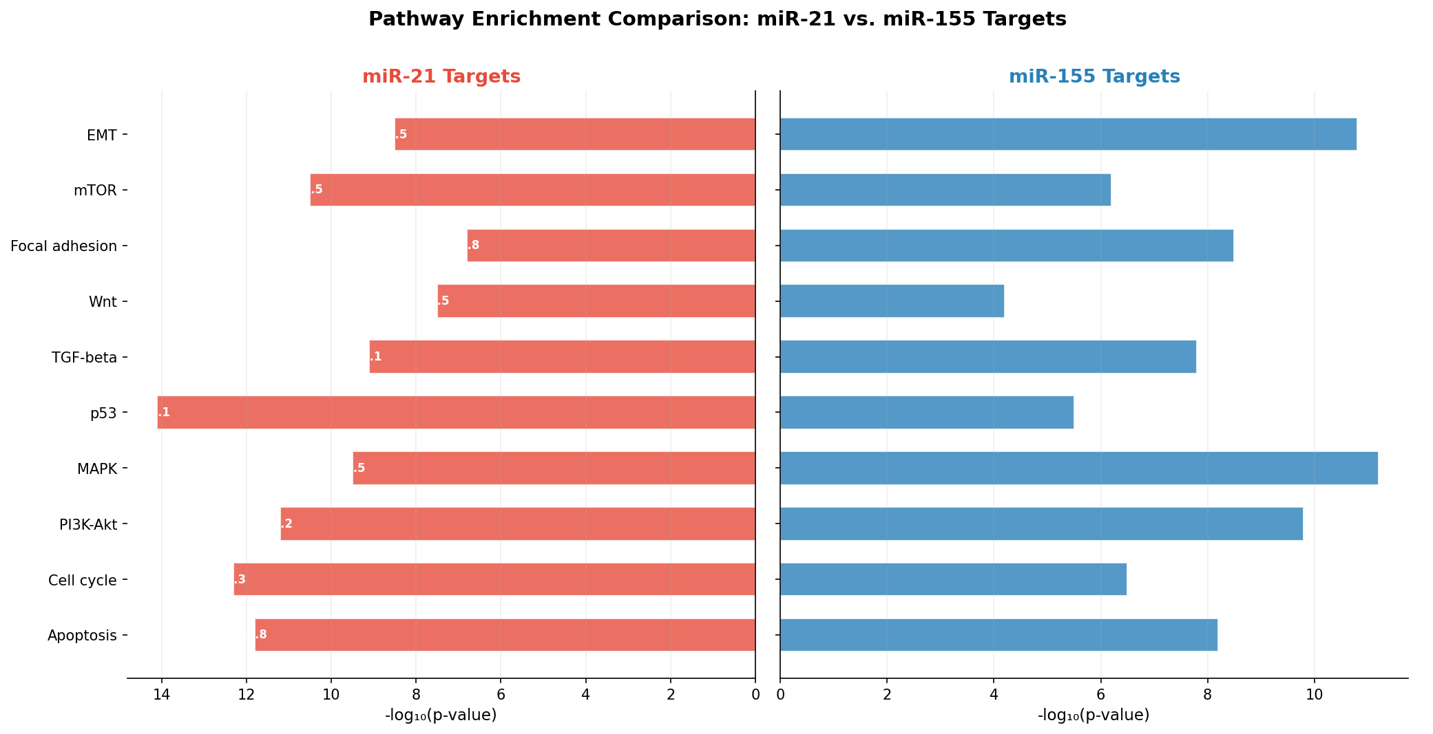
Die Gegenüberstellung zeigt zwei verschiedene regulatorische Profile: miR-21 ist ein „Apoptose-Spezialist" (p53, Apoptose, Zellzyklus stark angereichert), während miR-155 ein „EMT-Spezialist" ist (EMT, MAPK stark angereichert). Aber beide konvergieren auf PI3K-Akt — dem zentralen Überlebens-Signalweg. Diese Konvergenz erklärt, warum die Kombination beider miRNAs in Multi-Marker-Panels so effektiv ist.
Kapitel 4: Die Heatmap — Sechs miRNAs, zehn Pathways
Warum nur zwei miRNAs vergleichen, wenn man sechs nehmen kann? Die Enrichment-Heatmap zeigt die Anreicherungs-Signifikanz für jede Kombination aus miRNA und Pathway. Jede Zelle enthält den -log₁₀(p-Wert) — je dunkler, desto stärker die Anreicherung.
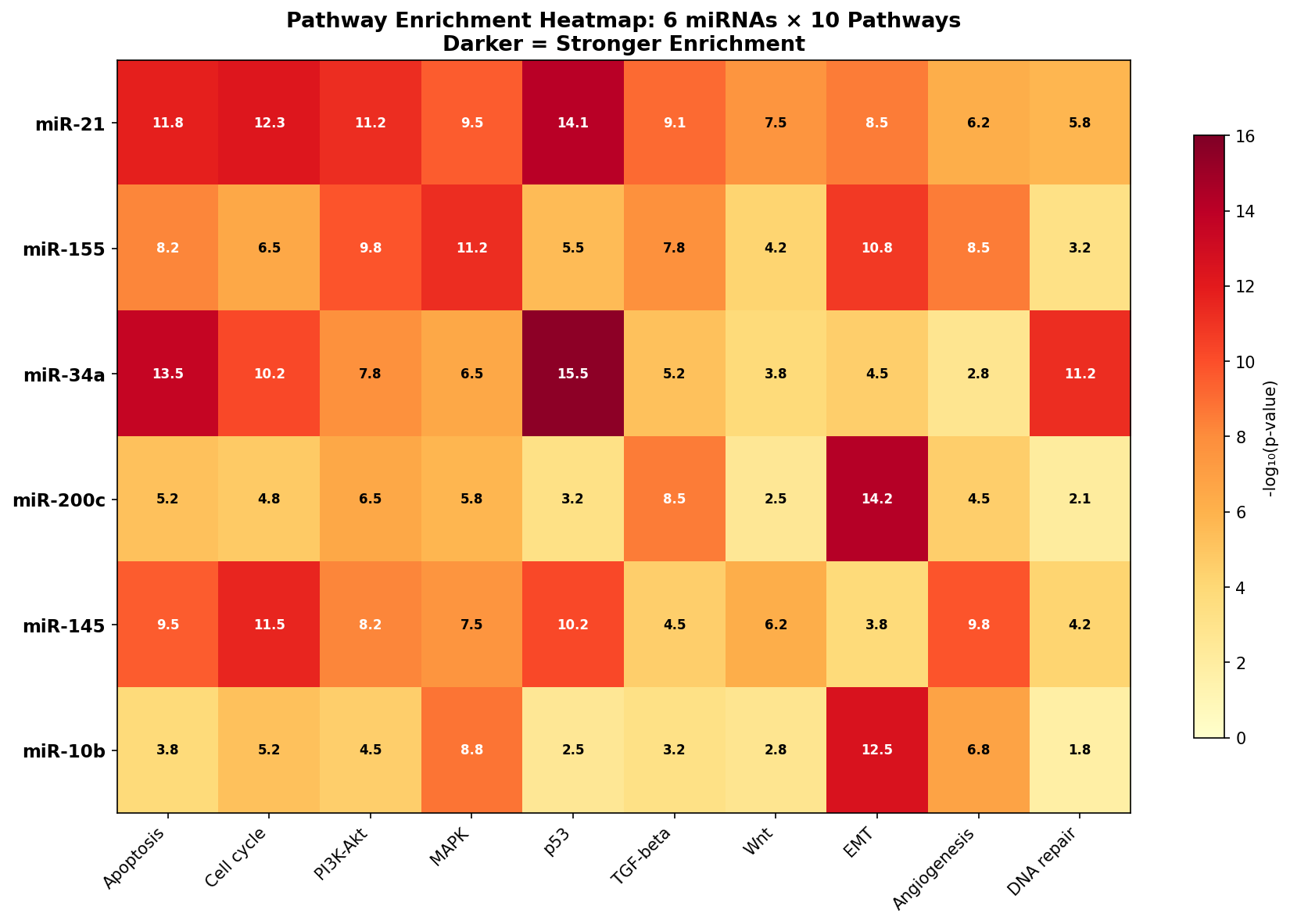
Die Heatmap ist ein Fingerabdruck-Atlas: Jede miRNA hat ein einzigartiges Pathway-Profil. miR-34a und p53 (15.5) ist die stärkste Einzelassoziation — nicht überraschend, da miR-34a ein direktes transkriptionelles Target von p53 ist. Die Heatmap identifiziert auch unerwartete Lücken: miR-10b hat fast keine Anreicherung für DNA-Reparatur (1.8), was es als Biomarker für bestimmte Therapieansätze ausschließt.
Kapitel 5: Das Konzept-Netzwerk — Gene verbinden Pathways
Pathways sind keine isolierten Einheiten — sie teilen Gene. Der Gene-Concept-Network-Plot (cnetplot) macht diese Überlappung sichtbar: Pathway-Knoten (rot) sind mit Gen-Knoten verbunden. Gene, die in mehreren Pathways vorkommen (orange), sind die Kreuzungs-Punkte der Biologie.
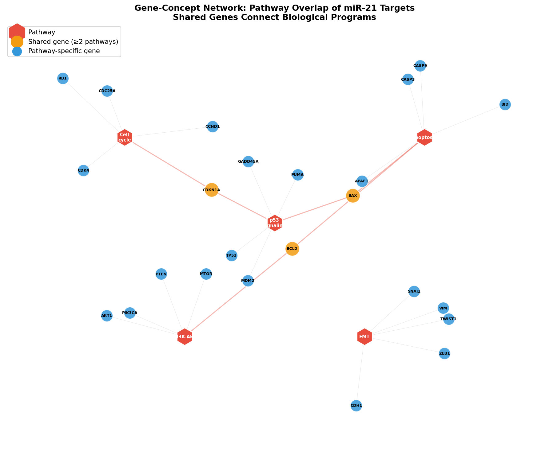
Das Netzwerk zeigt, warum miR-21 so mächtig ist: Über geteilte Gene wie BAX, BCL2 und CDKN1A kontrolliert es nicht nur einzelne Pathways, sondern den Cross-Talk zwischen Pathways. Die Unterdrückung von CDKN1A (p21) dereguliert gleichzeitig Zellzyklus UND p53-Signaling. Ein Gen, zwei Pathways, ein Regulierungsprobleme — das ist die Essenz der miRNA-Biologie.
Kapitel 6: Die Landkarte der Begriffe — Enrichment Map
Alle bisherigen Plots zeigen einzelne Terme. Aber wie hängen die Terme untereinander zusammen? Die Enrichment Map berechnet die Ähnlichkeit zwischen GO-Termen (basierend auf geteilten Genen) und zeigt sie als Netzwerk. Ähnliche Terme bilden Cluster — und jeder Cluster repräsentiert ein übergeordnetes biologisches Thema.
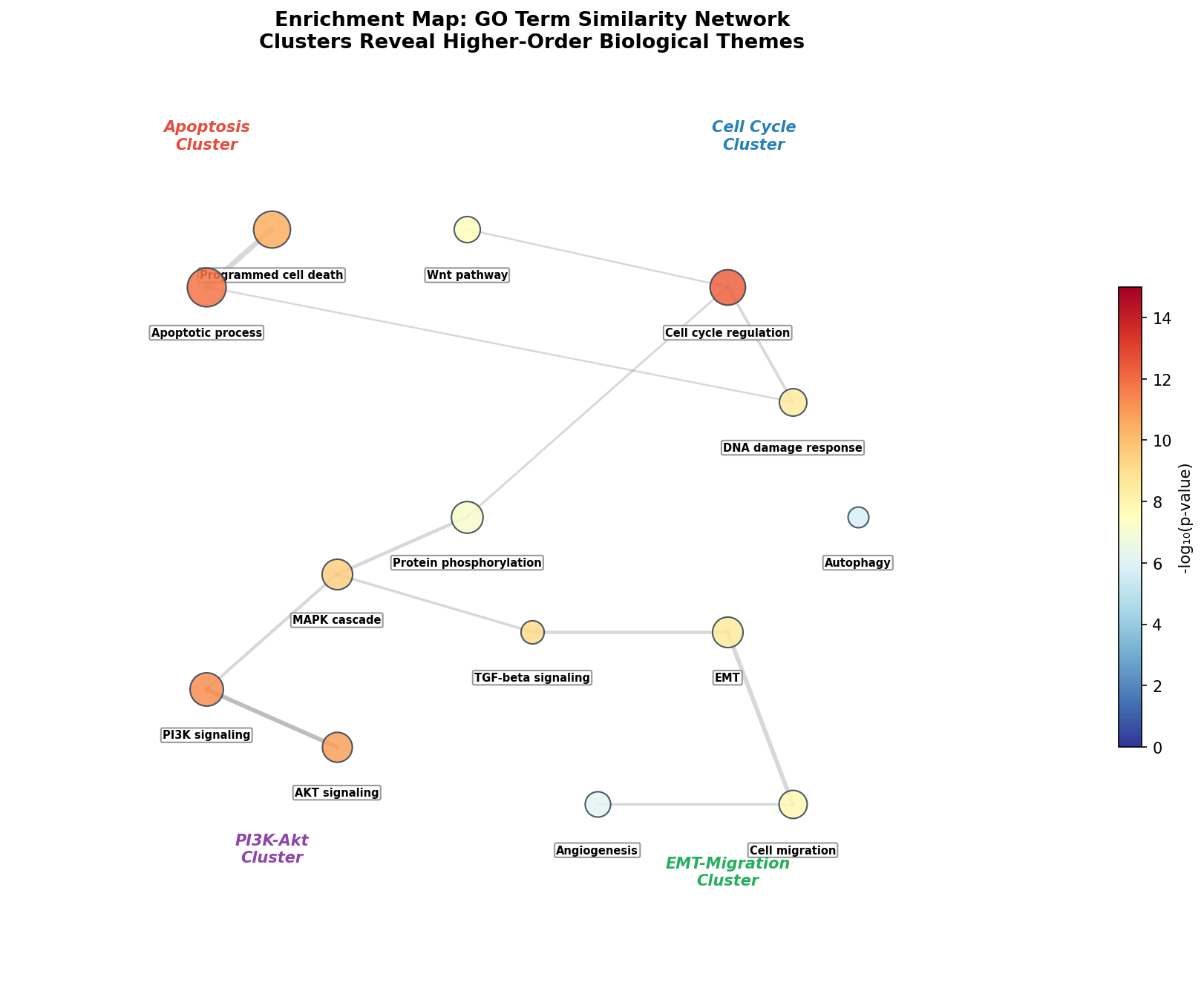
Die Enrichment Map ist das Meta-Werkzeug der funktionellen Analyse: Sie reduziert redundante Einzelterme zu übersichtlichen Themen. Statt 15 einzelner GO-Terme sehen wir vier biologische Programme, die miR-21 kontrolliert. Die Verbindungen zwischen Clustern (z. B. Apoptose–Zellzyklus) zeigen, wo verschiedene Programme zusammenlaufen — genau an den Genen, die wir im cnetplot als Kreuzungspunkte identifiziert haben.
Epilog: Von Zahlen zu Biologie
Die Enrichment-Analyse ist die Brücke zwischen Statistik und Biologie. Sie transformiert Genlisten in biologische Narrative: Welche Prozesse sind betroffen? Welche Pathways konvergieren? Welche miRNAs kontrollieren welche Programme? Jeder Plot — Dot Plot, Bubble Chart, Heatmap, cnetplot, Enrichment Map — fügt eine andere Perspektive hinzu. Zusammen ergeben sie ein mehrdimensionales Bild der regulatorischen Landschaft.
Zitationen
- Ashburner, M. et al. (2000). Gene Ontology: tool for the unification of biology. Nature Genetics, 25(1), 25-29.
- Kanehisa, M. & Goto, S. (2000). KEGG: Kyoto Encyclopedia of Genes and Genomes. Nucleic Acids Research, 28(1), 27-30.
- Yu, G. et al. (2012). clusterProfiler: an R package for comparing biological themes among gene clusters. OMICS, 16(5), 284-287.
- Subramanian, A. et al. (2005). Gene set enrichment analysis: A knowledge-based approach. PNAS, 102(43), 15545-15550.
- Merico, D. et al. (2010). Enrichment map: A network-based method for gene-set enrichment visualization. PLoS ONE, 5(11), e13984.
Fazit
Enrichment-Visualisierungen sind unverzichtbar für die funktionelle Interpretation von Omics-Daten. Der Dot Plot quantifiziert, der Bubble Chart priorisiert, der Vergleichs-Barplot contextualisiert, die Heatmap skaliert, der cnetplot verbindet, und die Enrichment Map abstrahiert. Zusammen beantworten sie die einzige Frage, die wirklich zählt: Was bedeuten diese Gene biologisch?
Dokumentation
| Parameter | Wert |
|---|---|
| Ziel-miRNA | miR-21 (primär), miR-155, miR-34a, miR-200c, miR-145, miR-10b |
| Datenbanken | GO (Biological Process), KEGG Pathways |
| Target-Gene (miR-21) | 234 validierte Zielgene |
| Statistik | Hypergeometrischer Test, BH-Korrektur |
| Top-Pathway | p53 signaling (p < 10⁻¹⁴, Fold Enrichment = 4.5) |
| Visualisierungstypen | Dot Plot, Bubble Chart, Barplot, Heatmap, cnetplot, Enrichment Map |
| Visualisierung | matplotlib (Python) |
Prologue: From Gene Lists to Biological Understanding
A differential expression analysis yields hundreds of significant genes. But what do they mean? A list of 500 gene names is biologically worthless until you understand which processes, pathways, and functions these genes represent. Enrichment analysis solves this problem: It asks whether certain biological terms are overrepresented in the gene list — more frequently than expected by chance.
In this story, we analyze the validated target genes of miR-21 — a master regulator in breast cancer biology. Which pathways does this single miRNA control? Which biological programs overlap? Enrichment visualization will reveal the answers.
Chapter 1: The Classic — GO Dot Plot
The dot plot is the standard visualization for enrichment analysis. Each dot represents an enriched GO term (Gene Ontology). Three dimensions are simultaneously encoded: The x-position shows the gene ratio (proportion of target genes in the term), the color shows statistical significance (-log₁₀ p-value), and the size shows the number of affected genes.
The picture is unambiguous: miR-21 primarily regulates apoptosis and cell cycle — the two cornerstones of tumor suppression. The p53 signaling pathway (p < 10⁻¹⁴) is the strongest hit, consistent with miR-21's known role as oncomiR: It suppresses tumor suppressors like PTEN, PDCD4, and TPM1, enabling uncontrolled tumor growth.
Chapter 2: Bubbles of Knowledge — KEGG Bubble Chart
The bubble chart goes a step further than the dot plot: It shows fold enrichment on the x-axis — how strongly a pathway is enriched compared to background. The y-axis shows significance. Together, a two-dimensional landscape emerges: Upper right are the most important and convincing terms.
The bubble chart reveals an important nuance: Statistically significant ≠ biologically meaningful. PI3K-Akt has many genes (large bubble) because it's a large pathway — but fold enrichment is moderate. The p53 pathway, however, is small but extremely strongly enriched. The interpretation rule: Fold enrichment > 3 with p < 10⁻⁶ are the most reliable hits.
Chapter 3: Mirror Mirror — miR-21 vs. miR-155
Different miRNAs can regulate the same pathways — but with different strength. The comparison barplot places enrichment results of miR-21 and miR-155 side by side. Where are they similar? Where do they diverge?
The comparison reveals two different regulatory profiles: miR-21 is an "apoptosis specialist" (p53, apoptosis, cell cycle strongly enriched), while miR-155 is an "EMT specialist" (EMT, MAPK strongly enriched). But both converge on PI3K-Akt — the central survival signaling pathway. This convergence explains why combining both miRNAs in multi-marker panels is so effective.
Chapter 4: The Heatmap — Six miRNAs, Ten Pathways
Why compare only two miRNAs when you can take six? The enrichment heatmap shows enrichment significance for every combination of miRNA and pathway. Each cell contains the -log₁₀(p-value) — the darker, the stronger the enrichment.
The heatmap is a fingerprint atlas: Each miRNA has a unique pathway profile. miR-34a and p53 (15.5) is the strongest individual association — not surprising since miR-34a is a direct transcriptional target of p53. The heatmap also identifies unexpected gaps: miR-10b has almost no enrichment for DNA repair (1.8), which excludes it as a biomarker for certain therapeutic approaches.
Chapter 5: The Concept Network — Genes Connect Pathways
Pathways are not isolated entities — they share genes. The gene-concept network plot (cnetplot) makes this overlap visible: Pathway nodes (red) are connected to gene nodes. Genes appearing in multiple pathways (orange) are the crossroads of biology.
The network shows why miR-21 is so powerful: Through shared genes like BAX, BCL2, and CDKN1A, it controls not just individual pathways but the cross-talk between pathways. Suppressing CDKN1A (p21) simultaneously deregulates cell cycle AND p53 signaling. One gene, two pathways, one regulatory problem — that's the essence of miRNA biology.
Chapter 6: The Map of Terms — Enrichment Map
All previous plots show individual terms. But how do terms relate to each other? The enrichment map calculates similarity between GO terms (based on shared genes) and displays them as a network. Similar terms form clusters — and each cluster represents a higher-order biological theme.
The enrichment map is the meta-tool of functional analysis: It reduces redundant individual terms to clear themes. Instead of 15 individual GO terms, we see four biological programs that miR-21 controls. The connections between clusters (e.g., Apoptosis–Cell Cycle) show where different programs converge — at exactly the genes we identified as crossroads in the cnetplot.
Epilogue: From Numbers to Biology
Enrichment analysis is the bridge between statistics and biology. It transforms gene lists into biological narratives: Which processes are affected? Which pathways converge? Which miRNAs control which programs? Each plot — dot plot, bubble chart, heatmap, cnetplot, enrichment map — adds a different perspective. Together they create a multidimensional picture of the regulatory landscape.
Citations
- Ashburner, M. et al. (2000). Gene Ontology: tool for the unification of biology. Nature Genetics, 25(1), 25-29.
- Kanehisa, M. & Goto, S. (2000). KEGG: Kyoto Encyclopedia of Genes and Genomes. Nucleic Acids Research, 28(1), 27-30.
- Yu, G. et al. (2012). clusterProfiler: an R package for comparing biological themes among gene clusters. OMICS, 16(5), 284-287.
- Subramanian, A. et al. (2005). Gene set enrichment analysis: A knowledge-based approach. PNAS, 102(43), 15545-15550.
- Merico, D. et al. (2010). Enrichment map: A network-based method for gene-set enrichment visualization. PLoS ONE, 5(11), e13984.
Conclusion
Enrichment visualizations are indispensable for the functional interpretation of omics data. The dot plot quantifies, the bubble chart prioritizes, the comparison barplot contextualizes, the heatmap scales, the cnetplot connects, and the enrichment map abstracts. Together they answer the only question that truly matters: What do these genes mean biologically?
Documentation
| Parameter | Value |
|---|---|
| Target miRNA | miR-21 (primary), miR-155, miR-34a, miR-200c, miR-145, miR-10b |
| Databases | GO (Biological Process), KEGG Pathways |
| Target genes (miR-21) | 234 validated target genes |
| Statistics | Hypergeometric test, BH correction |
| Top pathway | p53 signaling (p < 10⁻¹⁴, Fold Enrichment = 4.5) |
| Visualization types | Dot Plot, Bubble Chart, Barplot, Heatmap, cnetplot, Enrichment Map |
| Visualization | matplotlib (Python) |