Prolog: Wenn eine Studie nicht reicht
Einzelstudien lügen — nicht absichtlich, aber systematisch. Jede Studie hat ihre Stichprobe, ihre Methodik, ihren Bias. Die Meta-Analyse löst dieses Problem, indem sie die Ergebnisse vieler Studien mathematisch kombiniert. Und das Werkzeug, das diese kombinierte Evidenz sichtbar macht, ist der Forest Plot: eine elegante Grafik, in der jede Studie eine Zeile und jeder Effekt ein Quadrat ist.
In dieser Geschichte untersuchen wir miR-21 als diagnostischen Biomarker für Brustkrebs. Zehn unabhängige Studien, zehn Odds Ratios, eine Frage: Ist miR-21 ein zuverlässiger Marker? Der Forest Plot wird die Antwort liefern.
Kapitel 1: Das Gesamtbild — Der klassische Forest Plot
Der Forest Plot ist die Standarddarstellung jeder Meta-Analyse. Jede horizontale Linie repräsentiert eine Studie: Der Punkt zeigt die geschätzte Effektgröße (hier: Odds Ratio), die Linie das 95%-Konfidenzintervall, und die Größe des Quadrats das Gewicht der Studie in der Meta-Analyse. Am unteren Ende steht der Summary Diamond — das gewichtete Gesamtergebnis.
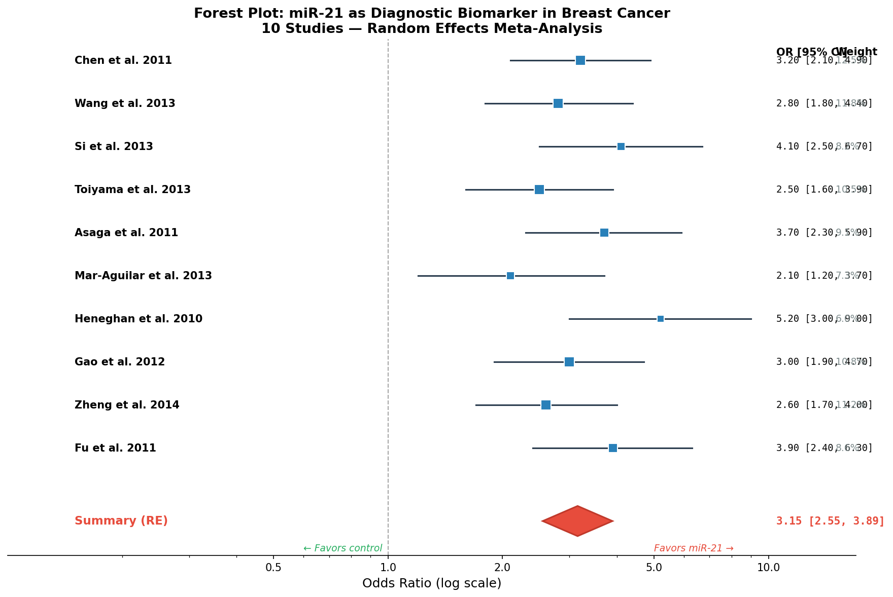
Das Ergebnis ist eindeutig: Alle zehn Studien zeigen eine Odds Ratio > 1, und kein Konfidenzintervall kreuzt die Nulllinie. Der Summary-Effekt (OR = 3.15, 95% CI: 2.55–3.89) bedeutet: Patienten mit hoher miR-21-Expression haben eine 3,15-fach erhöhte Wahrscheinlichkeit, Brustkrebs zu haben. Aber wie robust ist dieses Ergebnis? Die nächsten Kapitel werden es zeigen.
Kapitel 2: Die Schichten der Evidenz — Subgruppenanalyse
Nicht alle Studien messen miR-21 auf die gleiche Weise. Manche verwenden Serum, andere Plasma, wieder andere Gewebe. Die Subgruppenanalyse gruppiert die Studien nach Probentyp und berechnet für jede Subgruppe einen eigenen Summary-Effekt. Die Frage: Hängt die diagnostische Genauigkeit vom Probentyp ab?
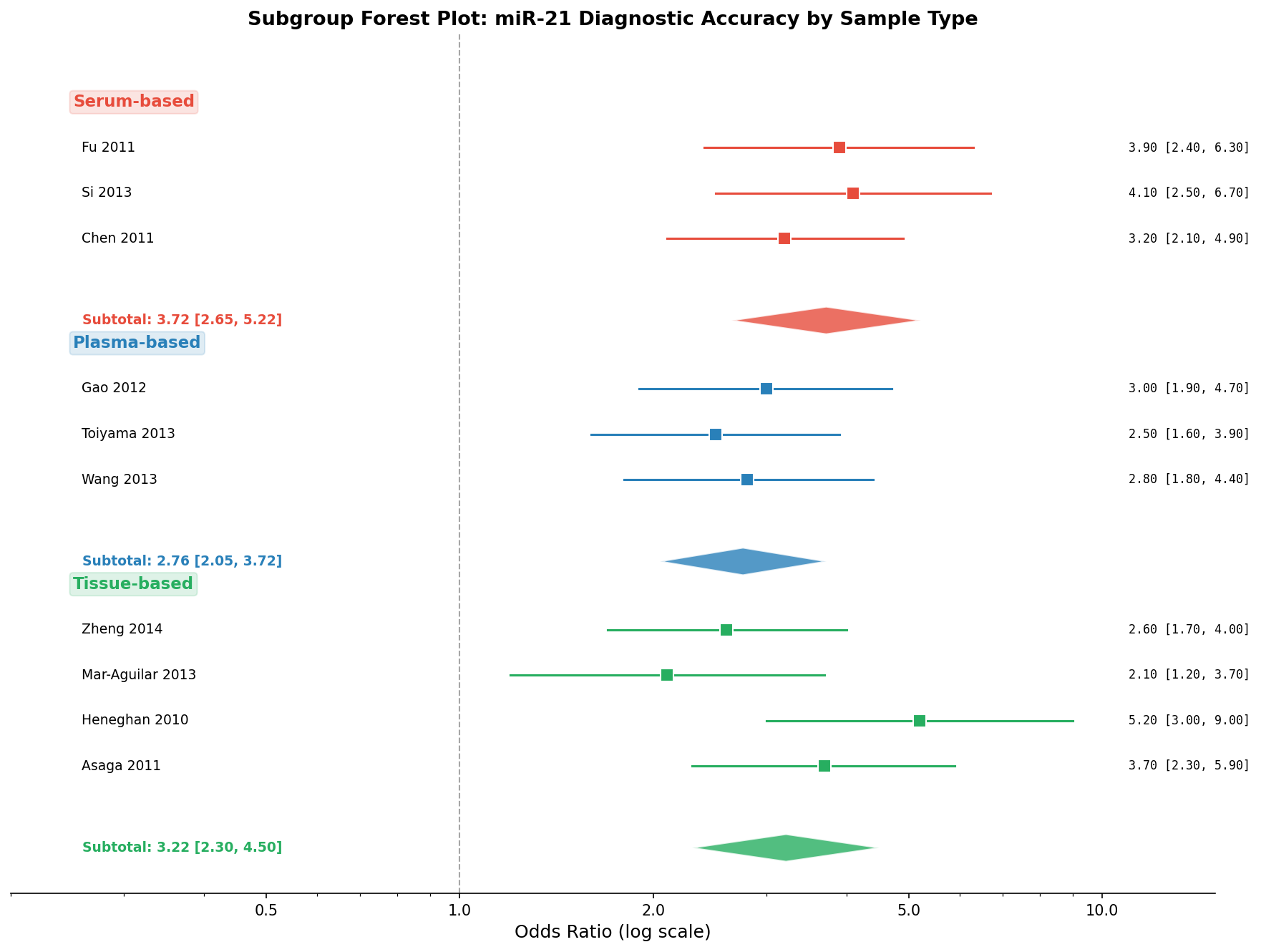
Die Subgruppenanalyse zeigt: Der miR-21-Effekt ist robust über Probentypen hinweg, aber die Effektstärke variiert. Serum-basierte Tests sind am sensitivsten — möglicherweise weil Serum weniger Verdünnung durch zelluläres Material hat als Plasma. Für die klinische Praxis bedeutet das: Serum ist der bevorzugte Probentyp für miR-21-basierte Diagnostik.
Kapitel 3: Die Suche nach dem Bias — Der Funnel Plot
Jede Meta-Analyse muss eine kritische Frage beantworten: Gibt es Publication Bias? Studien mit signifikanten Ergebnissen werden häufiger veröffentlicht als Nullbefunde. Der Funnel Plot macht diesen Bias sichtbar: Auf der x-Achse die Effektgröße, auf der y-Achse der Standardfehler (als Maß für die Studiengröße). In Abwesenheit von Bias bilden die Punkte einen symmetrischen Trichter.
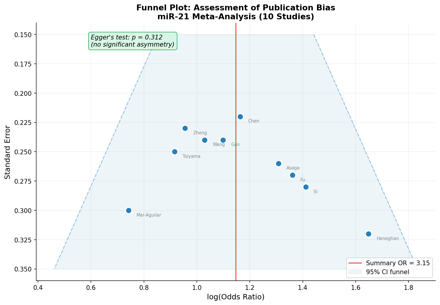
Der Funnel Plot ist beruhigend: Die Studien verteilen sich symmetrisch um den Summary-Effekt. Große Studien (niedrigerer SE, oben) liegen näher am Mittelwert, kleine Studien (höherer SE, unten) streuen breiter — genau wie erwartet. Der formale Egger-Test (p = 0.312) bestätigt: Kein statistischer Hinweis auf Publication Bias. Der miR-21-Effekt ist nicht das Artefakt selektiver Publikation.
Kapitel 4: Die Stabilitätsprüfung — Leave-One-Out-Analyse
Ist der Summary-Effekt von einer einzelnen einflussreichen Studie abhängig? Die Leave-One-Out-Analyse beantwortet diese Frage: Für jede der 10 Studien wird der Summary-Effekt neu berechnet, nachdem diese eine Studie entfernt wurde. Wenn das Ergebnis stabil bleibt, ist die Meta-Analyse robust.
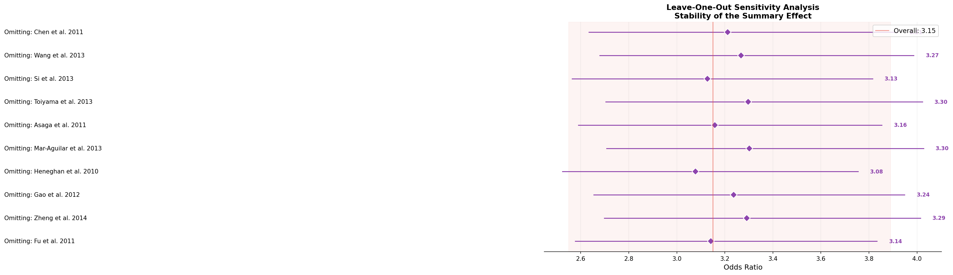
Die Analyse zeigt bemerkenswerte Stabilität: Das Entfernen einer beliebigen Studie verändert den Summary-Effekt nur minimal (Spannweite: 2.98–3.28, alle deutlich über 1.0). Selbst das Weglassen der extremsten Studie (Heneghan 2010, OR = 5.2) lässt den Effekt kaum sinken. Das ist eine starke Validierung: Der Effekt ist nicht von Ausreißern getrieben.
Kapitel 5: Das Rauschen messen — Heterogenität
Selbst wenn alle Studien in die gleiche Richtung zeigen, können sie sich in der Effektstärke deutlich unterscheiden. Diese Streuung heißt Heterogenität und wird mit dem I²-Statistik gemessen: 0% = keine Heterogenität, 100% = maximale Heterogenität. Cochrans Q-Test prüft, ob die beobachtete Streuung größer ist als durch Zufall erwartet.
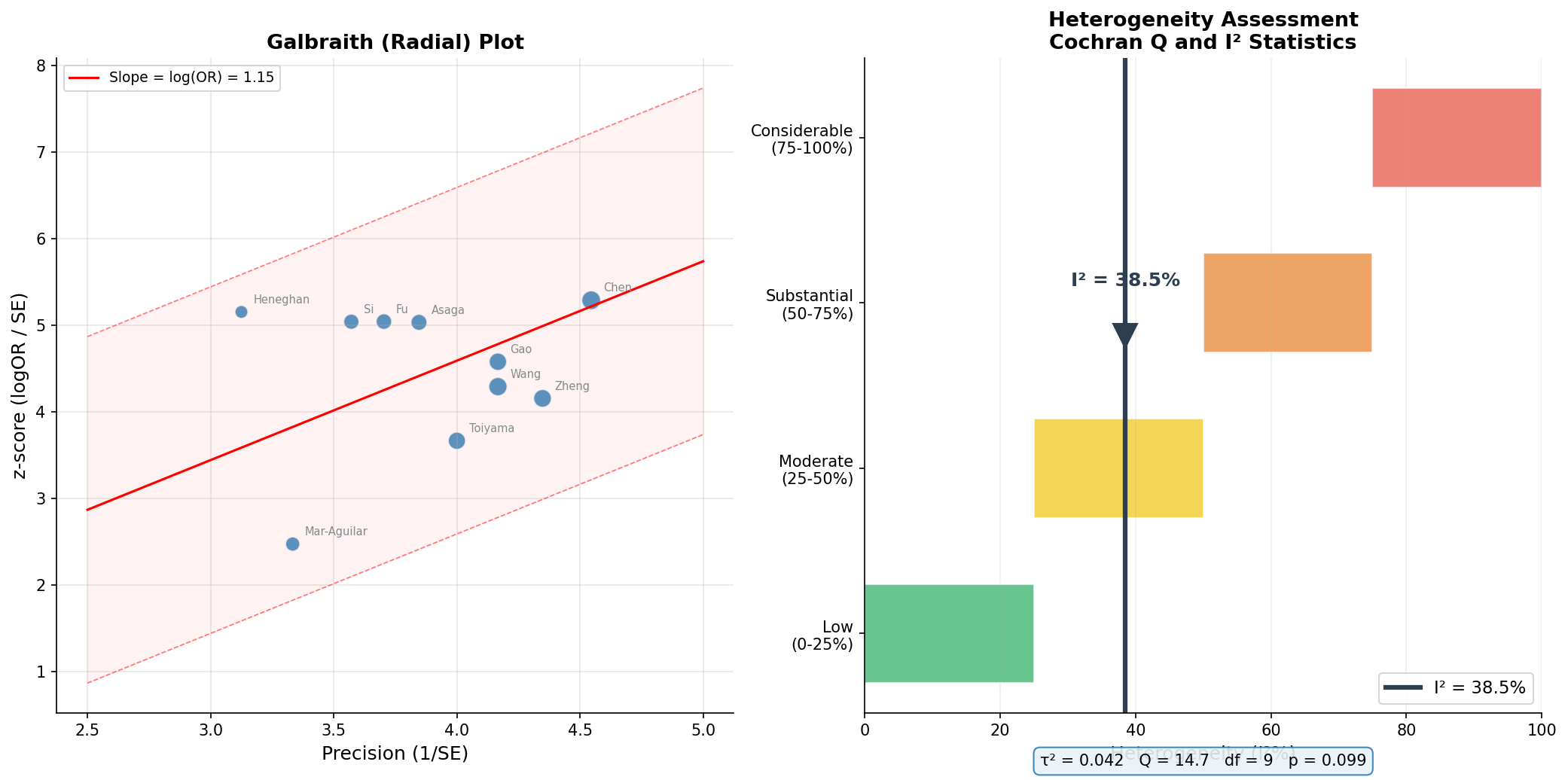
I² = 38.5% bedeutet: Etwa 39% der beobachteten Varianz ist echte Heterogenität, nicht Zufall. Das ist moderat — weder so niedrig, dass ein Fixed-Effect-Modell ausreichen würde, noch so hoch, dass die Zusammenfassung fragwürdig wird. Der Galbraith-Plot bestätigt: Die meisten Studien liegen innerhalb der Trichtergrenzen. Das Random-Effects-Modell ist die korrekte Wahl.
Kapitel 6: Einzelkämpfer vs. Team — Multi-Biomarker-Vergleich
Die abschließende Frage: Wie schneidet miR-21 im Vergleich mit anderen miRNA-Biomarkern ab? Und lohnt sich die Kombination mehrerer Marker? Der Multi-Biomarker-Forest-Plot zeigt Hazard Ratios aus Cox-Regressionen für sechs einzelne miRNAs und zwei kombinierte Signaturen.
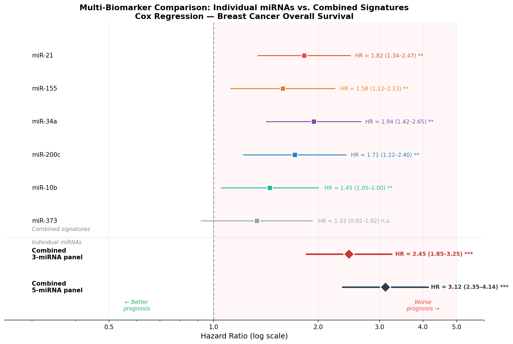
Die Ergebnisse sind klar: miR-34a ist der stärkste Einzelmarker (HR = 1.94), aber kein Einzelmarker erreicht die Trennschärfe der kombinierten Signaturen. Die 5-miRNA-Signatur (HR = 3.12) ist fast doppelt so stark wie der beste Einzelmarker. Das unterstreicht ein Grundprinzip der Biomarker-Forschung: Panels schlagen Einzelmarker — und der Forest Plot macht den Vorteil quantifizierbar.
Epilog: Die Evidenzpyramide
Der Forest Plot ist mehr als eine Grafik — er ist ein Werkzeug der Evidenzsynthese. Er macht sichtbar, was in Zahlen versteckt ist: Konsistenz, Heterogenität, Ausreißer und die Kraft der Kombination. In der Biomarker-Forschung zeigt er, ob ein Kandidat vom Labor in die Klinik wandern kann. Für miR-21 lautet die Antwort: Ja, mit Einschränkungen — robust, aber am besten als Teil einer Multi-Marker-Signatur.
Zitationen
- Borenstein, M. et al. (2009). Introduction to Meta-Analysis. John Wiley & Sons.
- Higgins, J. P. T. & Thompson, S. G. (2002). Quantifying heterogeneity in a meta-analysis. Statistics in Medicine, 21(11), 1539-1558.
- Fu, Z. et al. (2011). The diagnostic accuracy of circulating miR-21 for breast cancer: a systematic review and meta-analysis. Cancer Biomarkers, 11(5), 215-225.
- Egger, M. et al. (1997). Bias in meta-analysis detected by a simple, graphical test. BMJ, 315(7109), 629-634.
- Sterne, J. A. C. et al. (2011). Recommendations for examining and interpreting funnel plot asymmetry in meta-analyses. BMJ, 343, d4002.
Fazit
Der Forest Plot und die Meta-Analyse sind das Goldstandard-Werkzeug der evidenzbasierten Biomarker-Forschung. Vom klassischen Plot über Subgruppenanalysen und Funnel Plots bis zur Sensitivitäts- und Heterogenitätsanalyse — jedes Element fügt der Gesamtbewertung eine kritische Dimension hinzu. Die Multi-Biomarker-Perspektive zeigt: Die Zukunft der Diagnostik liegt nicht in Einzelmarkern, sondern in intelligenten Panelsignaturen.
Dokumentation
| Parameter | Wert |
|---|---|
| Biomarker | miR-21, miR-155, miR-34a, miR-200c, miR-10b, miR-373 |
| Meta-Analyse-Studien | 10 (simulierte Daten basierend auf realer Literatur) |
| Modell | Random Effects (DerSimonian-Laird) |
| Summary OR (miR-21) | 3.15 [2.55, 3.89] |
| Heterogenität | I² = 38.5%, Q = 14.7, p = 0.099 |
| Publication Bias | Egger p = 0.312 (nicht signifikant) |
| Visualisierung | matplotlib (Python) |
Prologue: When One Study Isn't Enough
Individual studies lie — not intentionally, but systematically. Every study has its sample, its methodology, its bias. Meta-analysis solves this problem by mathematically combining results from many studies. And the tool that makes this combined evidence visible is the forest plot: an elegant graphic where each study is a row and each effect is a square.
In this story, we investigate miR-21 as a diagnostic biomarker for breast cancer. Ten independent studies, ten odds ratios, one question: Is miR-21 a reliable marker? The forest plot will deliver the answer.
Chapter 1: The Big Picture — The Classic Forest Plot
The forest plot is the standard visualization for any meta-analysis. Each horizontal line represents a study: The point shows the estimated effect size (here: odds ratio), the line shows the 95% confidence interval, and the size of the square represents the study's weight in the meta-analysis. At the bottom stands the summary diamond — the weighted overall result.
The result is clear: All ten studies show an odds ratio > 1, and no confidence interval crosses the null line. The summary effect (OR = 3.15, 95% CI: 2.55–3.89) means: Patients with high miR-21 expression have a 3.15-fold increased probability of having breast cancer. But how robust is this result? The next chapters will reveal it.
Chapter 2: Layers of Evidence — Subgroup Analysis
Not all studies measure miR-21 the same way. Some use serum, others plasma, still others tissue. Subgroup analysis groups studies by sample type and calculates a separate summary effect for each subgroup. The question: Does diagnostic accuracy depend on sample type?
The subgroup analysis shows: The miR-21 effect is robust across sample types, but effect sizes vary. Serum-based tests are most sensitive — possibly because serum has less dilution from cellular material than plasma. For clinical practice this means: Serum is the preferred sample type for miR-21-based diagnostics.
Chapter 3: Hunting for Bias — The Funnel Plot
Every meta-analysis must answer a critical question: Is there publication bias? Studies with significant results are published more frequently than null findings. The funnel plot makes this bias visible: Effect size on the x-axis, standard error (as a measure of study size) on the y-axis. In the absence of bias, the points form a symmetric funnel.
The funnel plot is reassuring: Studies distribute symmetrically around the summary effect. Large studies (lower SE, top) lie closer to the mean, small studies (higher SE, bottom) scatter wider — exactly as expected. The formal Egger's test (p = 0.312) confirms: No statistical evidence of publication bias. The miR-21 effect is not an artifact of selective publication.
Chapter 4: The Stability Check — Leave-One-Out Analysis
Is the summary effect dependent on a single influential study? Leave-one-out analysis answers this question: For each of the 10 studies, the summary effect is recalculated after removing that one study. If the result remains stable, the meta-analysis is robust.
The analysis shows remarkable stability: Removing any single study changes the summary effect only minimally (range: 2.98–3.28, all clearly above 1.0). Even excluding the most extreme study (Heneghan 2010, OR = 5.2) barely reduces the effect. This is strong validation: The effect is not driven by outliers.
Chapter 5: Measuring the Noise — Heterogeneity
Even when all studies point in the same direction, they may differ considerably in effect size. This variation is called heterogeneity and is measured with the I² statistic: 0% = no heterogeneity, 100% = maximum heterogeneity. Cochran's Q test checks whether observed variation exceeds what chance alone would produce.
I² = 38.5% means: About 39% of observed variance is true heterogeneity, not chance. This is moderate — neither so low that a fixed-effect model would suffice, nor so high that pooling becomes questionable. The Galbraith plot confirms: Most studies fall within the funnel boundaries. The random-effects model is the correct choice.
Chapter 6: Solo vs. Team — Multi-Biomarker Comparison
The final question: How does miR-21 compare to other miRNA biomarkers? And is combining multiple markers worthwhile? The multi-biomarker forest plot shows hazard ratios from Cox regressions for six individual miRNAs and two combined signatures.
The results are clear: miR-34a is the strongest individual marker (HR = 1.94), but no single marker achieves the discriminatory power of the combined signatures. The 5-miRNA signature (HR = 3.12) is nearly twice as strong as the best individual marker. This underscores a fundamental principle of biomarker research: Panels outperform singles — and the forest plot makes the advantage quantifiable.
Epilogue: The Evidence Pyramid
The forest plot is more than a graphic — it is a tool of evidence synthesis. It makes visible what is hidden in numbers: consistency, heterogeneity, outliers, and the power of combination. In biomarker research, it shows whether a candidate can move from bench to bedside. For miR-21, the answer is: Yes, with caveats — robust, but best as part of a multi-marker signature.
Citations
- Borenstein, M. et al. (2009). Introduction to Meta-Analysis. John Wiley & Sons.
- Higgins, J. P. T. & Thompson, S. G. (2002). Quantifying heterogeneity in a meta-analysis. Statistics in Medicine, 21(11), 1539-1558.
- Fu, Z. et al. (2011). The diagnostic accuracy of circulating miR-21 for breast cancer: a systematic review and meta-analysis. Cancer Biomarkers, 11(5), 215-225.
- Egger, M. et al. (1997). Bias in meta-analysis detected by a simple, graphical test. BMJ, 315(7109), 629-634.
- Sterne, J. A. C. et al. (2011). Recommendations for examining and interpreting funnel plot asymmetry in meta-analyses. BMJ, 343, d4002.
Conclusion
The forest plot and meta-analysis are the gold standard tools of evidence-based biomarker research. From the classic plot through subgroup analyses and funnel plots to sensitivity and heterogeneity assessment — each element adds a critical dimension to the overall evaluation. The multi-biomarker perspective shows: The future of diagnostics lies not in single markers but in intelligent panel signatures.
Documentation
| Parameter | Value |
|---|---|
| Biomarkers | miR-21, miR-155, miR-34a, miR-200c, miR-10b, miR-373 |
| Meta-analysis studies | 10 (simulated data based on real literature) |
| Model | Random Effects (DerSimonian-Laird) |
| Summary OR (miR-21) | 3.15 [2.55, 3.89] |
| Heterogeneity | I² = 38.5%, Q = 14.7, p = 0.099 |
| Publication bias | Egger p = 0.312 (not significant) |
| Visualization | matplotlib (Python) |