Prolog: Die Asymmetrie, die niemand sieht
Es gibt ein Problem, das in jeder RNA-Seq-Analyse lauert, aber selten diskutiert wird: Gene mit niedrigen Counts sind instabil. Ihre Fold Changes schwanken wild — nicht weil sie biologisch relevant sind, sondern weil wenige Reads statistisch verrauscht sind. Der Volcano Plot, so elegant er ist, zeigt dieses Problem nicht. Er versteckt es. Der MA-Plot (M = log₂ Fold Change, A = mittlere Expression) macht es sichtbar — und genau deshalb ist er für jeden Bioinformatiker unverzichtbar.
In dieser Detektivgeschichte analysieren wir 2.500 Gene aus einer Brustkrebs-Kohorte (20 Tumor, 20 Normal) und verfolgen den Weg vom rohen Streudiagramm bis zur biologischen Hypothese. Jedes Kapitel enthüllt eine neue Schicht des MA-Plots.
Kapitel 1: Die erste Sichtung — Das Gesamtbild
Der MA-Plot stellt jedes Gen als Punkt in einem Koordinatensystem dar: Die x-Achse zeigt die mittlere Expression A (wie stark wird dieses Gen insgesamt exprimiert?), die y-Achse den log₂ Fold Change M (wie stark ist es im Tumor verändert?). Die zentrale Linie bei M = 0 markiert "keine Veränderung".
Was sofort auffällt: Die Punktwolke hat die Form eines Trichters. Links, bei niedriger Expression, streuen die Fold Changes weit — Gene mit wenigen Reads können zufällig extreme Werte annehmen. Rechts, bei hoher Expression, wird die Wolke schmal — viele Reads stabilisieren die Schätzung. Diese Heteroskedastizität ist das zentrale Phänomen, das der MA-Plot sichtbar macht.
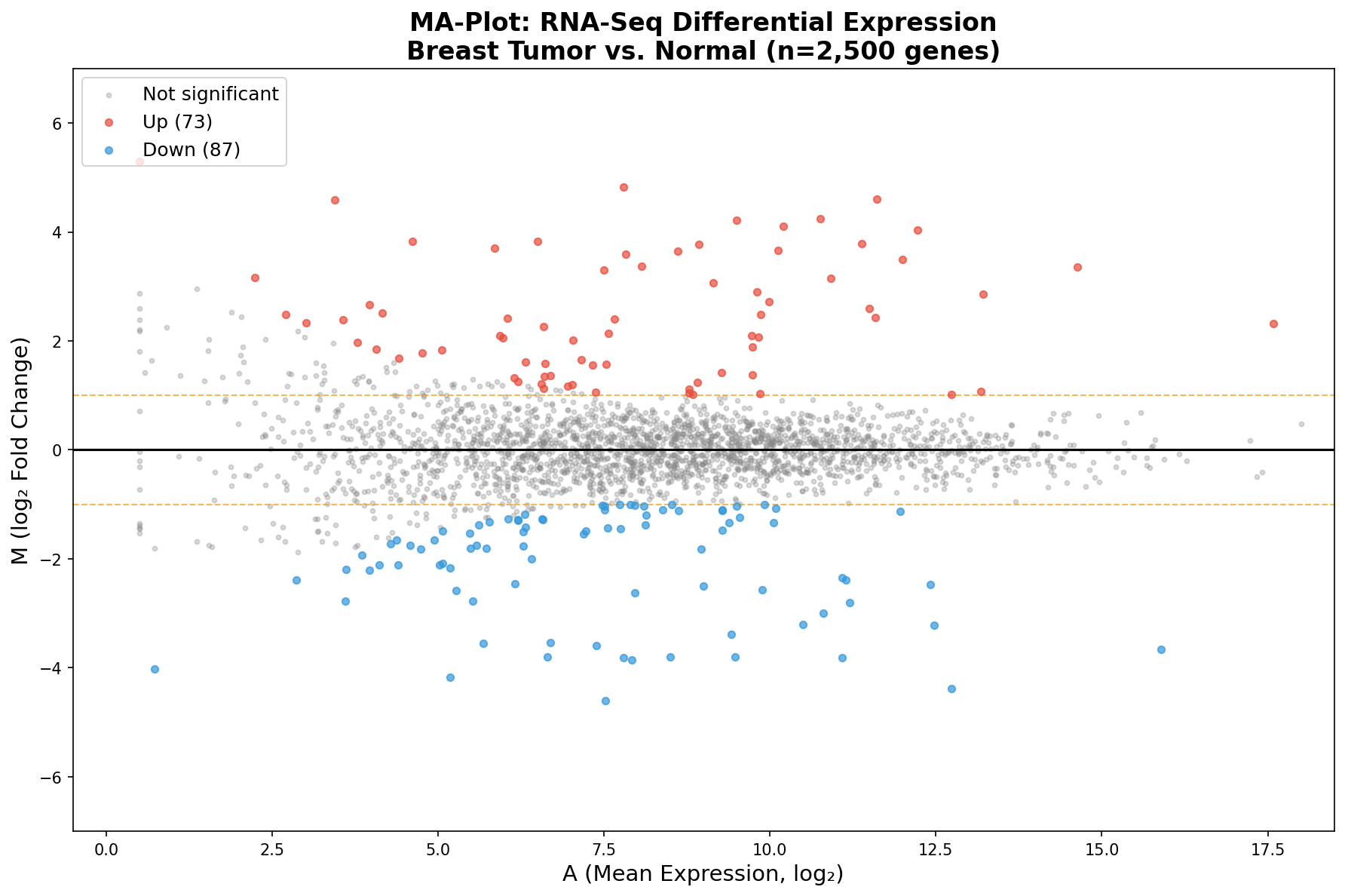
Das Gesamtbild zeigt: Die Mehrheit der Gene liegt symmetrisch um M = 0 — sie sind nicht differenziell exprimiert. Aber an den Rändern, gefärbt in Rot und Blau, zeichnen sich die Kandidaten ab. Und der MA-Plot zeigt etwas, das der Volcano verschweigt: Fast alle signifikanten Gene liegen rechts, bei mittlerer bis hoher Expression. Links, wo die Punkte am wildesten streuen, findet man fast keine Signifikanz — die statistische Power reicht einfach nicht aus.
Kapitel 2: Der Bias-Detektor — LOESS-Trend und Varianz-Trichter
Ein perfekt normalisiertes Experiment zeigt eine LOESS-Kurve, die flach auf der Nulllinie liegt. Wenn die Kurve abweicht, haben wir ein Problem: einen systematischen Bias, der von der Expressionsstärke abhängt. Das kann auf unvollständige Normalisierung, Bibliotheksgröße-Effekte oder auch Batch-Effekte hindeuten.
Der grüne Trichter zeigt die erwartete Varianz als Funktion der Expression. Gene, die innerhalb des Trichters liegen, verhalten sich statistisch wie erwartet. Gene außerhalb sind die Kandidaten — entweder echte biologische Signale oder technische Artefakte.
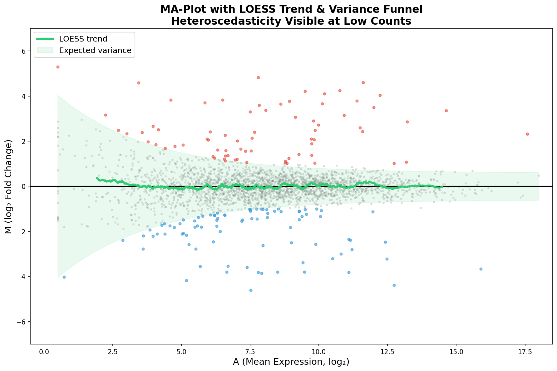
In unserem Fall zeigt die LOESS-Kurve nur minimale Abweichungen — ein gutes Zeichen. Die Median-of-Ratios-Normalisierung von DESeq2 hat ihren Job gut gemacht. Aber stellen Sie sich vor, die Kurve würde bei A < 5 nach oben ausschlagen: Das wäre ein Alarmsignal, dass Low-Count-Gene systematisch als hochreguliert erscheinen, ein klassisches Normalisierungsartefakt.
Kapitel 3: Die üblichen Verdächtigen — Schlüsselgene annotiert
Wie beim Volcano Plot wird der MA-Plot erst durch Annotation zur Geschichte. Wir markieren die bekannten Krebstreiber: MYC (Onkogen, hochreguliert), ERBB2 (HER2, stark hochreguliert), EGFR (Wachstumsfaktor-Rezeptor), aber auch die Tumorsuppressoren: BRCA1, TP53, PTEN, ESR1 — alle signifikant herunterreguliert im Tumor.
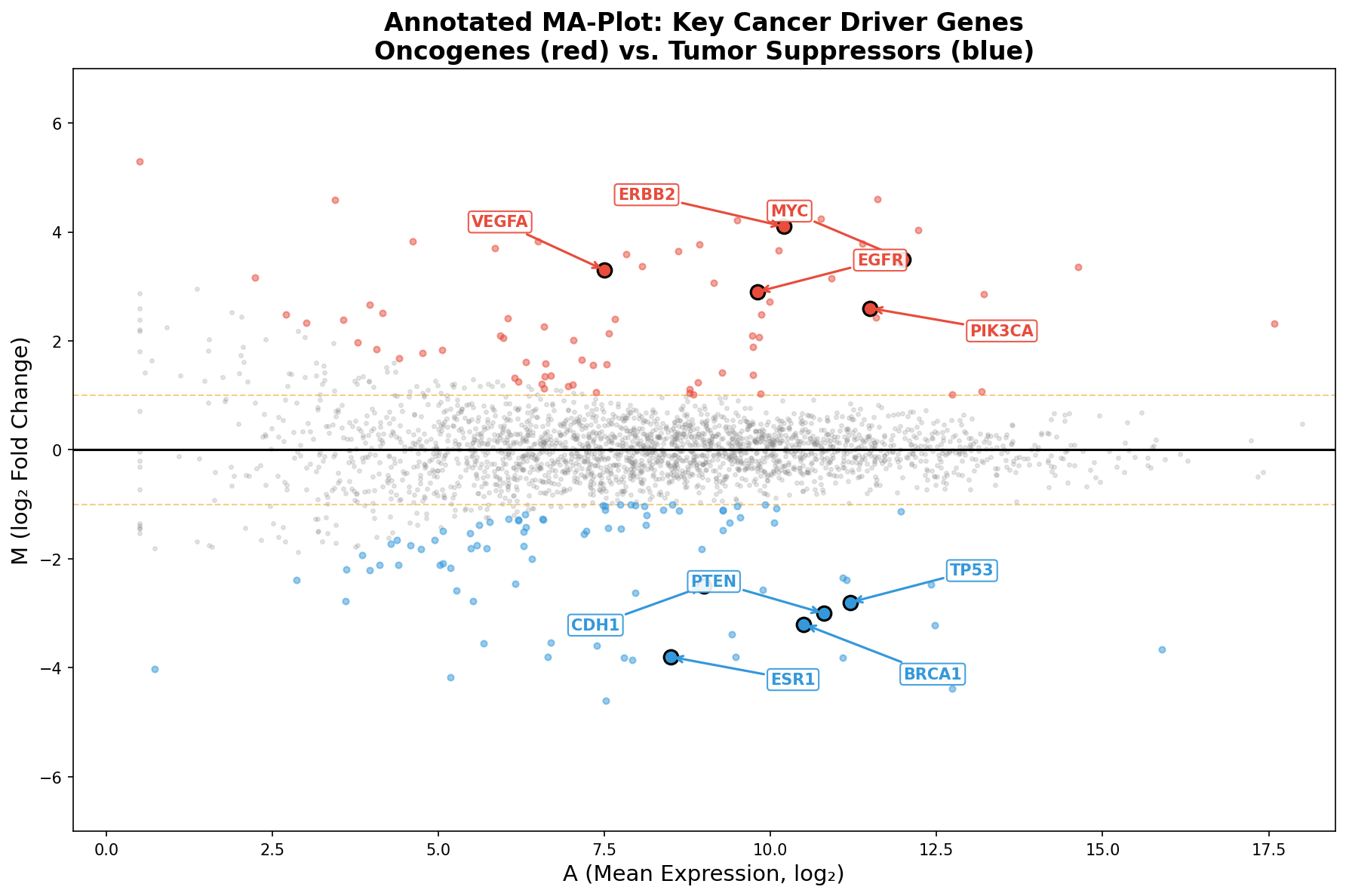
Ein Muster springt ins Auge: Alle annotierten Gene liegen rechts der Mitte (A > 7). Das ist kein Zufall — Krebstreiber sind typischerweise stark exprimierte Gene. Ein Gen, das kaum abgelesen wird, kann die Zelle nicht effektiv steuern. Der MA-Plot zeigt diesen Zusammenhang zwischen Expression und biologischer Relevanz direkter als jede andere Darstellung.
Kapitel 4: Die Schrumpfung — Empirischer Bayes als Lügendetektor
Hier kommt die methodische Pointe des MA-Plots: Log-Fold-Change-Shrinkage. DESeq2 bietet mit dem apeglm-Algorithmus eine Bayesianische Schrumpfung an, die extreme Fold Changes bei niedrig exprimierten Genen zur Mitte zieht. Der Vergleich vorher/nachher ist dramatisch.
Links der ungeschrumpfte MA: Gene mit wenigen Reads zeigen Fold Changes von ±5 oder mehr — reine statistische Artefakte. Rechts nach der Schrumpfung: Die Trichterform verschwindet nahezu, und nur Gene mit konsistenter Evidenz behalten große Fold Changes. Die Schrumpfung ist kein Datenfälschen — sie ist ein Lügendetektor.
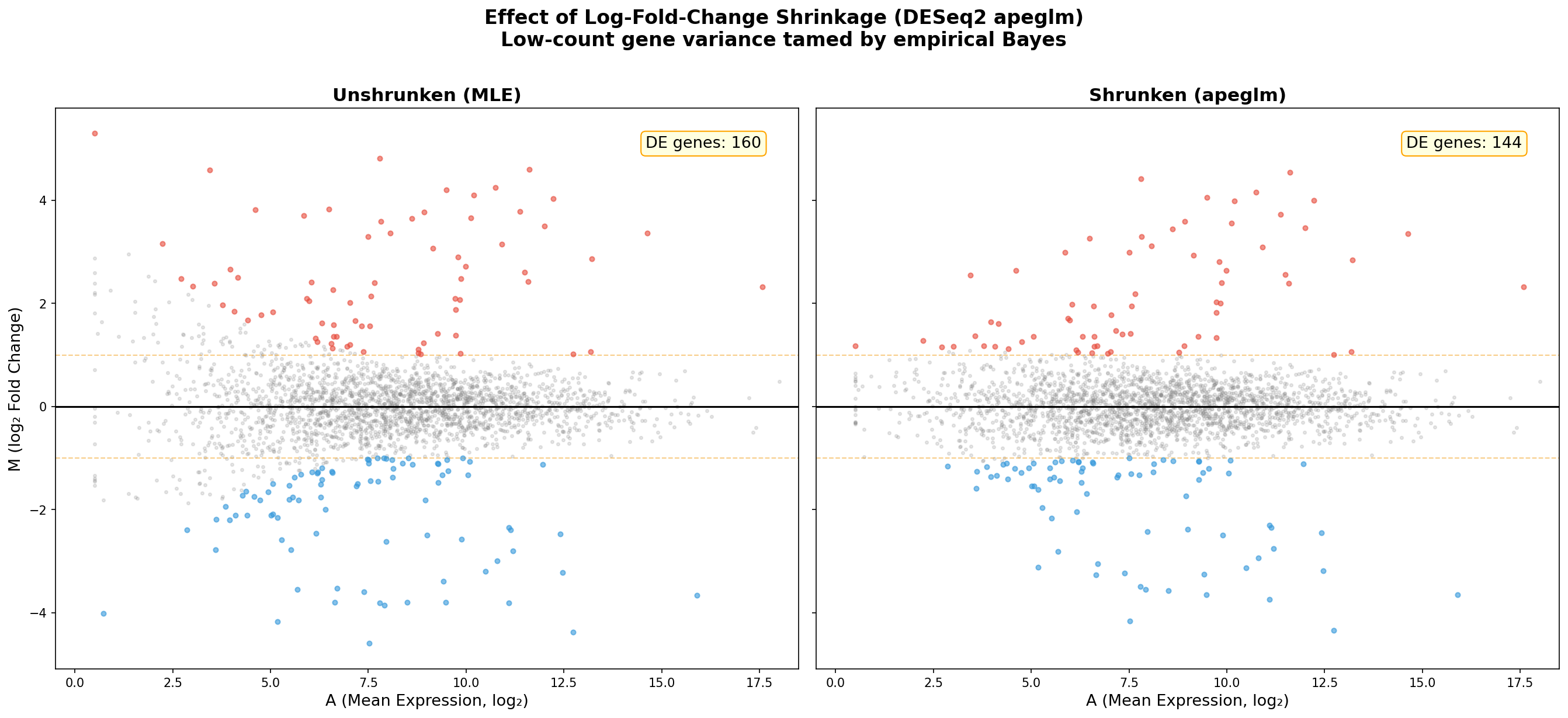
Die praktische Konsequenz: Ohne Schrumpfung stehen an der Spitze einer nach |FC| sortierten Liste obskure Gene mit 10 Reads — statistisch unverlässlich, biologisch bedeutungslos. Nach der Schrumpfung stehen dort die echten Treiber: MYC, ERBB2, BRCA1. Die Schrumpfung verändert nicht die Signifikanzbewertung, sondern das Ranking — und damit die Forschungspriorität.
Kapitel 5: Zwei Perspektiven — MA-Plot vs. Volcano Plot
Die gleichen 2.500 Gene, die gleichen Farben — aber zwei völlig verschiedene Geschichten. Der MA-Plot (links) zeigt die Abhängigkeit der Fold Changes von der Expressionsstärke. Der Volcano Plot (rechts) zeigt die Abhängigkeit von der statistischen Signifikanz. Beide Perspektiven sind nötig, keine ersetzt die andere.
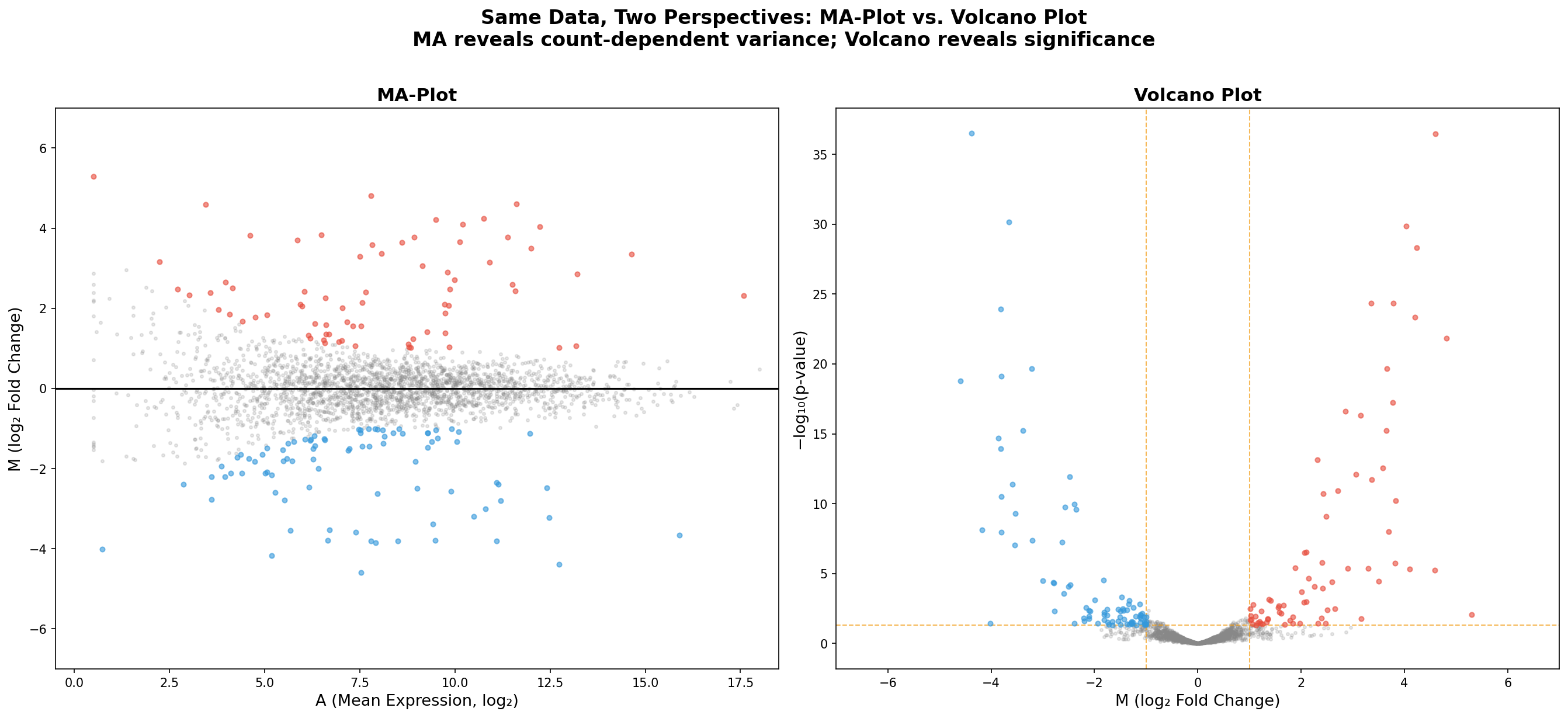
Was der MA-Plot zeigt, das der Volcano verschweigt: Die Count-Abhängigkeit der Varianz. Was der Volcano zeigt, das der MA verschweigt: Die p-Wert-Dimension. In der Praxis erstellt jede seriöse RNA-Seq-Publikation beide Plots. Der MA-Plot für die Qualitätskontrolle (Normalisierung, Bias-Check), der Volcano für die biologische Interpretation (Kandidatenauswahl).
Kapitel 6: Multi-Kontrast — Verschiedene Therapien, verschiedene Antworten
Im finalen Kapitel vergleichen wir die Expressionsantwort auf drei verschiedene Therapien: Doxorubicin (klassische Chemotherapie), Trastuzumab (gezielte Anti-HER2-Therapie) und Pembrolizumab (Immuntherapie). Jeder MA-Plot zeigt das Expressionsprofil nach Behandlung im Vergleich zur unbehandelten Kontrolle.
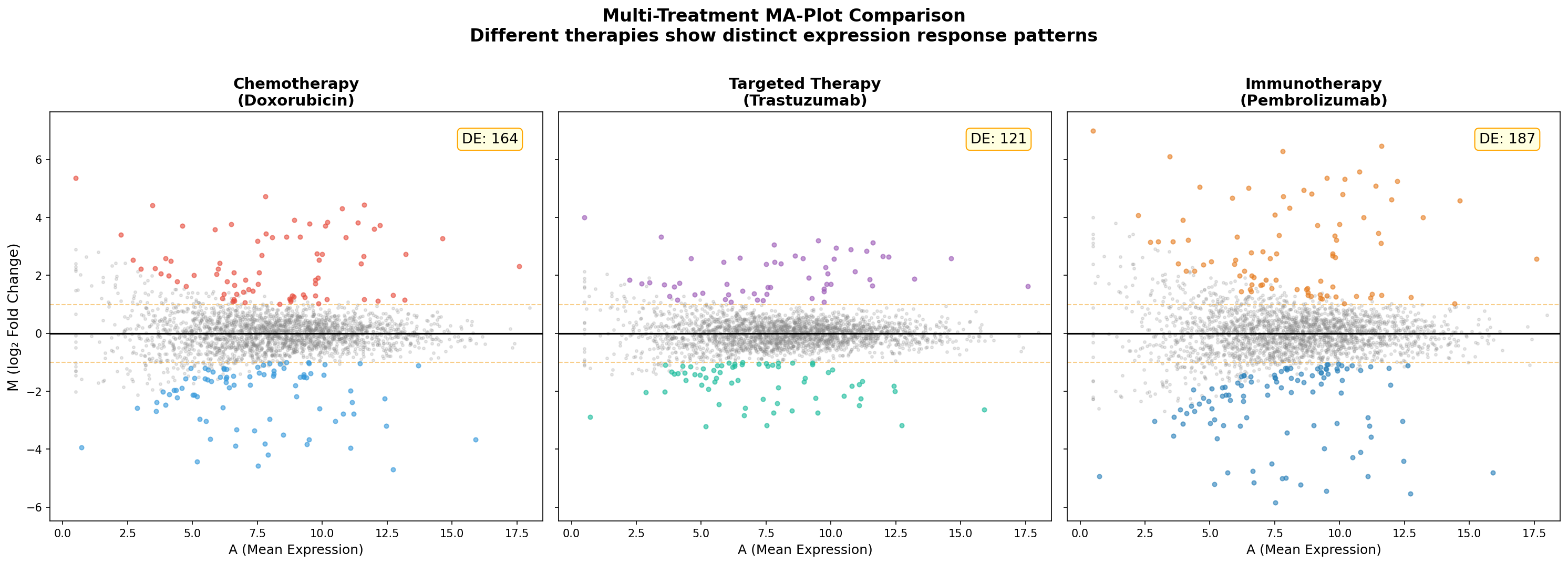
Der Multi-Kontrast-MA offenbart die Therapie-Spezifität auf einen Blick: Chemotherapie wirkt breit und unspezifisch — sie verändert viele Gene moderat. Gezielte Therapie trifft weniger Targets, aber präziser. Immuntherapie aktiviert eine Kaskade von Genen, die weit über das primäre Target hinausgeht. Diese Unterschiede sind klinisch relevant und beeinflussen, welche Biomarker für welche Therapie geeignet sind.
Epilog: Warum der MA-Plot nicht optional ist
Der MA-Plot ist das Qualitätskontroll-Instrument der differenziellen Expression. Während der Volcano Plot die biologisch interessanten Kandidaten zeigt, zeigt der MA-Plot, ob die Analyse selbst vertrauenswürdig ist. Ein schiefe LOESS-Kurve, eine asymmetrische Punktwolke, ein verdächtiger Trichter — all das sind Warnsignale, die ohne den MA-Plot unsichtbar bleiben.
In unserer Detektivgeschichte hat der MA-Plot drei Rollen gespielt: Qualitätsprüfer (Normalisierungs-Check), Bias-Detektor (LOESS-Trend) und Ranking-Korrektur (Shrinkage-Visualisierung). Diese drei Funktionen machen ihn in der RNA-Seq-Analyse unverzichtbar.
Zitationen
- Dudoit, S., Yang, Y. H., Callow, M. J. & Speed, T. P. (2002). Statistical methods for identifying differentially expressed genes in replicated cDNA microarray experiments. Statistica Sinica, 12(1), 111-139.
- Love, M. I., Huber, W. & Anders, S. (2014). Moderated estimation of fold change and dispersion for RNA-seq data with DESeq2. Genome Biology, 15(12), 550.
- Zhu, A., Ibrahim, J. G. & Love, M. I. (2019). Heavy-tailed prior distributions for sequence count data: removing the noise and preserving large differences. Bioinformatics, 35(12), 2084-2092.
- Robinson, M. D. & Oshlack, A. (2010). A scaling normalization method for differential expression analysis of RNA-seq data. Genome Biology, 11, R25.
- Yang, Y. H. & Speed, T. (2002). Design issues for cDNA microarray experiments. Nature Reviews Genetics, 3(8), 579-588.
Fazit
Der MA-Plot verwandelt die abstrakte Beziehung zwischen Expressionsstärke und Fold Change in ein visuelles Werkzeug. Seine Stärke liegt in der Sichtbarmachung der Heteroskedastizität — jenes Phänomens, das statistische Analyse kompliziert macht, aber biologisch erklärbar ist: Wenige Reads bedeuten wenig Information, viele Reads bedeuten stabile Schätzungen. Für RNA-Seq, miRNA-Seq und jede andere zählbasierte Omics-Technologie ist der MA-Plot nicht optional — er ist Pflicht.
Dokumentation
| Parameter | Wert |
|---|---|
| Kohorte | 40 Brustkrebsbiopsien (20 Tumor, 20 Normal) |
| Plattform | RNA-Seq (Illumina) |
| Gene analysiert | 2.500 |
| DE-Pipeline | DESeq2 (Median-of-Ratios Normalisierung) |
| Shrinkage | apeglm (empirischer Bayes) |
| FC-Schwelle | |log₂FC| > 1.0 |
| Signifikanzschwelle | FDR < 0.05 (Benjamini-Hochberg) |
| Visualisierung | matplotlib + seaborn (Python) |
| Therapievergleich | Doxorubicin, Trastuzumab, Pembrolizumab |
Prologue: The Asymmetry Nobody Sees
There is a problem lurking in every RNA-Seq analysis that is rarely discussed: Low-count genes are unstable. Their fold changes fluctuate wildly — not because they are biologically relevant, but because few reads are statistically noisy. The Volcano Plot, elegant as it is, does not show this problem. It hides it. The MA-Plot (M = log₂ Fold Change, A = mean expression) makes it visible — and that is precisely why it is indispensable for every bioinformatician.
In this detective story, we analyze 2,500 genes from a breast cancer cohort (20 tumor, 20 normal) and follow the path from raw scatter diagrams to biological hypotheses. Each chapter reveals a new layer of the MA-Plot.
Chapter 1: The First Look — The Big Picture
The MA-Plot represents each gene as a point in a coordinate system: The x-axis shows the mean expression A (how strongly is this gene expressed overall?), the y-axis the log₂ Fold Change M (how strongly is it altered in the tumor?). The central line at M = 0 marks "no change."
What immediately stands out: The point cloud has the shape of a funnel. On the left, at low expression, fold changes scatter widely — genes with few reads can randomly assume extreme values. On the right, at high expression, the cloud narrows — many reads stabilize the estimate. This heteroscedasticity is the central phenomenon that the MA-Plot makes visible.
The big picture shows: The majority of genes lie symmetrically around M = 0 — they are not differentially expressed. But at the margins, colored in red and blue, candidates emerge. And the MA-Plot reveals something the Volcano conceals: Almost all significant genes lie on the right, at moderate to high expression. On the left, where points scatter most wildly, you find almost no significance — the statistical power simply isn't sufficient.
Chapter 2: The Bias Detector — LOESS Trend & Variance Funnel
A perfectly normalized experiment shows a LOESS curve lying flat on the zero line. If the curve deviates, we have a problem: a systematic bias that depends on expression strength. This can indicate incomplete normalization, library-size effects, or batch effects.
The green funnel shows the expected variance as a function of expression. Genes lying within the funnel behave as statistically expected. Genes outside are the candidates — either real biological signals or technical artifacts.
In our case, the LOESS curve shows only minimal deviations — a good sign. DESeq2's median-of-ratios normalization has done its job well. But imagine the curve spiking upward for A < 5: That would be an alarm signal that low-count genes systematically appear upregulated — a classic normalization artifact.
Chapter 3: The Usual Suspects — Key Genes Annotated
Like the Volcano Plot, the MA-Plot only becomes a story through annotation. We mark the known cancer drivers: MYC (oncogene, upregulated), ERBB2 (HER2, strongly upregulated), EGFR (growth factor receptor), as well as the tumor suppressors: BRCA1, TP53, PTEN, ESR1 — all significantly downregulated in tumors.
A pattern leaps out: All annotated genes lie right of center (A > 7). This is no coincidence — cancer drivers are typically highly expressed genes. A gene that is barely transcribed cannot effectively control the cell. The MA-Plot shows this relationship between expression and biological relevance more directly than any other visualization.
Chapter 4: The Shrinkage — Empirical Bayes as Lie Detector
Here comes the methodological punchline of the MA-Plot: Log-Fold-Change Shrinkage. DESeq2 offers a Bayesian shrinkage with the apeglm algorithm that pulls extreme fold changes of low-expression genes toward the center. The before/after comparison is dramatic.
On the left, the unshrunk MA: Genes with few reads show fold changes of ±5 or more — pure statistical artifacts. On the right, after shrinkage: The funnel shape nearly vanishes, and only genes with consistent evidence retain large fold changes. Shrinkage is not data manipulation — it is a lie detector.
The practical consequence: Without shrinkage, the top of a |FC|-sorted list features obscure genes with 10 reads — statistically unreliable, biologically meaningless. After shrinkage, the real drivers surface: MYC, ERBB2, BRCA1. Shrinkage does not change significance assessment but the ranking — and thereby the research priority.
Chapter 5: Two Perspectives — MA-Plot vs. Volcano Plot
The same 2,500 genes, the same colors — but two completely different stories. The MA-Plot (left) shows the dependence of fold changes on expression strength. The Volcano Plot (right) shows the dependence on statistical significance. Both perspectives are necessary; neither replaces the other.
What the MA-Plot shows that the Volcano conceals: The count-dependent variance. What the Volcano shows that the MA conceals: The p-value dimension. In practice, every serious RNA-Seq publication produces both plots. The MA-Plot for quality control (normalization, bias check), the Volcano for biological interpretation (candidate selection).
Chapter 6: Multi-Contrast — Different Therapies, Different Answers
In the final chapter, we compare the expression response to three different therapies: Doxorubicin (classical chemotherapy), Trastuzumab (targeted anti-HER2 therapy), and Pembrolizumab (immunotherapy). Each MA-Plot shows the expression profile after treatment compared to untreated controls.
The multi-contrast MA reveals therapy specificity at a glance: Chemotherapy acts broadly and non-specifically — it moderately changes many genes. Targeted therapy hits fewer targets but more precisely. Immunotherapy activates a cascade of genes far beyond the primary target. These differences are clinically relevant and influence which biomarkers are suitable for which therapy.
Epilogue: Why the MA-Plot Is Not Optional
The MA-Plot is the quality control instrument of differential expression. While the Volcano Plot shows biologically interesting candidates, the MA-Plot shows whether the analysis itself is trustworthy. A skewed LOESS curve, an asymmetric point cloud, a suspicious funnel — all are warning signs that remain invisible without the MA-Plot.
In our detective story, the MA-Plot played three roles: Quality checker (normalization verification), bias detector (LOESS trend), and ranking corrector (shrinkage visualization). These three functions make it indispensable in RNA-Seq analysis.
Citations
- Dudoit, S., Yang, Y. H., Callow, M. J. & Speed, T. P. (2002). Statistical methods for identifying differentially expressed genes in replicated cDNA microarray experiments. Statistica Sinica, 12(1), 111-139.
- Love, M. I., Huber, W. & Anders, S. (2014). Moderated estimation of fold change and dispersion for RNA-seq data with DESeq2. Genome Biology, 15(12), 550.
- Zhu, A., Ibrahim, J. G. & Love, M. I. (2019). Heavy-tailed prior distributions for sequence count data: removing the noise and preserving large differences. Bioinformatics, 35(12), 2084-2092.
- Robinson, M. D. & Oshlack, A. (2010). A scaling normalization method for differential expression analysis of RNA-seq data. Genome Biology, 11, R25.
- Yang, Y. H. & Speed, T. (2002). Design issues for cDNA microarray experiments. Nature Reviews Genetics, 3(8), 579-588.
Conclusion
The MA-Plot transforms the abstract relationship between expression strength and fold change into a visual tool. Its strength lies in making heteroscedasticity visible — that phenomenon which complicates statistical analysis but is biologically explainable: Few reads mean little information, many reads mean stable estimates. For RNA-Seq, miRNA-Seq, and every other count-based omics technology, the MA-Plot is not optional — it is mandatory.
Documentation
| Parameter | Value |
|---|---|
| Cohort | 40 breast cancer biopsies (20 tumor, 20 normal) |
| Platform | RNA-Seq (Illumina) |
| Genes analyzed | 2,500 |
| DE pipeline | DESeq2 (median-of-ratios normalization) |
| Shrinkage | apeglm (empirical Bayes) |
| FC threshold | |log₂FC| > 1.0 |
| Significance threshold | FDR < 0.05 (Benjamini-Hochberg) |
| Visualization | matplotlib + seaborn (Python) |
| Therapy comparison | Doxorubicin, Trastuzumab, Pembrolizumab |