Prolog: Die Akte der 2.500 Verdächtigen
Es ist Montagmorgen im Bioinformatik-Labor der translationalen Onkologie. Auf dem Bildschirm leuchtet eine Tabelle mit 2.500 Zeilen — jede Zeile eine miRNA, jede mit einem log2 Fold Change und einem p-Wert. Die Kohorte: 40 Brustkrebsbiopsien, 20 Tumor, 20 Normal. Die Sequenzierung ist abgeschlossen, DESeq2 hat gerechnet. Jetzt beginnt die eigentliche Arbeit: Wer sind die Smoking Guns — jene miRNAs, die gleichzeitig einen starken biologischen Effekt und statistische Signifikanz zeigen? Der Volcano Plot ist das Werkzeug, das diese Frage in Sekunden beantwortet.
In dieser Geschichte verfolgen wir den Weg von rohen Zahlen zu biologischen Hypothesen — Schritt für Schritt, Plot für Plot. Jedes Kapitel enthüllt eine neue Schicht der Daten.
Kapitel 1: Die erste Sichtung — Das Gesamtbild
Der erste Blick auf einen Volcano Plot ist wie das Öffnen einer Fallakte: Auf der x-Achse liegt der log2 Fold Change (Effektstärke), auf der y-Achse der −log10(p-Wert) (statistische Signifikanz). Jeder Punkt ist eine miRNA. Die gelben gestrichelten Linien markieren die Schwellenwerte: |log2FC| > 1 und FDR < 0.05.
Warum diese Transformationen? Ohne Logarithmus wären Hoch- und Runterregulation asymmetrisch (2-fach hoch = 2, 2-fach runter = 0.5). Der log2 macht sie symmetrisch um Null. Die −log10-Transformation der p-Werte spreizt den Bereich, sodass signifikante Punkte nach oben "fliegen" — daher der Name Volcano.
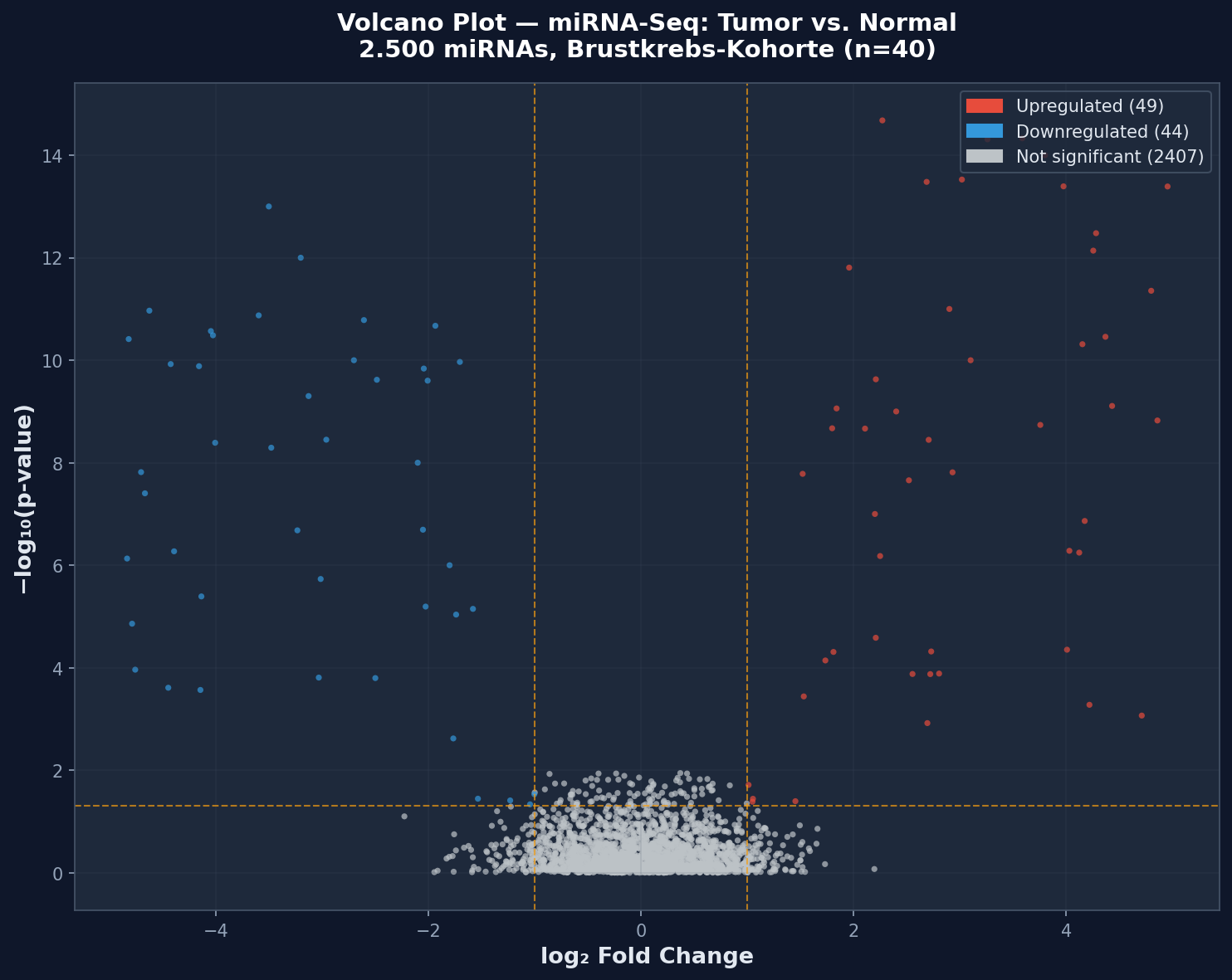
Das Gesamtbild zeigt sofort: Die Mehrheit der 2.500 miRNAs liegt im grauen Zentrum — sie sind weder stark verändert noch statistisch auffällig. Aber an den Flanken des Vulkans, in Rot und Blau, zeichnen sich die Kandidaten ab, die unsere Aufmerksamkeit verdienen.
Kapitel 2: Die üblichen Verdächtigen — Annotation der Top-Kandidaten
Ein Volcano Plot ohne Beschriftung ist wie ein Phantombild ohne Namen. Im zweiten Schritt annotieren wir die Top-Kandidaten — jene miRNAs, die in der Krebsbiologie bereits bekannt sind. hsa-miR-21-5p, der "Klassiker" unter den OncomiRs, leuchtet oben rechts mit einem log2FC von 3.8 und einem p-Wert von 10−14. Links oben: hsa-miR-34a-5p, ein direkter Effektor von p53, herunterreguliert mit FC = −3.5.
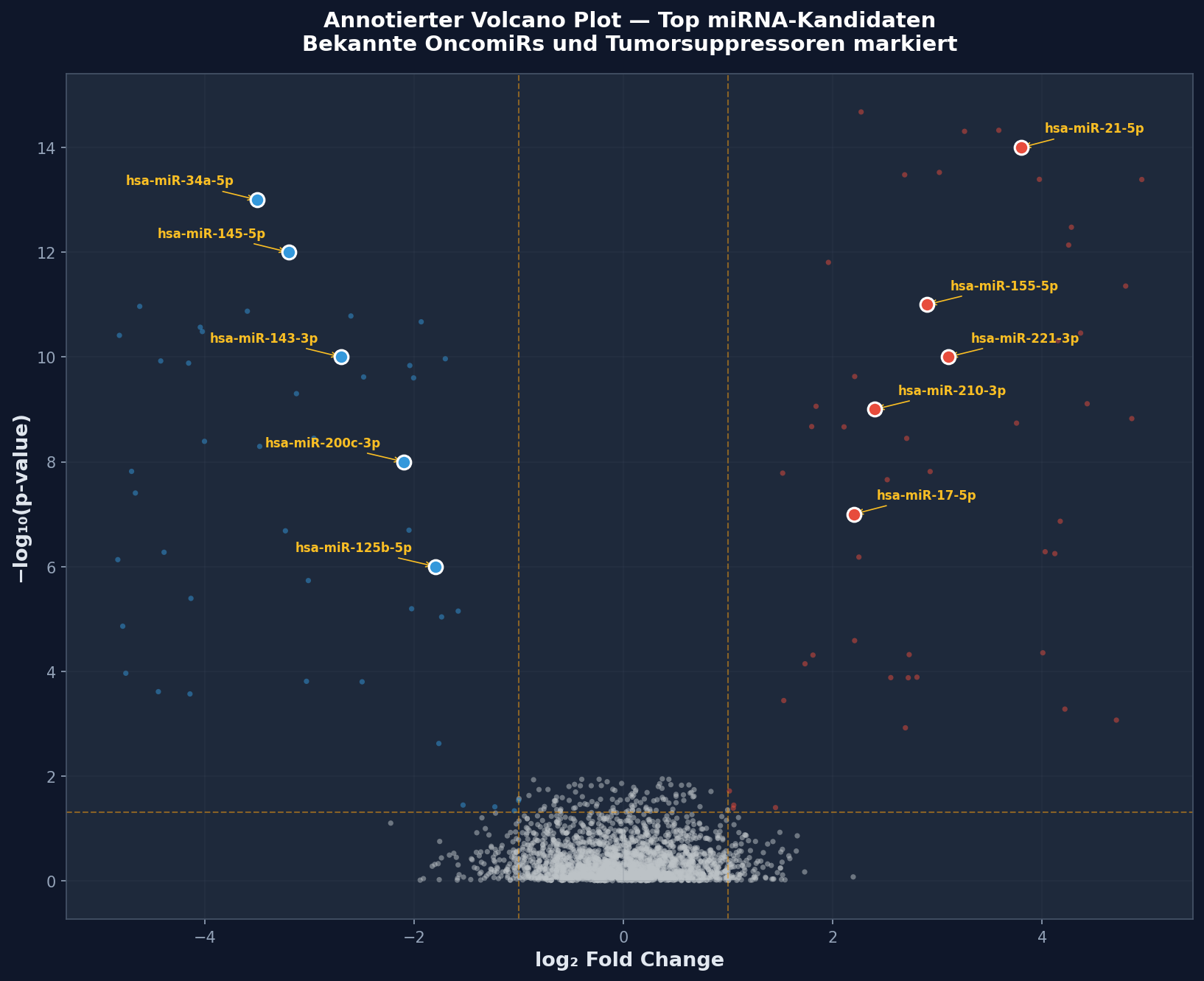
Die Annotation enthüllt ein klares Muster: Auf der rechten Seite (hochreguliert) finden wir die OncomiRs — miR-21, miR-155, miR-210, miR-221, miR-17. Diese miRNAs unterdrücken Tumorsuppressor-Gene und fördern Zellwachstum. Auf der linken Seite (herunterreguliert) die Tumorsuppressor-miRNAs — miR-34a, miR-145, miR-143, miR-200c, miR-125b. Diese hemmen normalerweise onkogene Signalwege, sind im Tumor aber stillgelegt.
Die Detektivarbeit zeigt: Unsere Daten reproduzieren exakt die bekannte Literatur. Das ist kein Zufall — es ist die Bestätigung, dass die Sequenzierung und Analyse korrekt funktioniert haben.
Kapitel 3: Die Beweiskette — Signifikanz als Gradient
Nicht alle signifikanten miRNAs sind gleich stark abgesichert. Ein p-Wert von 0.04 ist gerade noch signifikant, einer von 10−14 ist ein statistischer Paukenschlag. Im dritten Kapitel färben wir die Punkte nicht binär (signifikant/nicht), sondern als Gradient: Je heller ein Punkt leuchtet, desto stärker die statistische Evidenz.
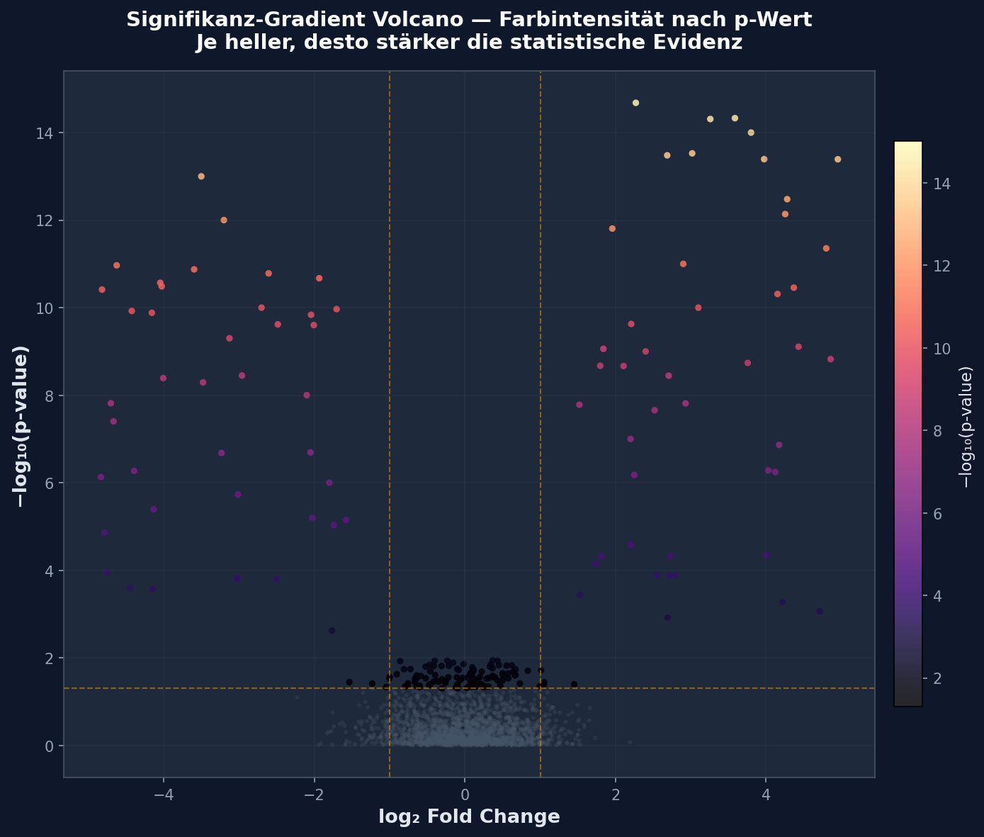
Der Gradient-Plot enthüllt eine Hierarchie innerhalb der signifikanten miRNAs: An der Spitze des Vulkans, wo die hellsten Punkte leuchten, sitzen die echten Schwergewichte — miRNAs mit überwältigender statistischer Evidenz. In der Mitte, gerade über der Schwellenwertlinie, die Grenzfälle, die bei strengeren Cutoffs herausfallen würden. Diese Unterscheidung ist kritisch für die Priorisierung von Validierungsexperimenten.
Kapitel 4: Die Gretchenfrage — Wo zieht man die Linie?
Die Wahl der Schwellenwerte ist eine der kontroversesten Entscheidungen in der Omics-Analyse. Ein liberaler Cutoff findet mehr Kandidaten, aber auch mehr falsch-Positive. Ein stringenter Cutoff ist konservativ, übersieht aber möglicherweise relevante miRNAs. Dieses Kapitel zeigt den direkten Vergleich dreier Strategien nebeneinander.
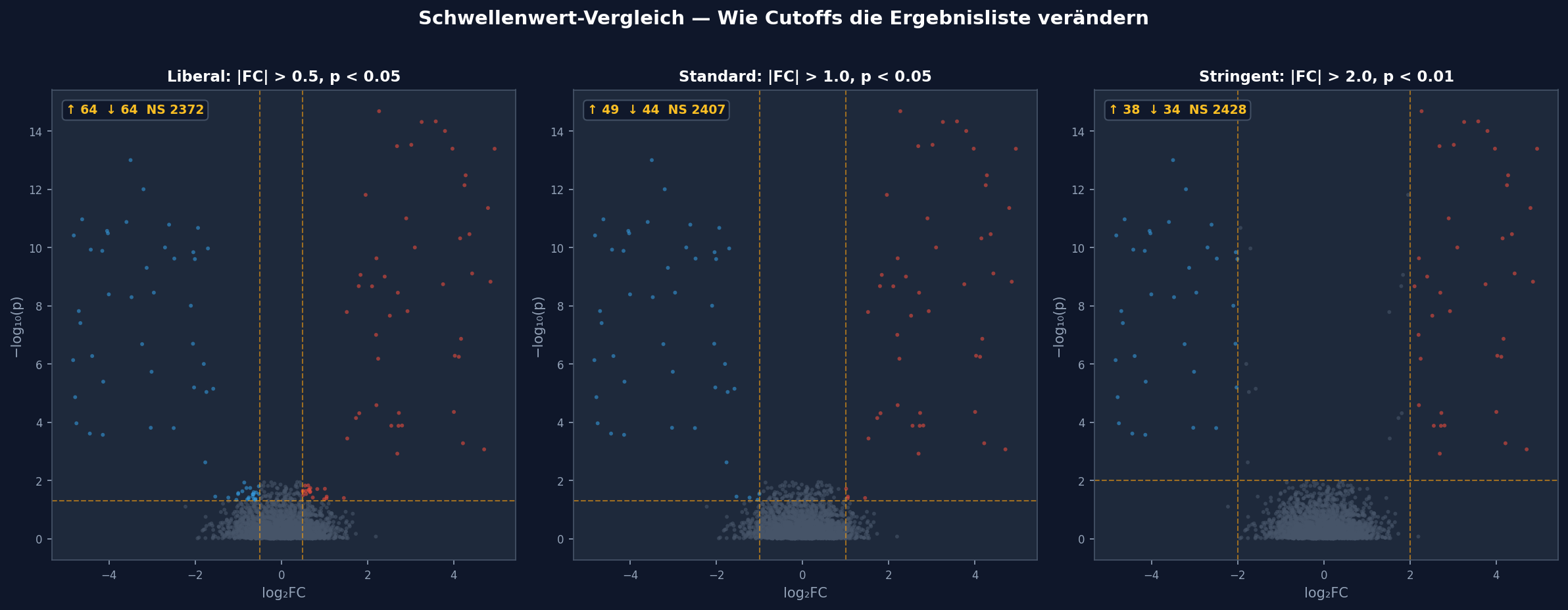
Der Vergleich zeigt dramatische Unterschiede: Mit liberalen Cutoffs (|FC| > 0.5, p < 0.05) erhalten wir eine lange Kandidatenliste — aber viele davon haben nur schwache Effekte, die biologisch fraglich sind. Mit stringenten Cutoffs (|FC| > 2.0, p < 0.01) bleiben nur die stärksten Signale übrig, aber wir könnten subtile, biologisch relevante Veränderungen übersehen. Die Standardwahl (|FC| > 1.0, p < 0.05) ist ein pragmatischer Kompromiss — nicht zu viel, nicht zu wenig.
Kapitel 5: Die vier Quadranten — Jeder erzählt eine Geschichte
Der Volcano Plot teilt sich natürlich in vier Quadranten, und jeder erzählt eine eigene biologische Geschichte. Oben rechts: die Smoking Guns — hochreguliert und signifikant. Oben links: die Silenced — herunterreguliert und signifikant. Unten an den Seiten: die Verdächtigen — großer Effekt, aber nicht statistisch abgesichert. Und im Zentrum: das Hintergrundrauschen.
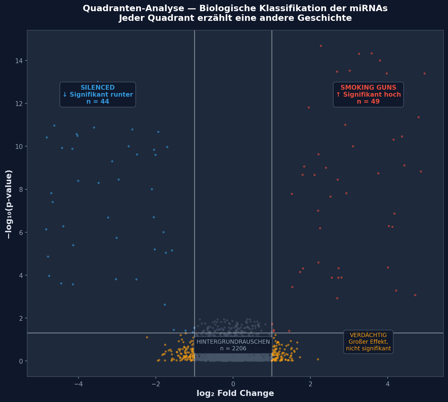
Besonders interessant sind die Verdächtigen — miRNAs mit großem Fold Change, die die Signifikanzschwelle knapp verfehlen. Das sind keine Nicht-Ergebnisse: Es sind Hypothesen, die mit einer größeren Kohorte oder einer alternativen statistischen Methode bestätigt werden könnten. In der Forschungspraxis werden diese oft für Follow-up-Studien vorgemerkt.
Kapitel 6: Die Subtypen — Verschiedene Feinde, verschiedene Waffen
Brustkrebs ist keine einzelne Krankheit, sondern ein Spektrum von Subtypen mit unterschiedlichen molekularen Profilen. Im finalen Kapitel vergleichen wir drei Volcano Plots nebeneinander: Luminal A (prognostisch günstig), HER2+ (aggressiv, aber behandelbar) und Triple-Negative (TNBC, am aggressivsten). Jeder Subtyp zeigt ein eigenes miRNA-Regulationsprofil.
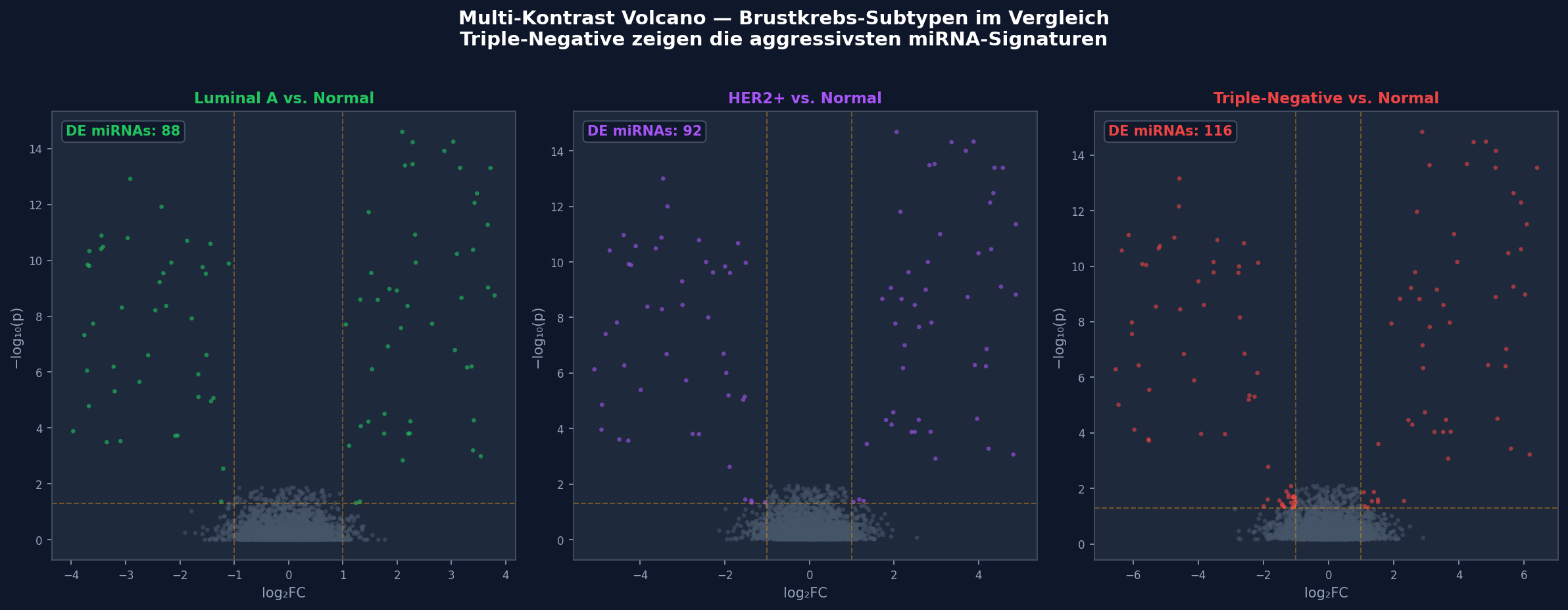
Der Multi-Kontrast-Vergleich bestätigt, was Kliniker seit Langem wissen: Triple-Negative Tumoren zeigen die stärksten und zahlreichsten miRNA-Veränderungen. Die höhere Zahl differenziell exprimierter miRNAs spiegelt die molekulare Heterogenität und Aggressivität dieses Subtyps wider. Für die therapeutische Forschung bedeutet das: TNBC bietet die meisten potenziellen miRNA-Targets, aber auch die größte Komplexität.
Epilog: Was der Volcano Plot wirklich zeigt
Der Volcano Plot ist mehr als ein hübsches Streudiagramm — er ist ein Entscheidungswerkzeug. Er beantwortet simultan drei Fragen: Welche Gene sind verändert? Wie stark? Und wie sicher sind wir? In unserer Detektivgeschichte hat er uns von 2.500 anonymen Verdächtigen zu einer fokussierten Kandidatenliste geführt — mit Namen, Evidenzstärke und biologischem Kontext.
Die sechs Plots dieses Artikels zeigen den Analysepfad, den jede seriöse Omics-Studie durchlaufen sollte: Vom Gesamtbild zur Annotation, von binären Cutoffs zu Gradienten, von einem Kontrast zu Multi-Kontrast-Vergleichen. Der Volcano Plot ist nicht das Ende der Analyse — er ist der Startschuss für die gezielte biologische Validierung.
Zitationen
- Li, W. (2012). Volcano plots in analyzing differential expressions with mRNA microarrays. Journal of Bioinformatics and Computational Biology, 10(6), 1231003.
- Love, M. I., Huber, W., & Anders, S. (2014). Moderated estimation of fold change and dispersion for RNA-seq data with DESeq2. Genome Biology, 15(12), 550.
- Peng, Y. & Croce, C. M. (2016). The role of MicroRNAs in human cancer. Signal Transduction and Targeted Therapy, 1, 15004.
- Calin, G. A. & Croce, C. M. (2006). MicroRNA signatures in human cancers. Nature Reviews Cancer, 6(11), 857-866.
- Iorio, M. V. et al. (2005). MicroRNA gene expression deregulation in human breast cancer. Cancer Research, 65(16), 7065-7070.
Fazit
Der Volcano Plot verwandelt eine unübersichtliche Ergebnistabelle in eine visuelle Landkarte der differenziellen Expression. Seine Stärke liegt in der simultanen Darstellung von Effektstärke und Signfikanz — zwei Dimensionen, die einzeln betrachtet irreführend sein können. Für miRNA-Seq-Projekte ist er nicht optional, sondern Pflicht: Er ist der erste Plot, den Reviewer erwarten, und oft der einzige, den Kliniker sofort verstehen.
Dokumentation
| Parameter | Wert |
|---|---|
| Kohorte | 40 Brustkrebsbiopsien (20 Tumor, 20 Normal) |
| Plattform | miRNA-Seq (Illumina) |
| miRNAs analysiert | 2.500 |
| DE-Pipeline | DESeq2 (Median-of-Ratios Normalisierung) |
| FC-Schwelle | |log₂FC| > 1.0 |
| Signifikanzschwelle | FDR < 0.05 (Benjamini-Hochberg) |
| Visualisierung | matplotlib + seaborn (Python) |
| Subtypen | Luminal A, HER2+, Triple-Negative (TNBC) |
Prologue: The Case File of 2,500 Suspects
It's Monday morning in the translational oncology bioinformatics lab. On the screen glows a table with 2,500 rows — each row a miRNA, each with a log2 Fold Change and a p-value. The cohort: 40 breast cancer biopsies, 20 tumor, 20 normal. Sequencing is complete, DESeq2 has run. Now the real work begins: Who are the smoking guns — those miRNAs that simultaneously show a strong biological effect and statistical significance? The Volcano Plot is the tool that answers this question in seconds.
In this story, we follow the path from raw numbers to biological hypotheses — step by step, plot by plot. Each chapter reveals a new layer of the data.
Chapter 1: The First Look — The Big Picture
The first glance at a Volcano Plot is like opening a case file: The x-axis shows the log2 Fold Change (effect size), the y-axis the −log10(p-value) (statistical significance). Each dot is a miRNA. The yellow dashed lines mark the thresholds: |log2FC| > 1 and FDR < 0.05.
Why these transformations? Without the logarithm, up- and downregulation would be asymmetric (2-fold up = 2, 2-fold down = 0.5). The log2 makes them symmetric around zero. The −log10 transformation of p-values spreads the range so that significant points "fly" upward — hence the name Volcano.
The big picture reveals immediately: The majority of the 2,500 miRNAs sit in the gray center — neither strongly altered nor statistically notable. But on the flanks of the volcano, in red and blue, the candidates that deserve our attention take shape.
Chapter 2: The Usual Suspects — Annotating Top Candidates
A Volcano Plot without labels is like a wanted poster without names. In the second step, we annotate the top candidates — those miRNAs already known in cancer biology. hsa-miR-21-5p, the "classic" among oncomiRs, shines in the upper right with a log2FC of 3.8 and a p-value of 10−14. Upper left: hsa-miR-34a-5p, a direct effector of p53, downregulated with FC = −3.5.
Annotation reveals a clear pattern: On the right side (upregulated), we find the oncomiRs — miR-21, miR-155, miR-210, miR-221, miR-17. These miRNAs suppress tumor suppressor genes and promote cell growth. On the left (downregulated), the tumor suppressor miRNAs — miR-34a, miR-145, miR-143, miR-200c, miR-125b. These normally inhibit oncogenic signaling but are silenced in tumors.
The detective work shows: Our data precisely reproduce the known literature. This is no coincidence — it confirms that sequencing and analysis performed correctly.
Chapter 3: The Chain of Evidence — Significance as a Gradient
Not all significant miRNAs are equally well-supported. A p-value of 0.04 is barely significant; one of 10−14 is a statistical thunderclap. In chapter three, we color the dots not binary (significant/not), but as a gradient: The brighter a point glows, the stronger the statistical evidence.
The gradient plot reveals a hierarchy among significant miRNAs: At the volcano's summit, where the brightest points glow, sit the true heavyweights — miRNAs with overwhelming statistical evidence. In the middle, just above the threshold line, the borderline cases that would fall out with stricter cutoffs. This distinction is critical for prioritizing validation experiments.
Chapter 4: The Cutoff Question — Where Do You Draw the Line?
The choice of thresholds is one of the most controversial decisions in omics analysis. A liberal cutoff finds more candidates but also more false positives. A stringent cutoff is conservative but may miss relevant miRNAs. This chapter shows the direct comparison of three strategies side by side.
The comparison reveals dramatic differences: With liberal cutoffs (|FC| > 0.5, p < 0.05), we get a long candidate list — but many have only weak effects of questionable biological relevance. With stringent cutoffs (|FC| > 2.0, p < 0.01), only the strongest signals survive, but we might miss subtle yet biologically meaningful changes. The standard choice (|FC| > 1.0, p < 0.05) is a pragmatic compromise — not too much, not too little.
Chapter 5: The Four Quadrants — Each Tells a Story
The Volcano Plot naturally divides into four quadrants, each telling its own biological story. Upper right: the Smoking Guns — upregulated and significant. Upper left: the Silenced — downregulated and significant. Lower sides: the Suspects — large effect but not statistically secured. And at center: the Background Noise.
Particularly interesting are the Suspects — miRNAs with large fold change that narrowly miss the significance threshold. These are not null results: They are hypotheses that might be confirmed with a larger cohort or an alternative statistical method. In research practice, these are often flagged for follow-up studies.
Chapter 6: The Subtypes — Different Enemies, Different Weapons
Breast cancer is not a single disease but a spectrum of subtypes with distinct molecular profiles. In the final chapter, we compare three Volcano Plots side by side: Luminal A (prognostically favorable), HER2+ (aggressive but treatable), and Triple-Negative (TNBC, most aggressive). Each subtype displays its own miRNA regulation profile.
The multi-contrast comparison confirms what clinicians have long known: Triple-Negative tumors show the strongest and most numerous miRNA alterations. The higher number of differentially expressed miRNAs reflects the molecular heterogeneity and aggressiveness of this subtype. For therapeutic research, this means: TNBC offers the most potential miRNA targets but also the greatest complexity.
Epilogue: What the Volcano Plot Really Shows
The Volcano Plot is more than a pretty scatter diagram — it is a decision tool. It simultaneously answers three questions: Which genes are altered? How strongly? And how certain are we? In our detective story, it guided us from 2,500 anonymous suspects to a focused candidate list — with names, evidence strength, and biological context.
The six plots in this article demonstrate the analysis path every serious omics study should follow: From the big picture to annotation, from binary cutoffs to gradients, from one contrast to multi-contrast comparisons. The Volcano Plot is not the end of the analysis — it is the starting gun for targeted biological validation.
Citations
- Li, W. (2012). Volcano plots in analyzing differential expressions with mRNA microarrays. Journal of Bioinformatics and Computational Biology, 10(6), 1231003.
- Love, M. I., Huber, W., & Anders, S. (2014). Moderated estimation of fold change and dispersion for RNA-seq data with DESeq2. Genome Biology, 15(12), 550.
- Peng, Y. & Croce, C. M. (2016). The role of MicroRNAs in human cancer. Signal Transduction and Targeted Therapy, 1, 15004.
- Calin, G. A. & Croce, C. M. (2006). MicroRNA signatures in human cancers. Nature Reviews Cancer, 6(11), 857-866.
- Iorio, M. V. et al. (2005). MicroRNA gene expression deregulation in human breast cancer. Cancer Research, 65(16), 7065-7070.
Conclusion
The Volcano Plot transforms an unwieldy results table into a visual map of differential expression. Its strength lies in the simultaneous display of effect size and significance — two dimensions that can be misleading when viewed alone. For miRNA-Seq projects, it is not optional but mandatory: It is the first plot reviewers expect, and often the only one clinicians immediately understand.
Documentation
| Parameter | Value |
|---|---|
| Cohort | 40 breast cancer biopsies (20 tumor, 20 normal) |
| Platform | miRNA-Seq (Illumina) |
| miRNAs analyzed | 2,500 |
| DE pipeline | DESeq2 (median-of-ratios normalization) |
| FC threshold | |log₂FC| > 1.0 |
| Significance threshold | FDR < 0.05 (Benjamini-Hochberg) |
| Visualization | matplotlib + seaborn (Python) |
| Subtypes | Luminal A, HER2+, Triple-Negative (TNBC) |