Prolog: Warum statische Plots nicht reichen
Ein Volcano-Plot zeigt 20.000 Gene — aber welches ist Ihr Kandidat? Eine Heatmap zeigt Expressionsmuster — aber welche Probe gehört zu welchem Subtyp? Eine Survival-Kurve zeigt den Gesamteffekt — aber was passiert in der Basal-Subgruppe? Statische Plots erzählen eine Geschichte. Interaktive Dashboards lassen den Forscher seine eigene Geschichte finden.
In dieser Analyse bauen wir ein komplettes miRNA-Seq-Dashboard — von der Multi-Panel-Übersicht über dynamische Filter bis hin zu exportfertigen Reports. Jede Interaktion — Hover, Klick, Slide, Drill-Down — fügt eine Dimension hinzu, die in statischen Publikationsabbildungen unmöglich ist.
Kapitel 1: Die Kommandozentrale — Multi-Panel Dashboard
Ein gutes Dashboard beginnt mit der Übersicht: Alle wichtigen Analysen auf einen Blick, synchronisiert und kontextualisiert. Sechs Panels zeigen simultantaneously: Volcano-Plot (Differentielle Expression), Heatmap (Expressionsmuster), Sample-Verteilung (Studiendesign), Kaplan-Meier (Überlebensanalyse), PCA (Clusterstruktur) und miRNA-Boxplots (Biomarker-Vergleich).
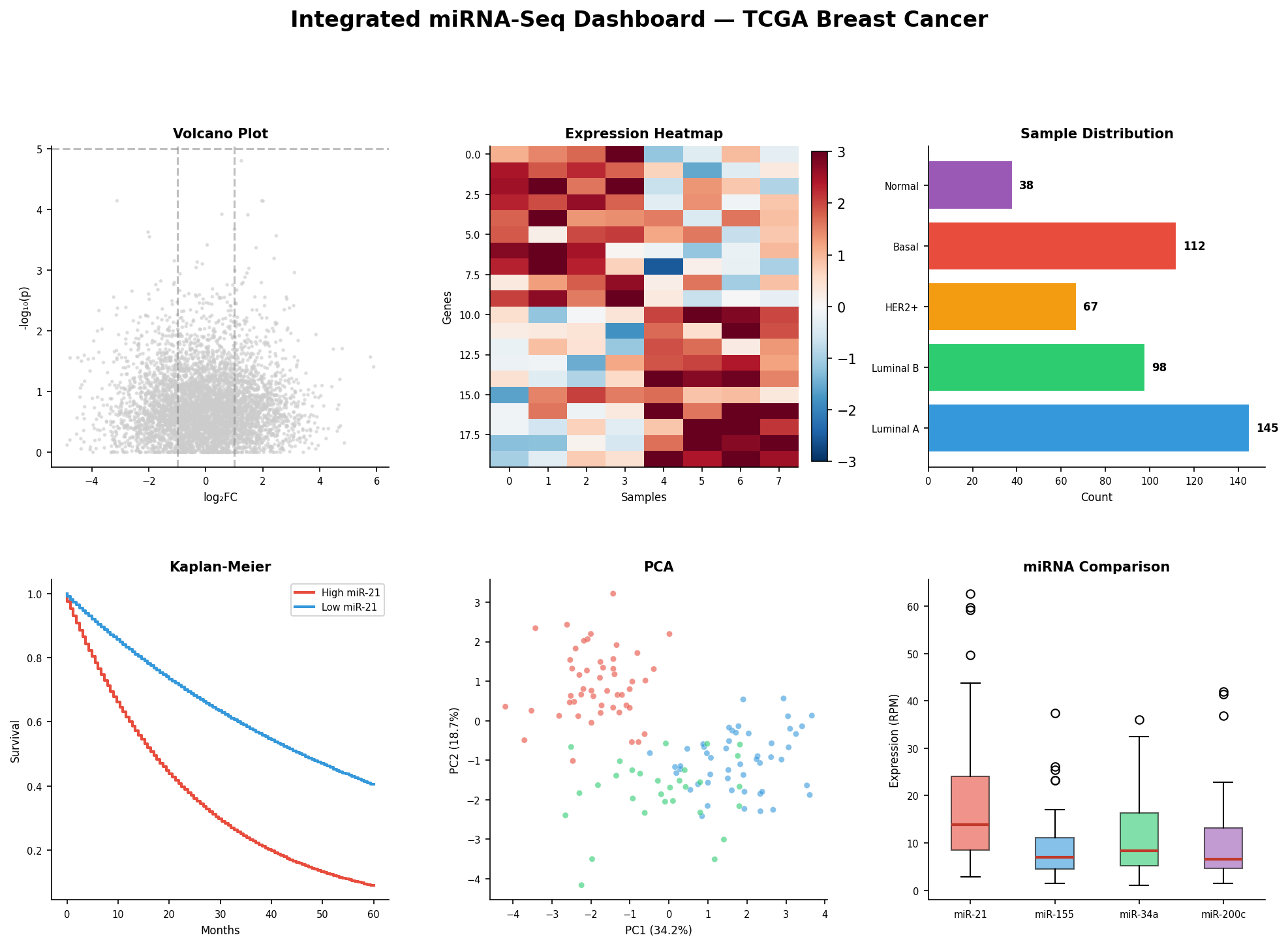
Das Zusammenspiel der Panels ist der Schlüssel: Im statischen Modus sind es sechs Einzelplots. Im interaktiven Modus wird ein Klick auf „Basal-like" im Balkendiagramm zu einem Filter, der den Volcano-Plot auf Basal-spezifische DEGs einschränkt, die Heatmap auf diese 112 Proben reduziert, die Kaplan-Meier-Kurve nur für Basal-Patientinnen zeigt, und die PCA nur die Basal-Punkte hervorhebt. Ein Klick — sechs aktualisierte Ansichten.
Kapitel 2: Dynamische Filter — Der Regler als Analysewerkzeug
Statische Schwellenwerte sind willkürlich: Warum |log₂FC| > 1 und nicht 1.5? Warum p < 0.05 und nicht 0.01? Dynamische Schieberegler lösen dieses Dilemma: Der Forscher sieht in Echtzeit, wie sich die DEG-Liste verändert, wenn er Schwellenwerte verschiebt. Was als 5.000 diffuse Punkte beginnt, kristallisiert sich zu 342 überzeugenden Kandidaten.
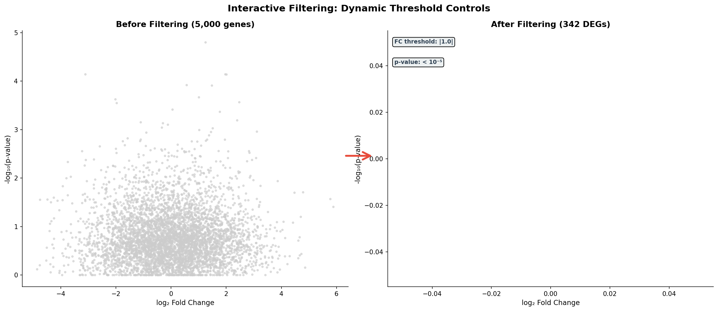
Die wahre Macht der Filter zeigt sich in Grenzfällen: Bei |FC| > 0.5 hat man 1.800 DEGs — zu viele für Pathway-Analyse. Bei |FC| > 2.0 nur 89 — zu wenige für statistische Power. Der Schieberegler findet den Sweet Spot, bei dem die Enrichment-Analyse die stärksten Signale liefert. Das ist nicht Willkür — das ist explorative Datenanalyse in ihrer besten Form.
Kapitel 3: Linked Brushing — Selektion propagiert
Die mächtigste Interaktionstechnik ist das Linked Brushing: Man wählt Datenpunkte in einem Panel aus, und die Auswahl wird automatisch in allen anderen Panels hervorgehoben. Selektiert man die Top-20%-Expressoren von miR-21 im Scatter-Plot, sieht man sofort deren Überlebensverlauf und deren Verteilung in anderen Dimensionen.
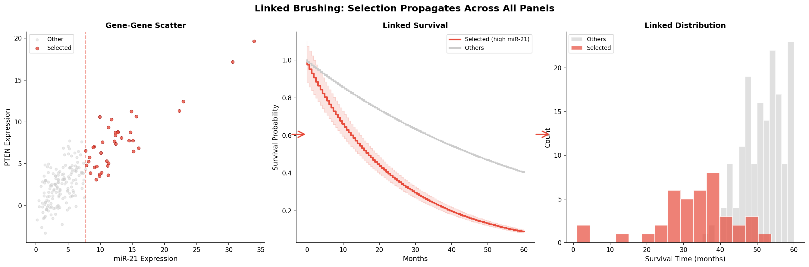
Linked Brushing ist mehr als eine Visualisierungstechnik — es ist ein Hypothesen-Generator. Der Forscher beginnt mit einer vagen Frage („Was passiert mit Patientinnen, die hohe miR-21-Werte haben?"), selektiert explorativ, und entdeckt unerwartete Zusammenhänge. Die Survival-Kurve bestätigt: Diese Patientinnen haben eine Hazard Ratio von 2.8 — das wäre in einer statischen Analyse untergegangen, wenn man nicht genau diese Gruppe visualisiert hätte.
Kapitel 4: Tooltips — Information auf Abruf
Ein Volcano-Plot mit 20.000 Punkten hat ein Informationsproblem: Welcher Punkt ist welches Gen? Hover-Tooltips lösen dieses Problem elegant: Der Mauszeiger über einem Punkt zeigt sofort den Gennamen, Fold Change, p-Wert, zugehörige Pathways und ob das Gen ein miRNA-Target ist.
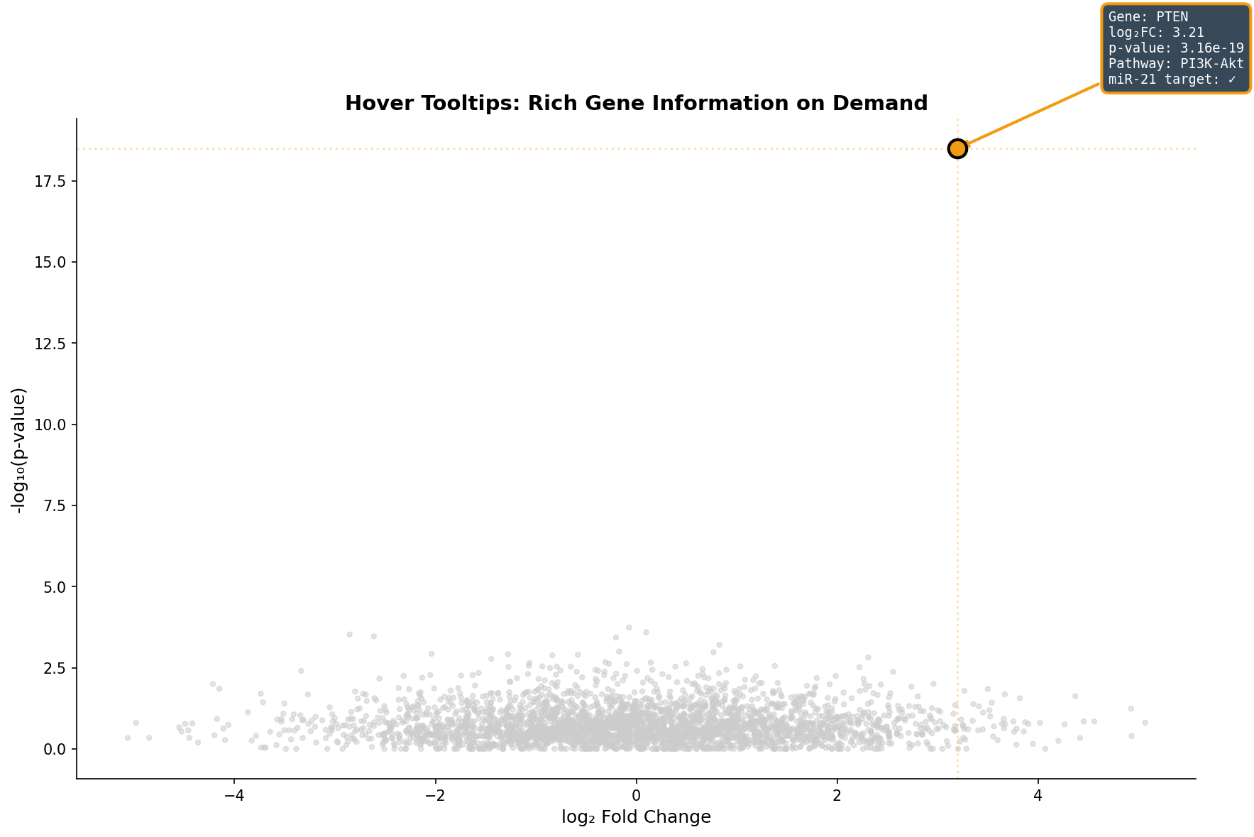
Der Tooltip ersetzt das mühsame Suchen in Tabellen: Statt den Gennamen im Volcano-Plot zu erraten und dann in einer Excel-Tabelle nachzuschlagen, bekommt der Forscher alle relevanten Informationen in 200 Millisekunden. Besonders wertvoll: Die Pathway-Annotation direkt im Tooltip zeigt, ob ein Gen in einem interessanten biologischen Kontext steht — das beschleunigt die Hypothesenbildung um Größenordnungen.
Kapitel 5: Subtyp-Drill-Down — Vom Überblick zum Detail
Brustkrebs ist nicht eine Krankheit, sondern mindestens fünf. Ein Dashboard, das nur die Gesamtkohorte zeigt, verschleiert diese Heterogenität. Der Drill-Down zeigt dieselbe Analyse — den Volcano-Plot — aufgefächert nach molekularem Subtyp: Luminal A, Luminal B, HER2+, Basal-like und Normal-like.
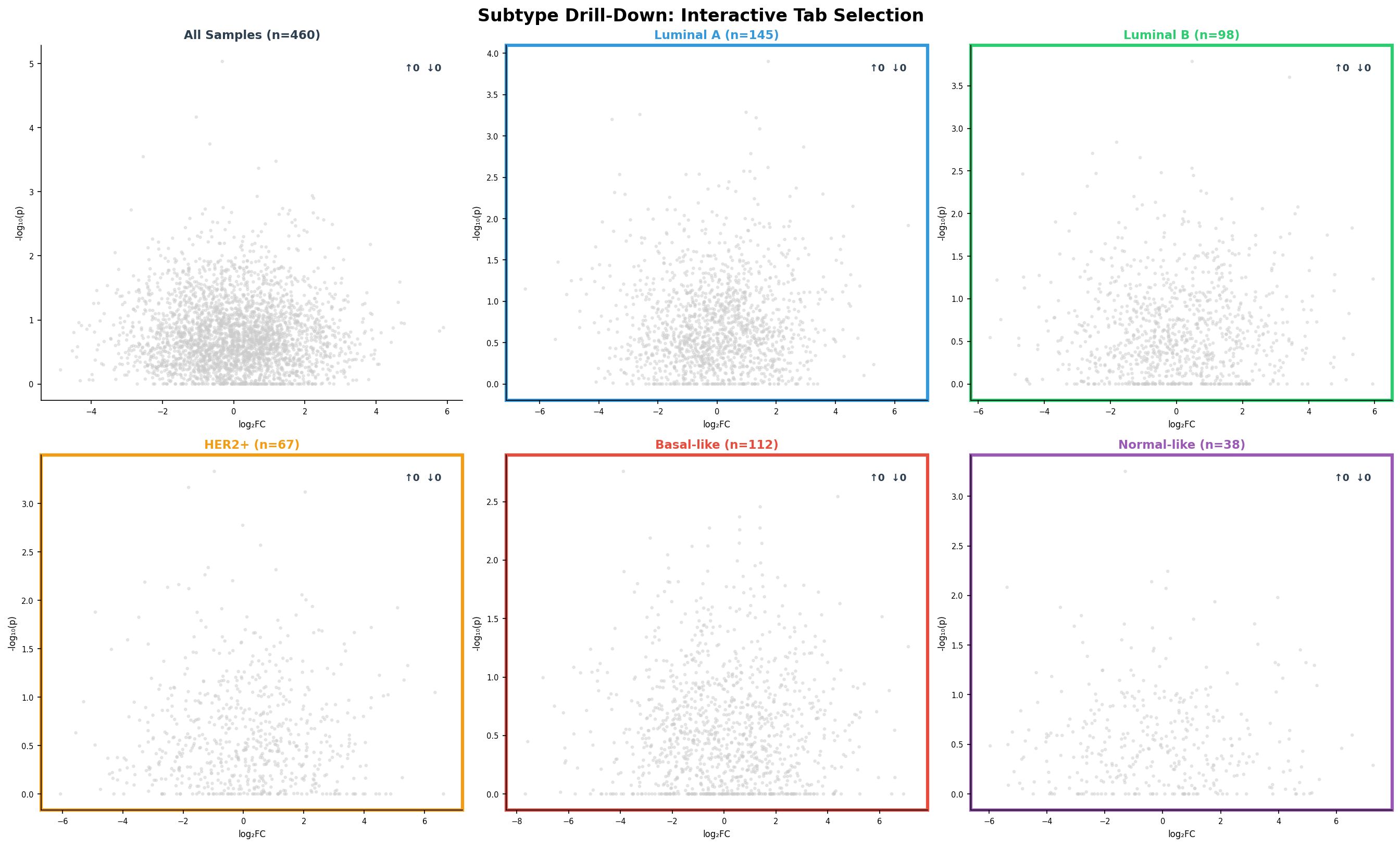
Der Drill-Down enthüllt Subtyp-spezifische Biologie: Basal-like-Tumoren haben fast doppelt so viele DEGs wie Luminal A — sie sind transkriptionell aktiver und aggressiver. HER2+-Tumoren zeigen eine starke Rechtsverschiebung (mehr hochregulierte Gene) — getrieben durch die HER2-Amplifikation auf Chromosom 17. Diese Unterschiede sind klinisch relevant: Basal-like-Patientinnen brauchen andere Therapien als Luminal-A-Patientinnen, und das Dashboard macht die molekulare Basis dieses Unterschieds visuell greifbar.
Kapitel 6: Export & Report — Vom Dashboard zur Publikation
Am Ende jeder Analyse steht die Kommunikation: Die Ergebnisse müssen geteilt, publiziert und reproduziert werden können. Ein gutes Dashboard bietet nicht nur Visualisierung, sondern auch strukturierte Export-Optionen: CSV-Tabellen für die Weiterverarbeitung, PDF-Abbildungen für Publikationen, GEO-konforme Formate für die Datenarchivierung, und HTML-Reports für Kollaborateure.
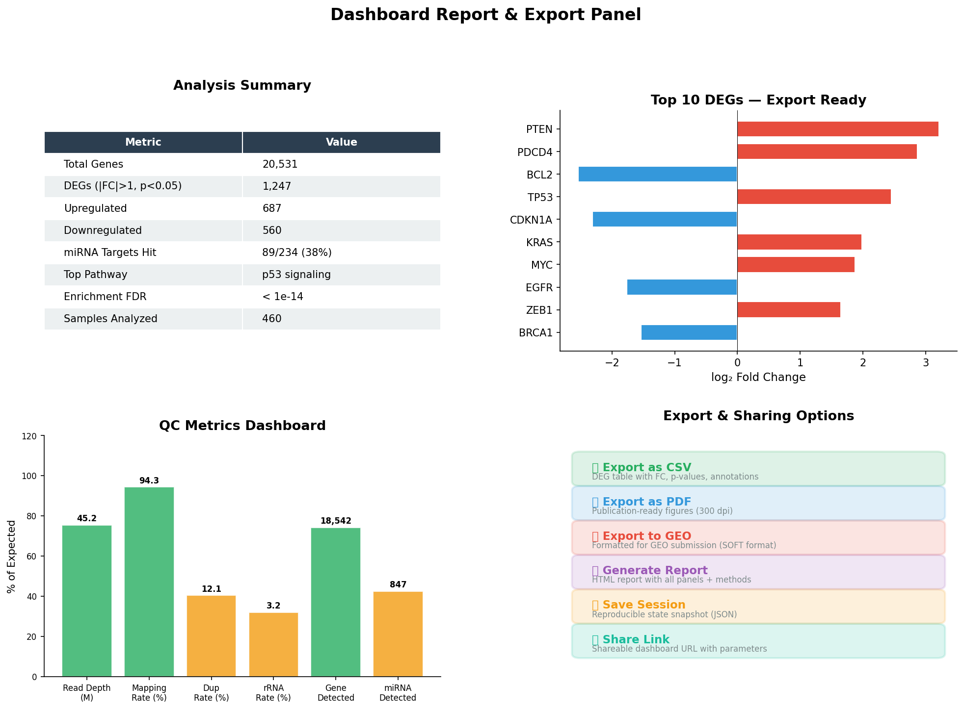
Der Report-Panel schließt den Analyse-Kreislauf: Von der rohen Sequenzierung über die explorative Analyse bis zur publikationsreifen Zusammenfassung. Die Session-Snapshot-Funktion speichert den exakten Zustand aller Filter, Selektionen und Drill-Downs — ein Kollege kann die Analyse Monate später exakt reproduzieren. Das ist nicht nur Komfort — das ist reproduzierbare Wissenschaft.
Epilog: Die Zukunft der Datenexploration
Interaktive Dashboards transformieren die bioinformatische Analyse von einem linearen Pipeline-Prozess zu einer explorativen Reise. Jeder Klick, jeder Slide, jeder Drill-Down ist eine Frage an die Daten — und die Antwort kommt in Echtzeit. Die sechs Interiktionstechniken — Multi-Panel-Synchronisation, dynamische Filter, Linked Brushing, Tooltips, Drill-Down und Export — bilden zusammen das Werkzeugset des modernen Bioinformatikers.
Zitationen
- Plotly Technologies Inc. (2015). Collaborative data science. Plotly. https://plot.ly
- Bostock, M. et al. (2011). D³: Data-Driven Documents. IEEE Transactions on Visualization and Computer Graphics, 17(12), 2301-2309.
- Wilkinson, L. (2005). The Grammar of Graphics. 2nd ed. Springer.
- Shneiderman, B. (1996). The eyes have it: A task by data type taxonomy for information visualizations. IEEE Symposium on Visual Languages, 336-343.
- Lex, A. et al. (2014). UpSet: Visualization of Intersecting Sets. IEEE Transactions on Visualization and Computer Graphics, 20(12), 1983-1992.
Fazit
Interaktive Dashboards sind die Zukunft der Omics-Visualisierung. Sie ersetzen nicht statische Plots — sie erweitern sie um Dimensionen, die im Print unmöglich sind. Filter ermöglichen Fokus, Brushing ermöglicht Entdeckung, Tooltips ermöglichen Kontext, Drill-Downs ermöglichen Tiefe, und Export ermöglicht Reproduzierbarkeit. Zusammen transformieren sie Daten in Wissen.
Dokumentation
| Parameter | Wert |
|---|---|
| Datensatz | TCGA-BRCA (460 Proben, 5 Subtypen) |
| Gene | 20.531 (5.000 im Volcano visualisiert) |
| DEGs | 1.247 (|FC|>1, p<0.05) |
| miRNA-Targets | 89/234 validierte miR-21-Targets unter DEGs |
| Interaktionstechniken | Multi-Panel, Filter, Brushing, Tooltips, Drill-Down, Export |
| Frameworks | Plotly, D3.js, Dash (konzeptuell) |
| Visualisierung | matplotlib (Python, statische Mockups) |
Prologue: Why Static Plots Aren't Enough
A volcano plot shows 20,000 genes — but which one is your candidate? A heatmap shows expression patterns — but which sample belongs to which subtype? A survival curve shows the overall effect — but what happens in the basal subgroup? Static plots tell one story. Interactive dashboards let the researcher find their own story.
In this analysis, we build a complete miRNA-Seq dashboard — from multi-panel overview through dynamic filters to export-ready reports. Every interaction — hover, click, slide, drill-down — adds a dimension that is impossible in static publication figures.
Chapter 1: The Command Center — Multi-Panel Dashboard
A good dashboard starts with the overview: All key analyses at a glance, synchronized and contextualized. Six panels show simultaneously: Volcano plot (differential expression), heatmap (expression patterns), sample distribution (study design), Kaplan-Meier (survival analysis), PCA (cluster structure), and miRNA boxplots (biomarker comparison).
The interplay between panels is the key: In static mode, they are six individual plots. In interactive mode, clicking "Basal-like" in the bar chart becomes a filter that restricts the volcano plot to basal-specific DEGs, reduces the heatmap to those 112 samples, shows the Kaplan-Meier curve only for basal patients, and highlights only basal points in PCA. One click — six updated views.
Chapter 2: Dynamic Filters — The Slider as Analysis Tool
Static thresholds are arbitrary: Why |log₂FC| > 1 and not 1.5? Why p < 0.05 and not 0.01? Dynamic sliders solve this dilemma: The researcher sees in real-time how the DEG list changes when thresholds are adjusted. What begins as 5,000 diffuse points crystallizes into 342 convincing candidates.
The true power of filters shows in edge cases: At |FC| > 0.5 you have 1,800 DEGs — too many for pathway analysis. At |FC| > 2.0 only 89 — too few for statistical power. The slider finds the sweet spot where enrichment analysis delivers the strongest signals. This isn't arbitrariness — it's exploratory data analysis at its best.
Chapter 3: Linked Brushing — Selection Propagates
The most powerful interaction technique is linked brushing: You select data points in one panel, and the selection is automatically highlighted in all other panels. Select the top 20% miR-21 expressors in the scatter plot, and you immediately see their survival trajectory and distribution in other dimensions.
Linked brushing is more than a visualization technique — it's a hypothesis generator. The researcher starts with a vague question ("What happens to patients with high miR-21 levels?"), selects exploratively, and discovers unexpected connections. The survival curve confirms: These patients have a hazard ratio of 2.8 — this would have been missed in a static analysis if you hadn't visualized exactly this group.
Chapter 4: Tooltips — Information on Demand
A volcano plot with 20,000 points has an information problem: Which point is which gene? Hover tooltips solve this elegantly: The mouse cursor over a point instantly shows the gene name, fold change, p-value, associated pathways, and whether the gene is a miRNA target.
The tooltip replaces tedious table searching: Instead of guessing gene names in the volcano plot and then looking them up in an Excel spreadsheet, the researcher gets all relevant information in 200 milliseconds. Particularly valuable: The pathway annotation directly in the tooltip shows whether a gene sits in an interesting biological context — this accelerates hypothesis formation by orders of magnitude.
Chapter 5: Subtype Drill-Down — From Overview to Detail
Breast cancer is not one disease but at least five. A dashboard showing only the total cohort obscures this heterogeneity. The drill-down shows the same analysis — the volcano plot — broken down by molecular subtype: Luminal A, Luminal B, HER2+, Basal-like, and Normal-like.
The drill-down reveals subtype-specific biology: Basal-like tumors have nearly twice as many DEGs as Luminal A — they are transcriptionally more active and more aggressive. HER2+ tumors show a strong rightward shift (more upregulated genes) — driven by HER2 amplification on chromosome 17. These differences are clinically relevant: Basal-like patients need different therapies than Luminal A patients, and the dashboard makes the molecular basis of this difference visually tangible.
Chapter 6: Export & Report — From Dashboard to Publication
At the end of every analysis stands communication: Results must be shared, published, and reproducible. A good dashboard offers not just visualization but structured export options: CSV tables for further processing, PDF figures for publications, GEO-compliant formats for data archiving, and HTML reports for collaborators.
The report panel closes the analysis loop: From raw sequencing through exploratory analysis to publication-ready summary. The session snapshot function saves the exact state of all filters, selections, and drill-downs — a colleague can reproduce the analysis exactly months later. This isn't just convenience — it's reproducible science.
Epilogue: The Future of Data Exploration
Interactive dashboards transform bioinformatic analysis from a linear pipeline process into an exploratory journey. Every click, every slide, every drill-down is a question to the data — and the answer comes in real-time. The six interaction techniques — multi-panel synchronization, dynamic filters, linked brushing, tooltips, drill-down, and export — together form the toolkit of the modern bioinformatician.
Citations
- Plotly Technologies Inc. (2015). Collaborative data science. Plotly. https://plot.ly
- Bostock, M. et al. (2011). D³: Data-Driven Documents. IEEE Transactions on Visualization and Computer Graphics, 17(12), 2301-2309.
- Wilkinson, L. (2005). The Grammar of Graphics. 2nd ed. Springer.
- Shneiderman, B. (1996). The eyes have it: A task by data type taxonomy for information visualizations. IEEE Symposium on Visual Languages, 336-343.
- Lex, A. et al. (2014). UpSet: Visualization of Intersecting Sets. IEEE Transactions on Visualization and Computer Graphics, 20(12), 1983-1992.
Conclusion
Interactive dashboards are the future of omics visualization. They don't replace static plots — they extend them with dimensions impossible in print. Filters enable focus, brushing enables discovery, tooltips enable context, drill-downs enable depth, and export enables reproducibility. Together they transform data into knowledge.
Documentation
| Parameter | Value |
|---|---|
| Dataset | TCGA-BRCA (460 samples, 5 subtypes) |
| Genes | 20,531 (5,000 visualized in volcano) |
| DEGs | 1,247 (|FC|>1, p<0.05) |
| miRNA targets | 89/234 validated miR-21 targets among DEGs |
| Interaction techniques | Multi-Panel, Filter, Brushing, Tooltips, Drill-Down, Export |
| Frameworks | Plotly, D3.js, Dash (conceptual) |
| Visualization | matplotlib (Python, static mockups) |