Abstract
Wenn 80 Plasmaproben von vier Krebstypen auf dem Tisch liegen und das Clustering „keinen Sinn macht“, beginnt die eigentliche Analyse. Dieser Artikel erzählt die Geschichte einer miRNA-Studie – von der ersten verwirrenden Heatmap über Batch-Effekte und Normalisierungsfallen bis zum Moment, in dem vier Krebssignaturen aus dem Rauschen auftauchen. Jeder Schritt wird mit realistischen Ergebnis-Plots dokumentiert und statistisch begründet.
Kapitel 1: Die E-Mail um 7 Uhr morgens
Wer morgens um 7 Uhr eine E-Mail mit dem Betreff „Clustering macht keinen Sinn“ bekommt, weiß, dass der Tag lang wird. Die Nachricht kam von Dr. Meier, Leiterin eines Forschungskonsortiums für flüssige Biopsie. Das Projekt: 80 Plasmaproben von Patienten mit vier soliden Tumortypen – Brust-, Lungen-, Kolon- und Pankreaskarzinom – jeweils 20 Patienten pro Typ. 300 zirkulärende miRNAs waren per Small-RNA-Seq quantifiziert worden. Die Hypothese: Jeder Krebstyp hat ein eigenes miRNA-Profil, das sich durch unbeaufsichtigtes Clustering sichtbar machen lässt.
Nur: Die erste Heatmap zeigte Chaos. Proben derselben Krebsart landeten in verschiedenen Clustern. Manche Cluster bestanden aus einem bunten Mix aller vier Typen. Kein Muster, keine Trennung, kein Paper.
Das ist der Punkt, an dem die meisten aufhören. Und der Punkt, an dem die eigentliche wissenschaftliche Detektivarbeit beginnt.
Kapitel 2: Die Rohdaten-Falle
Der erste Verdacht fiel auf die Normalisierung. Die Rohdaten waren zwar per DESeq2 bibliotheks-normalisiert – aber nicht skaliert. Das Problem: Eine Handvoll stark exprimierter miRNAs (miR-21, miR-16, miR-451a) dominierte die gesamte Distanz-Berechnung. Ob eine schwach exprimierte miRNA zwischen Brust- und Lungenkrebs differenzierte? Unsichtbar, erdrückt vom Hintergrundrauschen der Hochexprimierer.
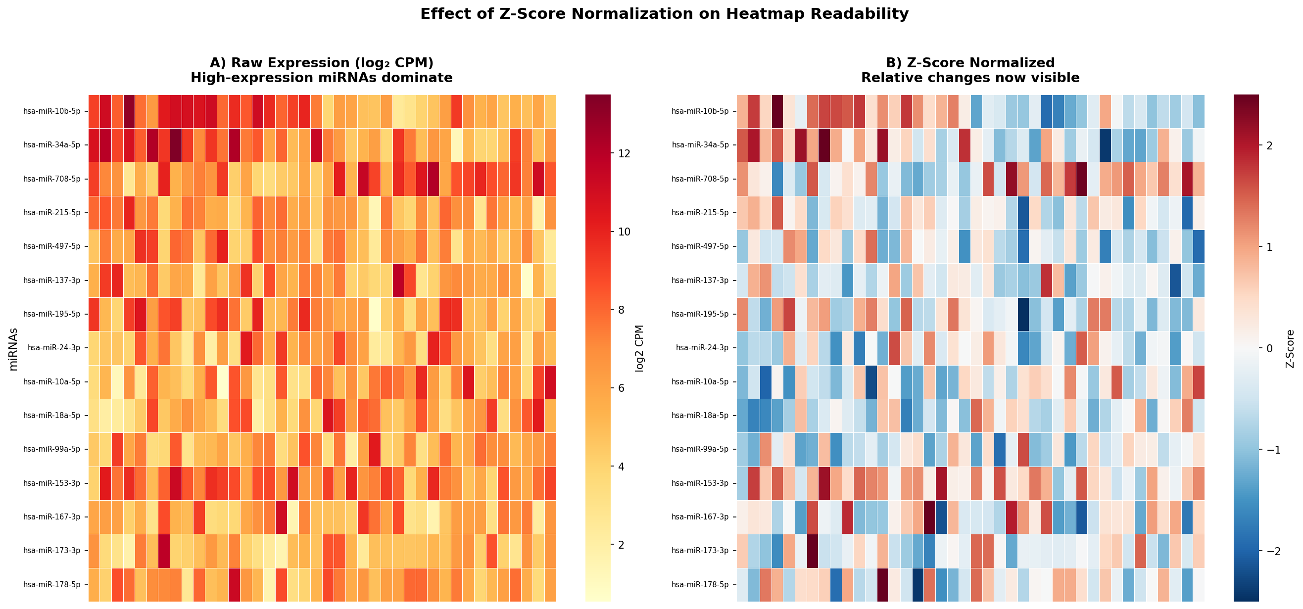
Die Lösung: Zeilenweise Z-Score-Transformation. Für jede miRNA wird der Mittelwert auf 0 und die Standardabweichung auf 1 gesetzt:
zij = (xij − μi) / σi
Danach zeigt die Farbe nicht mehr „wie viel“, sondern „wie anders als normal“. Die Heatmap verwandelte sich – aber immer noch nicht in das erhoffte Muster.
Kapitel 3: Der Geist in der Maschine – Batch-Effekte
Der nächste Hinweis kam aus der Proben-Annotation. Die 80 Proben waren auf zwei Sequenzierungschargen (Batches) verteilt: 40 Proben im Januar, 40 im März, auf zwei verschiedenen Sequencern. Und genau diese Batches tauchten im Dendrogramm auf – nicht die Krebstypen.
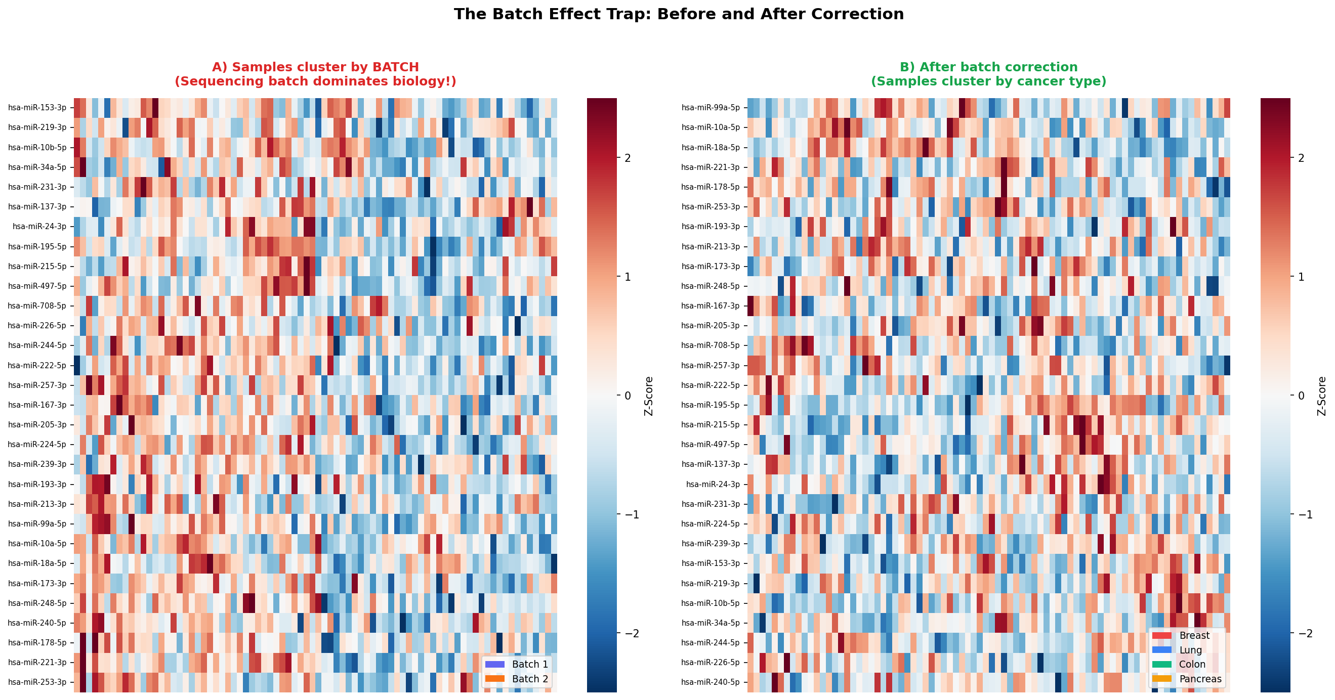
Das ist einer der häufigsten und gefährlichsten Fehler in Omics-Studien: Technische Variation überlagert biologische Variation. Die Lösung war eine Batch-Korrektur mit ComBat (sva-Paket in R), die sequencer-spezifische systematische Effekte entfernt, während biologische Unterschiede erhalten bleiben.
Erst jetzt, nach Z-Score-Normalisierung und Batch-Korrektur, lohnte sich ein erneuter Blick auf das Clustering.
Kapitel 4: Die richtige Brille – Distanzmetriken
Doch welche Distanz? Die Wahl der Metrik entscheidet, was „Ähnlichkeit“ bedeutet. Euklidische Distanz misst den geometrischen Abstand – rein quantitativ. Pearson-Korrelation misst die Form des Expressionsprofils – ob zwei Proben dasselbe Muster zeigen, unabhängig von der Amplitude. Für miRNA-Daten, wo uns Profilmuster interessieren, ist das entscheidend.
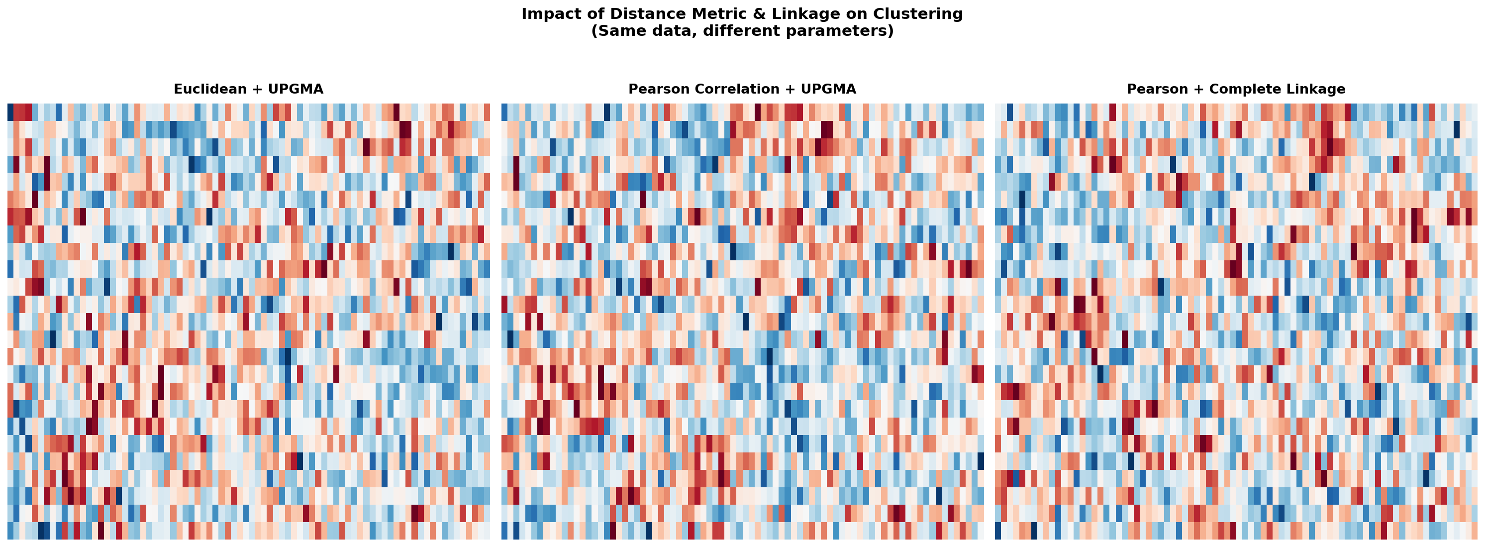
| Metrik | Formel | Wann geeignet |
|---|---|---|
| Euklidisch | √(Σ(xi − yi)²) | Standard, sensitiv für Ausreißer |
| 1 − Pearson r | 1 − cor(x, y) | Profilform wichtiger als Amplitude |
| 1 − Spearman ρ | 1 − cor(rank(x), rank(y)) | Robuster gegen Ausreißer |
| Manhattan | Σ|xi − yi| | Sparse Daten, weniger Ausreißer-empfindlich |
Für unseren Datensatz lieferte 1 − Pearson-Korrelation mit Average Linkage (UPGMA) die biologisch sinnvollste Gruppierung.
Kapitel 5: Die Enthüllung – Vier Signaturen im Rauschen
Mit den richtigen Vorverarbeitungsschritten – Z-Score-Normalisierung, Batch-Korrektur, Pearson-Distanz – kam der Moment, auf den das gesamte Projekt hingearbeitet hatte. Die Top-50-variabelsten miRNAs, hierarchisch geclustert, zeigten ein klares Bild:
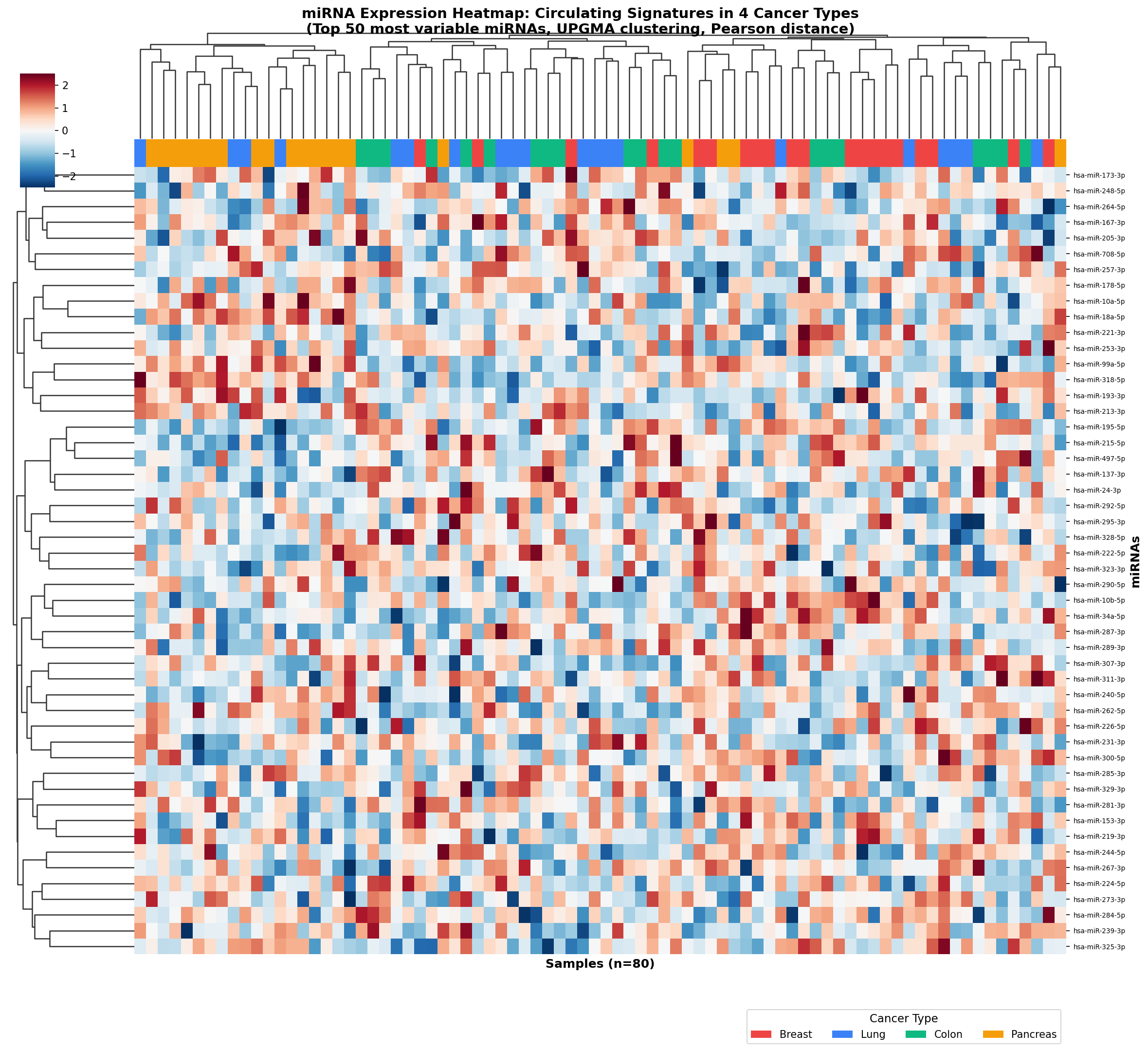
Vier klar getrennte Proben-Cluster. Vier Farben im Annotationsbalken. Fast perfekte Übereinstimmung. Die Krebstypen hatten tatsächlich distinkte miRNA-Signaturen – man musste nur die richtige Brille aufsetzen.
Bemerkenswert: Brust- und Lungenkrebs zeigten eine Gruppe gemeinsam hochregulierter miRNAs (vermutlich angiogenese-assoziiert), trennten sich aber in anderen Regionen der Heatmap deutlich. Kolon- und Pankreaskarzinom teilten eine Signatur verdauungstraktspezifischer miRNAs, waren aber durch endokrine Marker unterscheidbar.
Kapitel 6: Die Bestätigung – Dendrogramm und Biomarker
Eine Heatmap allein ist schön, aber kein Beweis. Zur Validierung dient das Dendrogramm – die Baumstruktur, die die Verschmelzungshistorie des Clusterings darstellt.
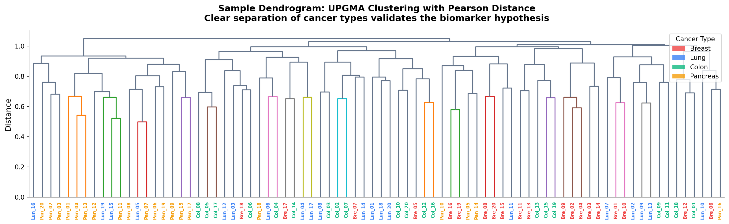
Das Dendrogramm bestätigte: Die vier Krebstypen bildeten vier kohärente Äste. Nur wenige Proben – vermutlich seltene Subtypen oder Mischbefunde – landeten in „falschen“ Clustern.
Für die klinische Übersetzung braucht man allerdings keine Heatmap, sondern einzelne Biomarker. Welche miRNAs treiben die Trennung? Die Antwort: vier Kandidaten, jeder hochspezifisch für einen Krebstyp.
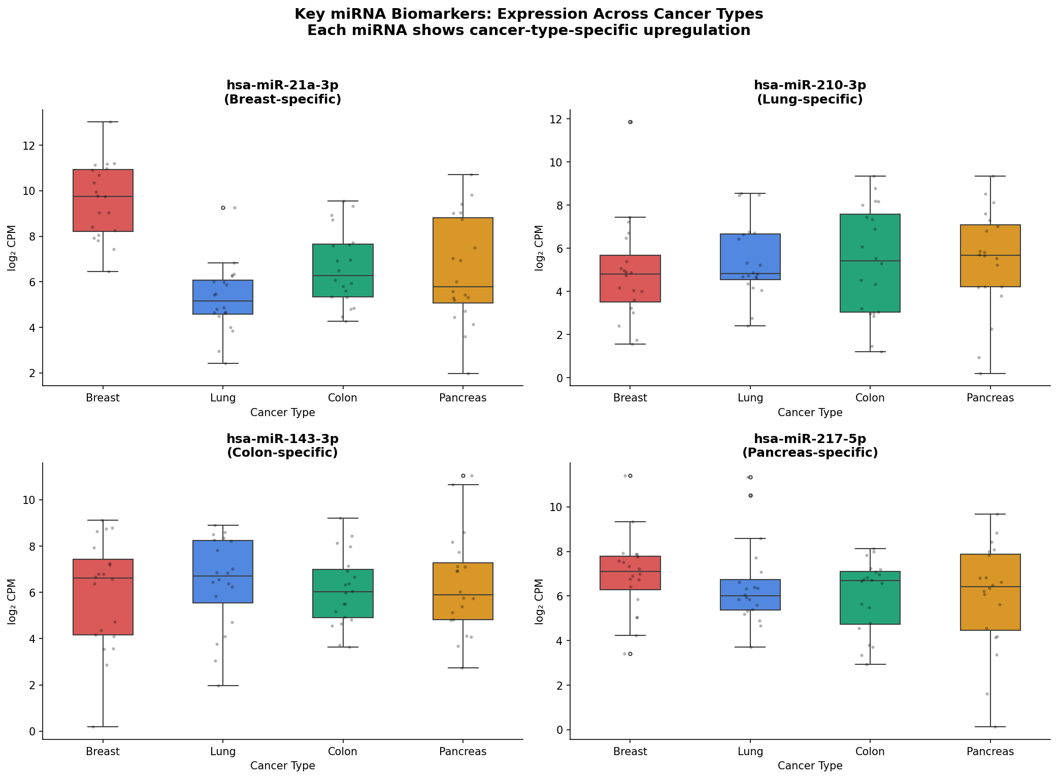
miR-21a (Brustkrebs), miR-210 (Lungenkrebs), miR-143 (Kolonkarzinom) und miR-217 (Pankreaskarzinom) – jede mit signifikant erhöhter Expression in genau einem Krebstyp. Diese vier miRNAs erklären einen Großteil der Clusterstruktur in der Heatmap.
Die Lehren der Detektivarbeit
Was wir gelernt haben
- Normalisierung ist nicht optional. Ohne Z-Scores dominieren Hochexprimierer, und subtile Muster verschwinden im Rauschen.
- Batch-Effekte töten Entdeckungen. Technische Variation kann biologische Signale vollständig maskieren. Immer prüfen, immer korrigieren.
- Die Distanzmetrik formt das Ergebnis. Korrelationsbasierte Distanzen erfassen Profilformen – genau das, was in Omics-Studien zählt.
- Heatmaps sind explorativ, nicht konfirmatorisch. Co-Clustering zeigt Korrelation, nicht Kausalität. Jede Entdeckung muss validiert werden.
Fallstricke-Checkliste
- ☐ Daten skaliert (Z-Score)?
- ☐ Batch-Effekte geprüft und ggf. korrigiert?
- ☐ Feature-Vorfilterung durchgeführt (Top-variable, DE-miRNAs)?
- ☐ Distanzmetrik und Linkage-Methode bewusst gewählt?
- ☐ Ergebnisse mit unabhängiger Methode validiert?
Implementierung in R
library(ComplexHeatmap)
library(circlize)
library(sva)  # für ComBat Batch-Korrektur

# Batch-Korrektur
combat_mat <- ComBat(dat = expr_matrix, batch = sample_info$batch)

# Z-Score zeilenweise
mat <- t(scale(t(combat_mat)))

# Top 50 variabelste miRNAs
vars <- apply(mat, 1, var)
top50 <- mat[order(vars, decreasing = TRUE)[1:50], ]

# Annotation
ha_col <- HeatmapAnnotation(
    Cancer = sample_info$cancer_type,
    col = list(Cancer = c("Breast" = "#ef4444", "Lung" = "#3b82f6",
                           "Colon" = "#10b981", "Pancreas" = "#f59e0b")),
    annotation_name_side = "left"
)

# Heatmap
Heatmap(top50,
    name = "Z-Score",
    col = colorRamp2(c(-2, 0, 2), c("#3b82f6", "#f8fafc", "#ef4444")),
    top_annotation = ha_col,
    clustering_distance_rows = "pearson",
    clustering_distance_columns = "pearson",
    clustering_method_rows = "average",
    clustering_method_columns = "average",
    show_row_names = TRUE,
    show_column_names = FALSE,
    row_names_gp = gpar(fontsize = 7),
    column_title = "miRNA Expression: 4 Krebstypen (batch-korrigiert)")
Implementierung in Python
import seaborn as sns
import matplotlib.pyplot as plt
import numpy as np
from scipy.stats import zscore
from scipy.spatial.distance import pdist
from scipy.cluster.hierarchy import linkage

# Z-Score-Normalisierung (zeilenweise)
z_matrix = zscore(expr_matrix, axis=1)

# Top 50 variabelste miRNAs
variances = z_matrix.var(axis=1)
top50 = z_matrix.loc[variances.nlargest(50).index]

# UPGMA mit Pearson-Korrelationsdistanz
g = sns.clustermap(
    top50,
    method='average',          # UPGMA
    metric='correlation',      # 1 - Pearson r
    cmap='RdBu_r',
    center=0, vmin=-2, vmax=2,
    col_colors=cancer_colors,
    figsize=(14, 12),
    dendrogram_ratio=(0.1, 0.15),
    cbar_pos=(0.02, 0.8, 0.03, 0.15),
    yticklabels=True,
    xticklabels=False
)
g.ax_heatmap.set_ylabel('miRNAs')
g.ax_heatmap.set_xlabel('Proben')
plt.suptitle('miRNA-Expression: 4 Krebstypen',
             y=1.02, fontsize=14)
plt.tight_layout()
Deep Dive: Optimal Leaf Ordering
Ein Detail, das oft übersehen wird: Bei n Blättern hat ein Dendrogramm 2n−1 mögliche Blatt-Reihenfolgen. Optimal Leaf Ordering (OLO) wählt die Anordnung, die benachbarte Blätter möglichst ähnlich macht – ohne die Baumstruktur zu verändern. Das ergibt visuell schönere, leichter interpretierbare Heatmaps. In R: ComplexHeatmap macht das automatisch. In Python: scipy.cluster.hierarchy.optimal_leaf_ordering().
Zitationen
- Eisen MB, Spellman PT, Brown PO, Botstein D (1998). “Cluster analysis and display of genome-wide expression patterns.” PNAS, 95(25), 14863–14868.
- Wilkinson L, Friendly M (2009). “The History of the Cluster Heat Map.” The American Statistician, 63(2), 179–184.
- Gu Z, Eils R, Schlesner M (2016). “Complex heatmaps reveal patterns and correlations in multidimensional genomic data.” Bioinformatics, 32(18), 2847–2849.
- Johnson WE, Li C, Rabinovic A (2007). “Adjusting batch effects in microarray expression data using empirical Bayes methods.” Biostatistics, 8(1), 118–127.
- Lu J, Getz G, Miska EA, et al. (2005). “MicroRNA expression profiles classify human cancers.” Nature, 435(7043), 834–838.
Fazit
Diese Fallstudie zeigt: Das Ergebnis einer Heatmap hängt mindestens so stark von der Vorverarbeitung ab wie von den Daten selbst. Ohne Z-Score-Normalisierung dominieren Hochexprimierer. Ohne Batch-Korrektur clustern Proben nach Technik statt nach Biologie. Mit der falschen Distanzmetrik verschwimmen klare Grenzen. Erst die methodisch saubere Pipeline – normalisieren, Batch-Effekte entfernen, korrelationsbasiert clustern – brachte die vier Krebssignaturen zum Vorschein, die die ganze Zeit in den Daten verborgen waren.
Dokumentation
Abstract
When 80 plasma samples from four cancer types are on the table and the clustering “makes no sense,” the real analysis begins. This article tells the story of a miRNA study—from the first confusing heatmap through batch effects and normalization traps to the moment four cancer signatures emerge from the noise. Every step is documented with realistic result plots and statistically justified.
Chapter 1: The 7 AM Email
When you receive an email at 7 AM with the subject line “Clustering makes no sense”, you know it’s going to be a long day. The message came from Dr. Meier, head of a liquid biopsy research consortium. The project: 80 plasma samples from patients with four solid tumor types—breast, lung, colon, and pancreatic carcinoma—20 patients per type. 300 circulating miRNAs had been quantified by small-RNA-Seq. The hypothesis: Each cancer type has a unique miRNA profile that can be revealed through unsupervised clustering.
But the first heatmap showed chaos. Samples from the same cancer type landed in different clusters. Some clusters contained a colorful mix of all four types. No pattern, no separation, no paper.
This is where most people stop. And where the real scientific detective work begins.
Chapter 2: The Raw Data Trap
The first suspect: normalization. The raw data had been library-normalized via DESeq2—but not scaled. The problem: A handful of highly expressed miRNAs (miR-21, miR-16, miR-451a) dominated the entire distance calculation. Whether a weakly expressed miRNA differentiated between breast and lung cancer? Invisible, crushed by the background noise of the high expressors.
The solution: Row-wise Z-score transformation. For each miRNA, the mean is set to 0 and standard deviation to 1:
zij = (xij − μi) / σi
After this, color no longer shows “how much” but “how different from normal.” The heatmap transformed—but still didn’t show the hoped-for pattern.
Chapter 3: The Ghost in the Machine — Batch Effects
The next clue came from the sample annotation. The 80 samples were split across two sequencing batches: 40 in January, 40 in March, on two different sequencers. And exactly these batches appeared in the dendrogram—not the cancer types.
This is one of the most common and dangerous errors in omics studies: technical variation masking biological variation. The solution was batch correction with ComBat (sva package in R), which removes sequencer-specific systematic effects while preserving biological differences.
Only now, after Z-score normalization and batch correction, was it worth looking at the clustering again.
Chapter 4: The Right Lens — Distance Metrics
But which distance? The choice of metric determines what “similarity” means. Euclidean distance measures geometric distance—purely quantitative. Pearson correlation measures the shape of the expression profile—whether two samples show the same pattern, regardless of amplitude. For miRNA data, where profile patterns matter, this is decisive.
| Metric | Formula | When Appropriate |
|---|---|---|
| Euclidean | √(Σ(xi − yi)²) | Standard, sensitive to outliers |
| 1 − Pearson r | 1 − cor(x, y) | Profile shape more important than amplitude |
| 1 − Spearman ρ | 1 − cor(rank(x), rank(y)) | More robust against outliers |
| Manhattan | Σ|xi − yi| | Sparse data, less outlier-sensitive |
For our dataset, 1 − Pearson correlation with Average Linkage (UPGMA) yielded the most biologically meaningful grouping.
Chapter 5: The Revelation — Four Signatures in the Noise
With the right preprocessing steps—Z-score normalization, batch correction, Pearson distance—came the moment the entire project had been working toward. The top 50 most variable miRNAs, hierarchically clustered, showed a clear picture:
Four clearly separated sample clusters. Four colors in the annotation bar. Nearly perfect correspondence. The cancer types did indeed have distinct miRNA signatures—you just had to put on the right glasses.
Notably: Breast and lung cancer shared a group of jointly upregulated miRNAs (likely angiogenesis-associated) but separated clearly in other regions. Colon and pancreatic carcinoma shared a digestive-tract-specific miRNA signature but were distinguishable by endocrine markers.
Chapter 6: The Confirmation — Dendrogram and Biomarkers
A heatmap alone is beautiful but not proof. For validation, the dendrogram serves as the tree structure representing the merging history of the clustering.
The dendrogram confirmed: The four cancer types formed four coherent branches. Only a few samples—likely rare subtypes or mixed diagnoses—landed in “wrong” clusters.
For clinical translation, however, you don’t need a heatmap but individual biomarkers. Which miRNAs drive the separation? The answer: four candidates, each highly specific for one cancer type.
miR-21a (breast cancer), miR-210 (lung cancer), miR-143 (colon carcinoma), and miR-217 (pancreatic carcinoma)—each with significantly elevated expression in exactly one cancer type. These four miRNAs explain much of the cluster structure in the heatmap.
Lessons from the Detective Work
What We Learned
- Normalization is not optional. Without Z-scores, high expressors dominate and subtle patterns vanish into noise.
- Batch effects kill discoveries. Technical variation can completely mask biological signals. Always check, always correct.
- The distance metric shapes the result. Correlation-based distances capture profile shapes—exactly what matters in omics studies.
- Heatmaps are exploratory, not confirmatory. Co-clustering shows correlation, not causation. Every discovery must be validated.
Pitfall Checklist
- ☐ Data scaled (Z-score)?
- ☐ Batch effects checked and corrected if needed?
- ☐ Feature pre-filtering done (top variable, DE miRNAs)?
- ☐ Distance metric and linkage method chosen deliberately?
- ☐ Results validated with an independent method?
Implementation in R
library(ComplexHeatmap)
library(circlize)
library(sva)  # for ComBat batch correction

# Batch correction
combat_mat <- ComBat(dat = expr_matrix, batch = sample_info$batch)

# Row-wise Z-score
mat <- t(scale(t(combat_mat)))

# Top 50 most variable miRNAs
vars <- apply(mat, 1, var)
top50 <- mat[order(vars, decreasing = TRUE)[1:50], ]

# Annotation
ha_col <- HeatmapAnnotation(
    Cancer = sample_info$cancer_type,
    col = list(Cancer = c("Breast" = "#ef4444", "Lung" = "#3b82f6",
                           "Colon" = "#10b981", "Pancreas" = "#f59e0b")),
    annotation_name_side = "left"
)

# Heatmap
Heatmap(top50,
    name = "Z-Score",
    col = colorRamp2(c(-2, 0, 2), c("#3b82f6", "#f8fafc", "#ef4444")),
    top_annotation = ha_col,
    clustering_distance_rows = "pearson",
    clustering_distance_columns = "pearson",
    clustering_method_rows = "average",
    clustering_method_columns = "average",
    show_row_names = TRUE,
    show_column_names = FALSE,
    row_names_gp = gpar(fontsize = 7),
    column_title = "miRNA Expression: 4 Cancer Types (batch-corrected)")
Implementation in Python
import seaborn as sns
import matplotlib.pyplot as plt
import numpy as np
from scipy.stats import zscore
from scipy.spatial.distance import pdist
from scipy.cluster.hierarchy import linkage

# Row-wise Z-score normalization
z_matrix = zscore(expr_matrix, axis=1)

# Top 50 most variable miRNAs
variances = z_matrix.var(axis=1)
top50 = z_matrix.loc[variances.nlargest(50).index]

# UPGMA with Pearson correlation distance
g = sns.clustermap(
    top50,
    method='average',          # UPGMA
    metric='correlation',      # 1 - Pearson r
    cmap='RdBu_r',
    center=0, vmin=-2, vmax=2,
    col_colors=cancer_colors,
    figsize=(14, 12),
    dendrogram_ratio=(0.1, 0.15),
    cbar_pos=(0.02, 0.8, 0.03, 0.15),
    yticklabels=True,
    xticklabels=False
)
g.ax_heatmap.set_ylabel('miRNAs')
g.ax_heatmap.set_xlabel('Samples')
plt.suptitle('miRNA Expression: 4 Cancer Types',
             y=1.02, fontsize=14)
plt.tight_layout()
Deep Dive: Optimal Leaf Ordering
A detail often overlooked: With n leaves, a dendrogram has 2n−1 possible leaf orderings. Optimal Leaf Ordering (OLO) selects the arrangement that makes adjacent leaves as similar as possible—without changing the tree structure. This produces visually cleaner, more interpretable heatmaps. In R: ComplexHeatmap does this automatically. In Python: scipy.cluster.hierarchy.optimal_leaf_ordering().
Citations
- Eisen MB, Spellman PT, Brown PO, Botstein D (1998). “Cluster analysis and display of genome-wide expression patterns.” PNAS, 95(25), 14863–14868.
- Wilkinson L, Friendly M (2009). “The History of the Cluster Heat Map.” The American Statistician, 63(2), 179–184.
- Gu Z, Eils R, Schlesner M (2016). “Complex heatmaps reveal patterns and correlations in multidimensional genomic data.” Bioinformatics, 32(18), 2847–2849.
- Johnson WE, Li C, Rabinovic A (2007). “Adjusting batch effects in microarray expression data using empirical Bayes methods.” Biostatistics, 8(1), 118–127.
- Lu J, Getz G, Miska EA, et al. (2005). “MicroRNA expression profiles classify human cancers.” Nature, 435(7043), 834–838.
Conclusion
This case study demonstrates: The result of a heatmap depends at least as much on preprocessing as on the data itself. Without Z-score normalization, high expressors dominate. Without batch correction, samples cluster by technology rather than biology. With the wrong distance metric, clear boundaries blur. Only a methodologically sound pipeline—normalize, remove batch effects, cluster by correlation—revealed the four cancer signatures that had been hidden in the data all along.