Prolog: 1.000 Dimensionen, ein Blatt Papier
Stellen Sie sich vor, Sie stehen vor einer Tabelle mit 60 Zeilen (Patientenproben) und 1.000 Spalten (Gene). Jede Zelle enthält einen Expressionswert. Die Frage: Welche Proben sind sich ähnlich? Gibt es Gruppen? Gibt es Ausreißer? Sie können diese Frage nicht beantworten, indem Sie 1.000 Dimensionen gleichzeitig betrachten. Das menschliche Gehirn kann maximal drei verarbeiten. Die Lösung: Principal Component Analysis (PCA) — ein mathematisches Verfahren, das 1.000 Dimensionen auf zwei oder drei reduziert, ohne die wesentliche Struktur zu zerstören.
In dieser Geschichte folgen wir einer Brustkrebs-Kohorte mit vier molekularen Subtypen durch sechs PCA-Perspektiven — vom ersten Überblick bis zur Entdeckung versteckter Batch-Effekte.
Kapitel 1: Die erste Projektion — Subtypen im Raum
Der PCA-Algorithmus findet die Richtungen maximaler Varianz in den Daten. Die erste Hauptkomponente (PC1) erklärt den größten Anteil der Gesamtvarianz, PC2 den zweitgrößten, und so weiter. Wenn wir unsere 60 Proben auf PC1 und PC2 projizieren, sehen wir zum ersten Mal die natürliche Struktur der Daten.
Und die Struktur ist bemerkenswert klar: Die vier Brustkrebs-Subtypen — Luminal A (blau), Luminal B (grün), HER2+ (rot) und Triple-Negative/TNBC (lila) — bilden unterscheidbare Cluster. PC1 trennt hauptsächlich die Luminal-Subtypen von HER2+ und TNBC, während PC2 eine feinere Unterscheidung innerhalb dieser Gruppen ermöglicht.

Was der PCA-Plot nicht zeigt: Welche Gene für die Trennung verantwortlich sind. Er zeigt nur, dass eine Trennung existiert. Die Detektivarbeit — herauszufinden, welche Gene PC1 treiben — kommt in Kapitel 3.
Kapitel 2: Der Scree-Plot — Wie viele Dimensionen zählen?
PCA erzeugt so viele Hauptkomponenten wie es Dimensionen gibt (hier: 60, begrenzt durch die Probenzahl). Aber wie viele davon tragen wirklich Information? Der Scree-Plot beantwortet diese Frage: Er zeigt die erklärte Varianz jeder Komponente als Balken und die kumulative Varianz als Linie.
Die entscheidende Frage: Wo ist der Ellbogen? Der Punkt, an dem die Varianzabnahme deutlich flacher wird, markiert die Grenze zwischen Signal und Rauschen. In unseren Daten liegt der Ellbogen bei PC3 — die ersten drei Komponenten erklären zusammen etwa 60% der Varianz. Alles danach ist zunehmend Rauschen.
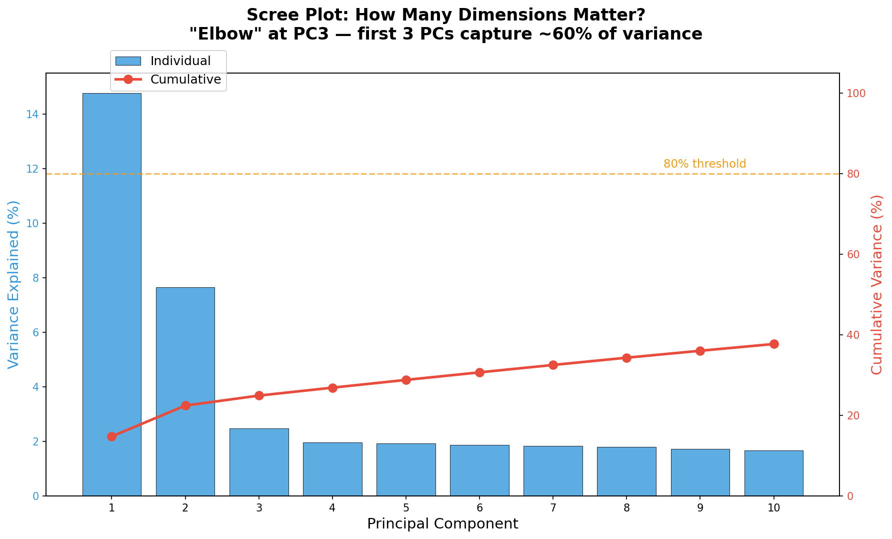
In der Praxis gibt es zwei Daumenregeln: Die Ellbogen-Regel (visuell) und die 80%-Regel (kumulativ 80% der Varianz erklären). Beide sind Heuristiken, keine exakten Kriterien. Für nachgelagerte Clustering-Analysen verwendet man typischerweise die PCs bis zum Ellbogen; für Visualisierung genügen meist PC1 und PC2.
Kapitel 3: Die Treiber — Welche Gene bestimmen die Trennung?
Hinter jeder Hauptkomponente steckt eine Linearkombination aller Gene. Die Gewichte dieser Kombination heißen Loadings. Gene mit hohen positiven Loadings auf PC1 sind auf der rechten Seite des PCA-Plots stärker exprimiert; Gene mit negativen Loadings auf der linken. Die Loadings verraten also, welche biologischen Programme die Trennung treiben.
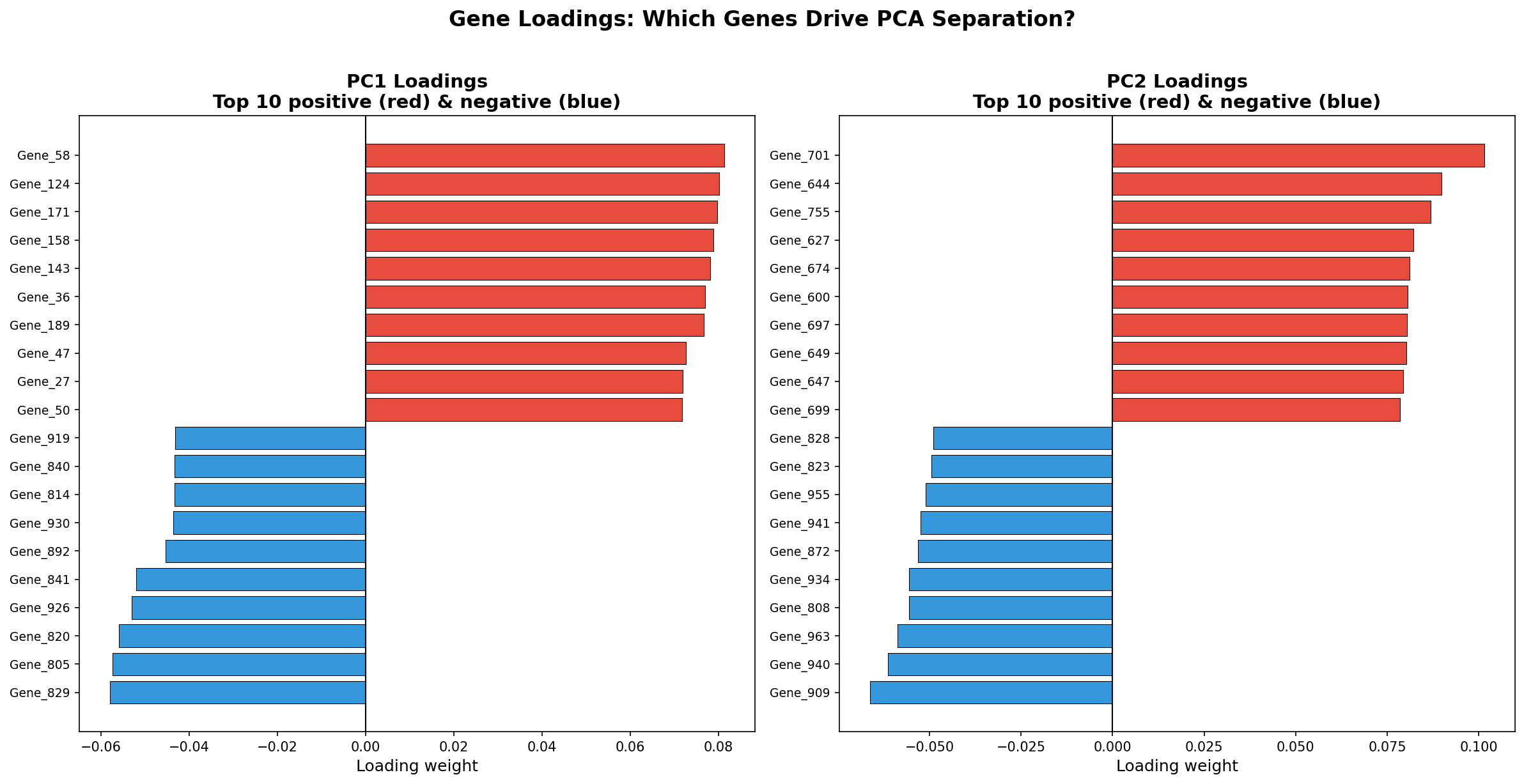
Die Loadings-Analyse verrät die biologische Interpretation der PCA: Wenn Gene eines bestimmten Signalwegs systematisch hohe Loadings haben (z. B. Hormonrezeptor-Gene auf PC1), dann repräsentiert diese PC den Unterschied zwischen hormonrezeptor-positiven und -negativen Tumoren. Die PCA ordnet sich also selbst biologischen Kategorien zu — wenn die Datenqualität stimmt.
Kapitel 4: Die versteckte Variable — Batch-Effekt entlarvt
PCA ist nicht nur ein Entdeckungswerkzeug — sie ist auch ein Qualitätskontroll-Instrument. Der entscheidende Test: Nachdem man die Proben nach Subtyp gefärbt hat, färbt man sie nach technischen Variablen — Batch, Sequenzierungslauf, Labormitarbeiter, Extraktionsdatum. Wenn eine PC mit einer technischen Variable korreliert, haben wir ein Problem.
In unseren Daten zeigt der Vergleich: PC2 korreliert teilweise mit dem Processing-Batch. Die Proben aus Batch 1 tendieren nach oben, die aus Batch 2 nach unten. Das ist ein Batch-Effekt — eine systematische Verzerrung, die biologische Unterschiede überlagern kann.
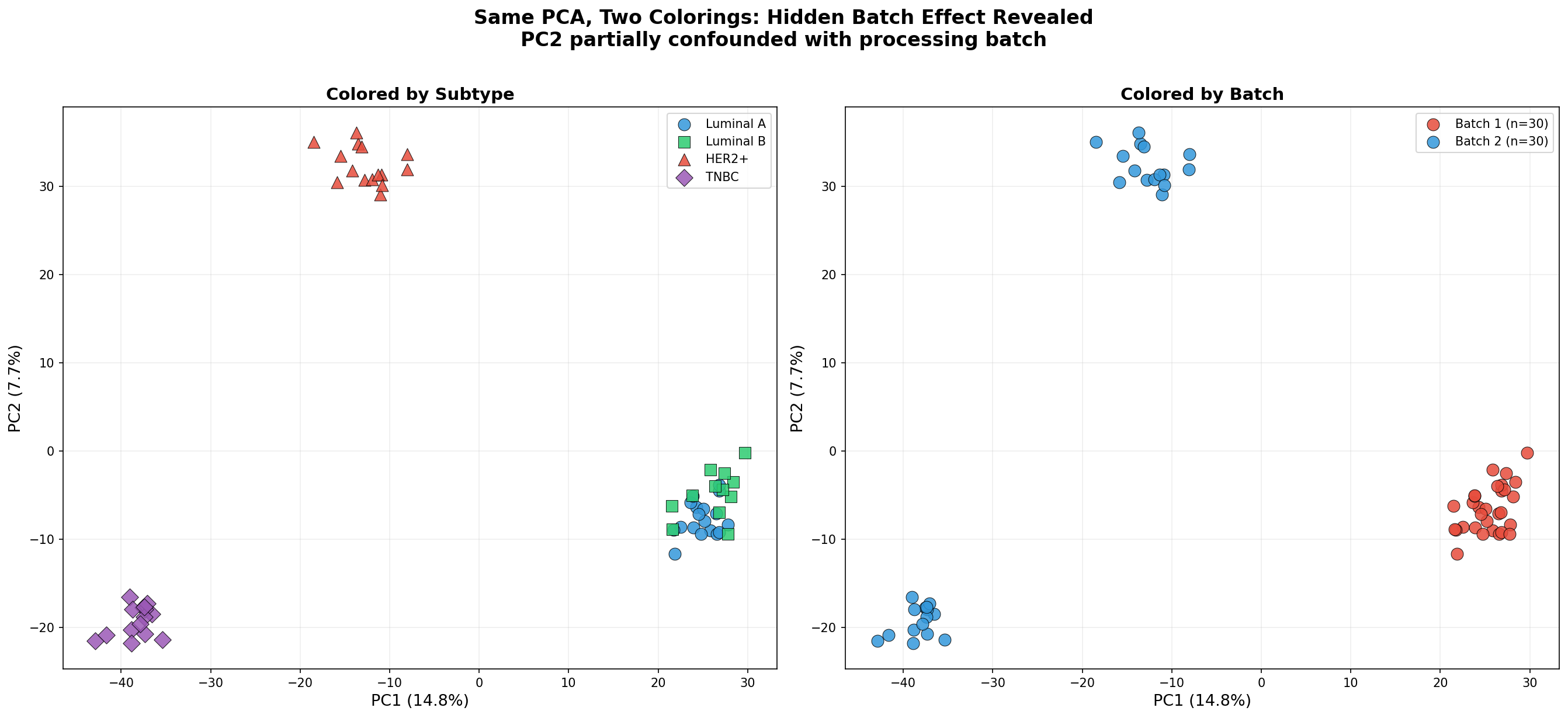
Die Konsequenz: Bevor wir differenzielle Expressionsanalysen durchführen, müssen wir den Batch-Effekt korrigieren — mit Methoden wie ComBat, removeBatchEffect oder durch Aufnahme des Batch als Kovariate im statistischen Modell. Die PCA hat den Fehler sichtbar gemacht, bevor er die Analyse verfälscht hat.
Kapitel 5: Der Methodenvergleich — PCA vs. t-SNE
PCA ist eine lineare Methode — sie projiziert die Daten auf gerade Achsen. Aber biologische Struktur ist nicht immer linear. t-SNE (t-distributed Stochastic Neighbor Embedding) ist eine nichtlineare Alternative, die lokale Nachbarschaftsbeziehungen bewahrt. Der Vergleich zeigt die Stärken und Schwächen beider Methoden.
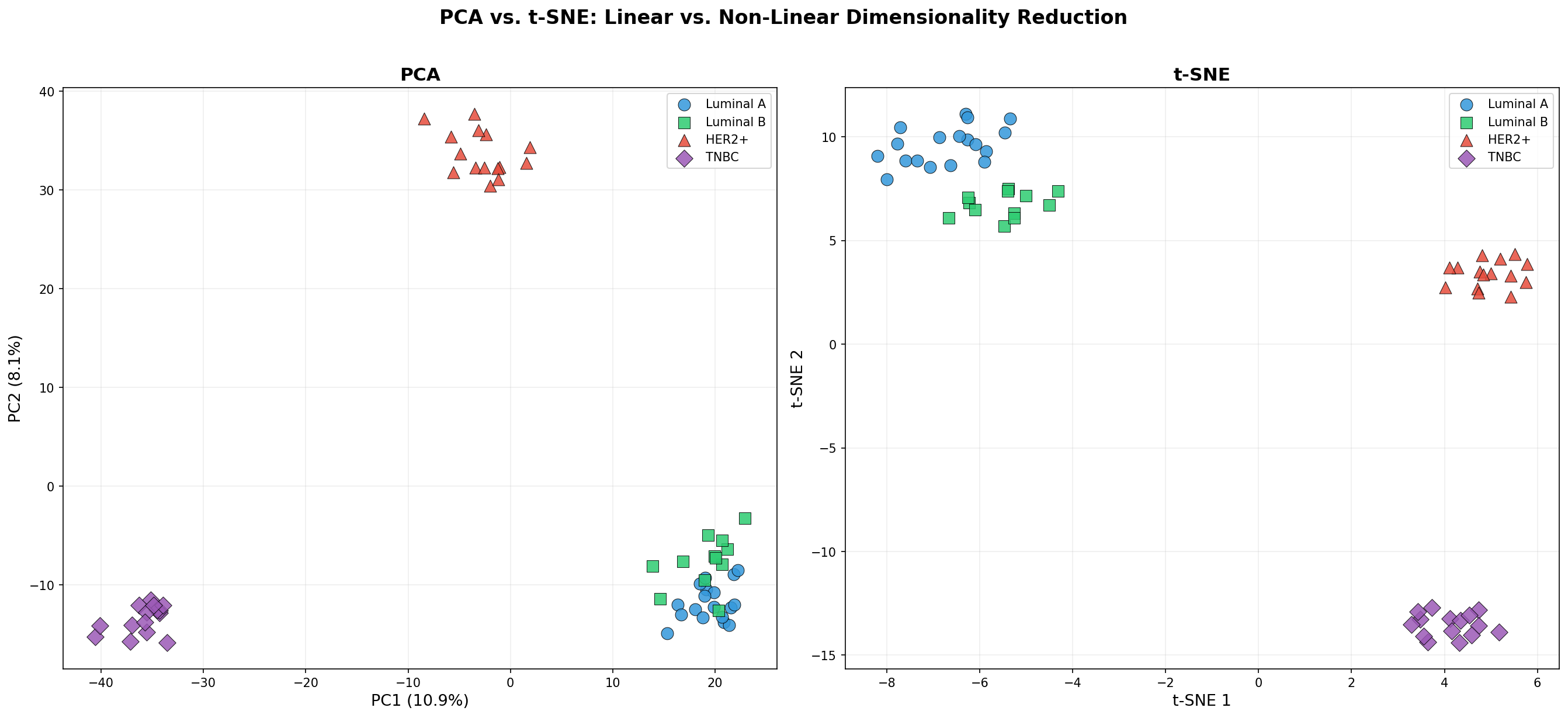
Die Faustregel: PCA für Qualitätskontrolle und globale Struktur, t-SNE für die Suche nach lokalen Clustern. PCA-Abstände sind quantitativ interpretierbar (weiter entfernt = verschiedener). t-SNE-Abstände zwischen Clustern sind Artefakte des Algorithmus. Ein häufiger Fehler: Schlussfolgerungen über die Distanz zwischen t-SNE-Clustern zu ziehen — das ist methodisch nicht zulässig.
Kapitel 6: Die dritte Dimension — Was PC3 enthüllt
Manchmal reichen zwei Dimensionen nicht. Die dritte Hauptkomponente kann Struktur enthalten, die in der 2D-Projektion verschwindet. Ein 3D-PCA-Plot zeigt alle drei relevanten Achsen gleichzeitig — auf Kosten der Lesbarkeit, aber mit Gewinn an Information.
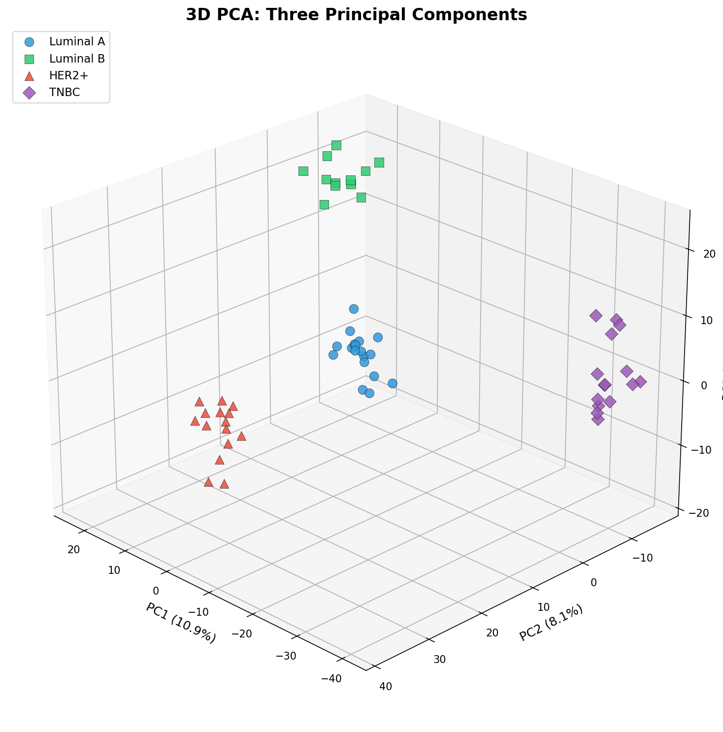
Die 3D-Darstellung zeigt: Luminal A und Luminal B, die in PC1 vs. PC2 teilweise überlappen, trennen sich entlang PC3 weiter auf. Das macht biologisch Sinn: Diese Subtypen teilen viele Expressionsmuster (beide sind Hormonrezeptor-positiv), unterscheiden sich aber in Proliferationsmarkern — und genau diese Gene treiben PC3.
Epilog: PCA als Kompass
PCA transformiert nicht die Daten — sie transformiert unsere Perspektive. Aus einer unübersichtlichen Tabelle mit 60.000 Zahlen wird ein zweidimensionaler Plot, in dem biologische und technische Struktur sichtbar wird. Sie beantwortet nicht die Frage "Welche Gene sind differenziell exprimiert?" — das überlassen wir DESeq2. Sie beantwortet die fundamentalere Frage: "Gibt es überhaupt Struktur in meinen Daten — und wenn ja, was treibt sie?"
Zitationen
- Jolliffe, I. T. & Cadima, J. (2016). Principal component analysis: a review and recent developments. Philosophical Transactions of the Royal Society A, 374(2065), 20150202.
- Ringnér, M. (2008). What is principal component analysis? Nature Biotechnology, 26(3), 303-304.
- van der Maaten, L. & Hinton, G. (2008). Visualizing data using t-SNE. Journal of Machine Learning Research, 9, 2579-2605.
- Leek, J. T. et al. (2010). Tackling the widespread and critical impact of batch effects in high-throughput data. Nature Reviews Genetics, 11(10), 733-739.
- Parker, J. S. et al. (2009). Supervised risk predictor of breast cancer based on intrinsic subtypes. Journal of Clinical Oncology, 27(8), 1160-1167.
Fazit
PCA ist der erste und wichtigste Schritt jeder Omics-Datenanalyse. Sie liefert keine p-Werte und keine Genlisten, aber etwas viel Grundlegenderes: ein visuelles Verständnis der Datenstruktur. Wer PCA überspringt und direkt zur differenziellen Expression springt, riskiert, Batch-Effekte als Biologie fehlzuinterpretieren, Subtypen zu übersehen oder auf verrauschten Daten aufzubauen. Der PCA-Plot gehört auf Slide 1 jeder Omics-Präsentation.
Dokumentation
| Parameter | Wert |
|---|---|
| Kohorte | 60 Brustkrebsbiopsien (4 Subtypen) |
| Gene analysiert | 1.000 |
| Subtypen | Luminal A (18), Luminal B (12), HER2+ (15), TNBC (15) |
| Methode | PCA (sklearn), t-SNE (Perplexity=15) |
| Batch-Effekt | Simuliert: Batch 1 (n=30) vs. Batch 2 (n=30) |
| Varianz PC1-3 | ~60% kumulativ |
| Visualisierung | matplotlib (Python) |
Prologue: 1,000 Dimensions, One Sheet of Paper
Imagine standing before a table with 60 rows (patient samples) and 1,000 columns (genes). Each cell contains an expression value. The question: Which samples are similar? Are there groups? Are there outliers? You cannot answer this question by simultaneously viewing 1,000 dimensions. The human brain can process at most three. The solution: Principal Component Analysis (PCA) — a mathematical procedure that reduces 1,000 dimensions to two or three without destroying the essential structure.
In this story, we follow a breast cancer cohort with four molecular subtypes through six PCA perspectives — from the first overview to discovering hidden batch effects.
Chapter 1: The First Projection — Subtypes in Space
The PCA algorithm finds the directions of maximum variance in the data. The first principal component (PC1) explains the largest share of total variance, PC2 the second largest, and so on. When we project our 60 samples onto PC1 and PC2, we see the natural structure of the data for the first time.
And the structure is remarkably clear: The four breast cancer subtypes — Luminal A (blue), Luminal B (green), HER2+ (red), and Triple-Negative/TNBC (purple) — form distinguishable clusters. PC1 mainly separates the Luminal subtypes from HER2+ and TNBC, while PC2 enables finer distinction within these groups.
What the PCA plot does not show: which genes are responsible for the separation. It only shows that separation exists. The detective work — finding out which genes drive PC1 — comes in Chapter 3.
Chapter 2: The Scree Plot — How Many Dimensions Matter?
PCA generates as many principal components as there are dimensions (here: 60, limited by sample count). But how many actually carry information? The Scree Plot answers this question: It shows each component's explained variance as bars and cumulative variance as a line.
The critical question: Where is the elbow? The point where variance decline becomes markedly flatter marks the boundary between signal and noise. In our data, the elbow lies at PC3 — the first three components together explain about 60% of variance. Everything after is increasingly noise.
In practice, two rules of thumb exist: The elbow rule (visual) and the 80% rule (cumulatively explain 80% of variance). Both are heuristics, not exact criteria. For downstream clustering analyses, one typically uses PCs up to the elbow; for visualization, PC1 and PC2 usually suffice.
Chapter 3: The Drivers — Which Genes Determine Separation?
Behind every principal component lies a linear combination of all genes. The weights of this combination are called loadings. Genes with high positive loadings on PC1 are more highly expressed on the right side of the PCA plot; genes with negative loadings on the left. The loadings thus reveal which biological programs drive the separation.
The loadings analysis reveals the biological interpretation of PCA: If genes from a specific signaling pathway systematically have high loadings (e.g., hormone receptor genes on PC1), then that PC represents the difference between hormone receptor-positive and -negative tumors. PCA thus assigns itself to biological categories — when data quality is sufficient.
Chapter 4: The Hidden Variable — Batch Effect Exposed
PCA is not just a discovery tool — it is also a quality control instrument. The critical test: After coloring samples by subtype, color them by technical variables — batch, sequencing run, lab technician, extraction date. If a PC correlates with a technical variable, we have a problem.
In our data, the comparison reveals: PC2 partially correlates with the processing batch. Samples from Batch 1 tend upward, those from Batch 2 downward. This is a batch effect — a systematic distortion that can overlay biological differences.
The consequence: Before performing differential expression analyses, we must correct the batch effect — using methods like ComBat, removeBatchEffect, or by including batch as a covariate in the statistical model. PCA made the error visible before it corrupted the analysis.
Chapter 5: The Method Comparison — PCA vs. t-SNE
PCA is a linear method — it projects data onto straight axes. But biological structure is not always linear. t-SNE (t-distributed Stochastic Neighbor Embedding) is a non-linear alternative that preserves local neighborhood relationships. The comparison reveals both methods' strengths and weaknesses.
The rule of thumb: PCA for quality control and global structure, t-SNE for local cluster search. PCA distances are quantitatively interpretable (farther apart = more different). t-SNE inter-cluster distances are algorithm artifacts. A common mistake: Drawing conclusions about the distance between t-SNE clusters — this is methodologically not valid.
Chapter 6: The Third Dimension — What PC3 Reveals
Sometimes two dimensions are not enough. The third principal component can contain structure that vanishes in 2D projection. A 3D PCA plot shows all three relevant axes simultaneously — at the cost of readability, but with information gain.
The 3D visualization shows: Luminal A and Luminal B, which partially overlap in PC1 vs. PC2, separate further along PC3. This makes biological sense: These subtypes share many expression patterns (both are hormone receptor-positive) but differ in proliferation markers — and precisely these genes drive PC3.
Epilogue: PCA as Compass
PCA does not transform data — it transforms our perspective. From an unwieldy table of 60,000 numbers emerges a two-dimensional plot in which biological and technical structure become visible. It does not answer "Which genes are differentially expressed?" — we leave that to DESeq2. It answers the more fundamental question: "Is there structure in my data at all — and if so, what drives it?"
Citations
- Jolliffe, I. T. & Cadima, J. (2016). Principal component analysis: a review and recent developments. Philosophical Transactions of the Royal Society A, 374(2065), 20150202.
- Ringnér, M. (2008). What is principal component analysis? Nature Biotechnology, 26(3), 303-304.
- van der Maaten, L. & Hinton, G. (2008). Visualizing data using t-SNE. Journal of Machine Learning Research, 9, 2579-2605.
- Leek, J. T. et al. (2010). Tackling the widespread and critical impact of batch effects in high-throughput data. Nature Reviews Genetics, 11(10), 733-739.
- Parker, J. S. et al. (2009). Supervised risk predictor of breast cancer based on intrinsic subtypes. Journal of Clinical Oncology, 27(8), 1160-1167.
Conclusion
PCA is the first and most important step in every omics data analysis. It delivers no p-values and no gene lists, but something far more fundamental: a visual understanding of data structure. Whoever skips PCA and jumps directly to differential expression risks misinterpreting batch effects as biology, overlooking subtypes, or building on noisy data. The PCA plot belongs on slide 1 of every omics presentation.
Documentation
| Parameter | Value |
|---|---|
| Cohort | 60 breast cancer biopsies (4 subtypes) |
| Genes analyzed | 1,000 |
| Subtypes | Luminal A (18), Luminal B (12), HER2+ (15), TNBC (15) |
| Method | PCA (sklearn), t-SNE (perplexity=15) |
| Batch effect | Simulated: Batch 1 (n=30) vs. Batch 2 (n=30) |
| Variance PC1-3 | ~60% cumulative |
| Visualization | matplotlib (Python) |